The MAP COMPARISON KIT: methods, software and applications
H. Visser (editor)
This investigation has been performed by order and for the account of RIVM, within the framework of project S/550002/01/TO, Tools for Uncertainty Analysis.
Abstract
Comparing maps is an important issue in environmental research. Reasons for comparing maps may be: (i) the different socio-economic scenarios on which they are based, (ii) detection of temporal changes, (iii) calibration/validation of land-use models, (iv) hot-spot detection, (v) their use in uncertainty analysis, and (vi) their origin in different methodologies/models. This report addresses the problem of quantifying subsequent map similarities and dissimilarities.
Our main focus is on maps denoted as ‘categorical’ or ‘nominal’. A number of the five map-comparison techniques are described. These techniques differ in mathematical approach (no math, ‘cell by cell’, two types of ‘fuzzy’ and ‘single-map statistics’) and apply to different types of maps (nominal, ordinal, ratio and interval scale). Special attention is given to the comparison of maps through fuzzy-set calculation rules. The rationale is that fuzzy-set map comparison is very close to human judgement, as shown in an Internet experiment.
The MAP COMPARISON KIT (MCK) software plays a major role in the report. MCK, a software package for ‘state-of-the-art’ map comparison, contains all the examples used in this report. The software, developed by order of the Netherlands Environmental Assessment Agency, was fully designed by the Research Institute for Knowledge Systems. The software will be made publicly available on the RIVM website early 2004 (www.rivm.nl).
Acknowledgements
A number of individuals and institutes have contributed to this report. First of all, let me thank the staff at RIKS, the Research Institute for Knowledge Systems. Inge Uljee and Alex Hagen did a marvellous job in designing and programming the MAP COMPARISON KIT software. In good cooperation with RIVM, they improved the various versions of the software needed to realize the final version. Alex Hagen also (co-)authored sections 2.3 and 2.5, and Appendix C on fuzzy-set map comparison versus human judgement. He was the initiator of section 4.1, the analysis of children’s maps. Many thanks to Guy Engelen for both his encouragement and his coordination of the software development at RIKS.
A number of RIVM colleagues have made the following contributions: Ton de Nijs (RIM/MNP) as co-author of Chapter 1 and section 5.2, and lead author of section 5.1, on the calibration of the LUMOS Environment Explorer; Raymond de Niet (RIM/MNP) as lead author of section 5.2 on the consistency of land-use maps, and Kees Klein Goldewijk (KMD/MNP) as author of section 4.2 on the analysis of historical agricultural land use. Furthermore, Michel Bakkenes (NLB/MNP) provided the maps on heavy metals in topsoils (section 4.6); Laurens Zwakhals (VTV) the maps on ambulance driving times (section 4.5) and Wideke Boersma (RIM/MNP), a number of maps from the LUMOS Land Use Scanner (sections 4.3 and 4.4). Judith Borsboom-van Beurden (RIM/MNP) was co-author of sections 4.3 and 4.4.
Kit Buurman (IMP/MNP) played on important role in the initial phase of the Map Comparison Project. I thank Geert Verspaij and Gert-Jan Stolwijk (both IMP/MNP) for programming and testing a prototype user shell of the MAP COMPARISON MODULE within ArcGis-8. Finally, Arthur Beusen and Arnold Dekkers (both IMP/MNP) designed software tools additional to the MAP COMPARISON KIT software.
Peter Verburg (Wageningen UR) was the lead author of Appendix A on single-map statistics. The programming of enrichment factors was performed by Kor de Jong (University of Utrecht). He was also the co-author of Appendix A.
The software development was funded by several project leaders at the RIVM, i.e.: Arthur Beusen (IMP/MNP), Harm van den Heiligenberg (NMD/MNP), Peter Janssen (IMP/MNP), and Marianne Kuypers-Linde (RIM/MNP).
Contents
SAMENVATTING ...8
SUMMARY...9
1. INTRODUCTION...11
1.1 THE ROLE OF MAPS IN ENVIRONMENTAL RESEARCH...11
1.2 WHY COMPARE MAPS? ...12
1.3 FROM CELL-BY-CELL TO FUZZY...15
1.4 THE MAP COMPARISON KIT ...17
1.5 THIS REPORT...17
2. MAP COMPARISON - METHODS ...19
2.1 DEFINITION OF MEASUREMENT SCALES...20
2.2 VISUAL MAP COMPARISON...22
2.3 COMPARING MAPS CELL BY CELL - KAPPA STATISTICS...25
2.3.1 Equal or unequal, that’s the question ...25
2.3.2 Advanced use of Kappa statistics...25
2.3.3 Kappa dissected into K-histo and K-location ...28
2.3.4 Example ...30
2.4 FUZZY-SET MAP COMPARISON...32
2.4.1 Considering categorical similarity ...32
2.4.2 Considering proximity of similar cells...33
2.4.3 Comparison of fuzzy cells ...33
2.4.4 Aggregated map results and overall similarity with Fuzzy Kappa ...35
2.4.5 Dublin example continued ...35
2.5 COMPARING MAPS BY HIERARCHICAL FUZZY PATTERN MATCHING...38
2.6 COMPARING MAPS BY USE OF SINGLE MAP STATISTICS...39
3. MAP COMPARISON - SOFTWARE ...41
3.1 MAP COMPARISON KIT...41
3.1.1 The software...41
3.1.2 Handling different measurement scales ...43
3.2 TOOLS ADDITIONAL TO THE MAP COMPARISON KIT...46
4. MAP COMPARISON KIT – APPLICATIONS ... 49
4.1 SPOT THE 15 DIFFERENCES!... 50
4.1.1 Introduction... 50
4.1.2 Cell-by-cell comparison ... 51
4.1.3 Fuzzy-set map comparison ... 53
4.1.4 Conclusion... 55
4.2 HISTORICAL PROJECTIONS OF AGRICULTURAL LAND USE, 1700-1990 ... 56
4.2.1 Context ... 56
4.2.2 Data... 56
4.2.3 Similarity based on Kappa statistics ... 58
4.2.4 Fuzzy-set map comparison ... 62
4.2.5 Effect of aggregation... 64
4.2.6 Conclusion... 66
4.3 THE LAND USE SCANNER AND SCENARIOS FOR THE YEAR 2020... 67
4.3.1 The Land Use Scanner ... 67
4.3.2 About the model... 68
4.3.3 Scenarios... 69
4.3.4 Comparing the different scenarios ... 70
4.4 RESIDENTIAL LAND USE IN 2020... 74
4.5 TRAVEL TIMES OF AMBULANCES... 78
4.6 HEAVY METALS IN TOPSOILS... 81
5. MAP COMPARISON KIT - SPECIAL TOPICS... 85
5.1 CALIBRATION OF LAND-USE MODELS... 85
5.1.1 Method ... 85
5.1.2 Environment Explorer ... 85
5.1.3 Calibration of the Environment Explorer for 1996 ... 89
5.2 CONSISTENCY IN LAND-USE MAPS... 93
5.2.1 Context ... 93
5.2.2 From CBS land-use maps to LUMOS land-use maps ... 94
5.2.3 Locating and identifying suspect changes by the MCK... 94
5.2.4 Fuzzy-set map comparison ... 95
5.2.5 Categories in detail ... 97
5.2.6 Formulating correction rules ... 99
5.2.7 Conclusions ... 101
6. CONCLUSIONS AND FURTHER RESEARCH... 103
REFERENCES... 107
APPENDIX A NEIGHBOURHOOD CHARACTERISTICS... 113
APPENDIX B MAP TRANSFORMATIONS... 120
Samenvatting
Kaarten, en in het bijzonder landgebruikskaarten, worden gepresenteerd in een reeks van uitgaves van het Milieu- en Natuurplanbureau (MNP/RIVM). Voorbeelden zijn de Milieu- en Natuurverkenning die eens per vier jaar uitkomen, als ook de Milieubalans en Natuurbalans die jaarlijks worden gepubliceerd. Kaarten en kaartbeeldvergelijkingen spelen een belangrijke rol bij het tot stand komen van deze producten. Hierbij kunnen kaarten voor allerlei doeleinden vergeleken worden: (i) kaarten kunnen gebaseerd zijn op verschillende economische/demografische scenario’s, (ii) detectie van veranderingen in landgebruik in de tijd, (iii) calibratie en validatie van landgebruiksmodellen, (iv) detectie van hot-spots in kaarten, (v) onzekerheidsanalyse en (vi) analyse van kaarten die afkomstig zijn van verschillende onderzoeksgroepen of modellen.
Dit rapport is gericht op het kwantificeren van verschillen en overeenkomsten in kaarten. Hierbij ligt de nadruk op nominale en ordinale kaarten. Voor dit type kaarten is het uitvoeren van vergelijkingen het lastigst. Immers, hoe zou je verschillen tusen de nominale landgebruikscategorieën ‘grasland’, ‘bebouwing’ of ‘recreatie’ numeriek moeten uitdrukken? We beschrijven een vijftal methodes om kaartbeelden te vergelijken. Deze methodes verschillen in wiskundige benadering (geen wiskunde, ‘cel bij cel’, twee soorten ‘fuzzy’ en kengetallen voor enkelvoudige kaarten) als ook in het type kaarten waarvoor ze bedoeld zijn (nominale schaal, ordinale schaal, ratio-schaal en interval-schaal ). Speciale aandacht wordt besteed aan kaartbeeldvergelijking gebaseerd op rekenregels uit de fuzzy-set theorie. Het sterke punt van deze benadering is dat door het fuzzificeren van categorieën en hun specifieke locatie, een methode ontstaat die veel overeenkomsten bezit met hoe het menselijk oog kaarten vergelijkt. We laten dit zien aan de hand van een Internet-experiment.
De kaartbeeldvergelijkingsmethodes worden geïllustreerd aan de hand van een aantal case-studies. De voorbeelden variëren van de analyse van historisch agrarisch grondgebruik over de periode 1700 tot 1990, tot het analyseren voor landgebruikstoekomstbeelden voor het jaar 2020. Speciale toepassingen zijn het calibreren en valideren van landgebruiksmodellen, en het zoeken naar inconsistenties in landgebruikskaarten van het CBS.
Alle analyses uit het rapport zijn uitgevoerd met de MAPCOMPARISONKIT-software. Dit software pakket is in opdracht van het RIVM ontwikkeld door het Research Instituut voor KennisSystemen (RIKS). De software is uniek in het integreren van vier kaartbeeld-vergelijkingsmethodes. De software zal begin 2004 algemeen beschikbaar worden gesteld via de RIVM-website (www.rivm.nl). We concluderen dat de nieuw ontwikkelde MAPCOMPARISONKIT-software een krachtig ‘state of the art’ hulpmiddel is bij het analyseren van kaartbeelden.
Summary
The use of (land-use) maps is important for a wide range of products issued by the Netherlands Environmental Assessment Agency (NEAA or MNP in Dutch), with special reference to the Nature Outlook and Environmental Outlook, each produced once in four years. Maps also form an integrated part of the annually produced Nature Balance and Environmental Balance. Maps and map comparisons play a role in the production of all these documents. Maps may be compared for a number of reasons, of which six will be named here: (i) the different economic/demographic scenarios forming the basis of maps, (ii) the detection of temporal changes, (iii) the calibration/validation of land-use models, (iv) hot-spot detection, (v) uncertainty analysis, and (vi) the different methodologies/models generating a set of maps.
This report addresses the problem of quantifying map similarities and dissimilarities. Our main focus is on maps denoted as ‘categorical’ or ‘nominal’. Comparison is most complicated for the type of map responding to the question: how can we quantify similarities and dissimilarities in maps with nominal categories such as ‘grassland’, ‘residential’, ‘infrastructural’ or ‘recreational’?
Here we will describe a number of five map-comparison techniques. These techniques differ in mathematical approach (‘no math’, ‘cell by cell’, two types of ‘fuzzy’, ‘single-map statistics’) and apply to different types of maps (nominal, ordinal, ratio and interval scales. Special attention is given to the comparison of maps based on fuzzy-set calculation rules. Here, both fuzziness of category and fuzziness of location are accounted for. The rationale is that fuzzy-set map comparison is very close to human judgement, as shown in an heuristic Internet experiment.
A variety of case studies show examples of the comparisons. Cases vary from land-use modelling for the year 2020 to historical reconstruction of worldwide agriculture from 1700 up to the present. Special topics are the role of map comparison in the calibration and validation of land-use models, and the search for consistency in land-use maps produced by Statistics Netherlands (CBS ).
The MAP COMPARISON KIT (MCK) software plays a major role in the comparisons reported here. The MCK, a software package applied to ‘state of the art’ map comparison, contains all examples brought forward in the report. The software, developed by order of NEAA, was fully designed by the Research Institute for Knowledge Systems (RIKS). The software will be made publicly available on the RIVM website early 2004 (www.rivm.nl). The MCK software can be concluded to be a powerful tool in map comparison applications. MCK is unique in having integrated four separate comparison techniques.
1.
Introduction
by H. Visser, A.C.M. de Nijs and A. Hagen
1.1
The role of maps in environmental research
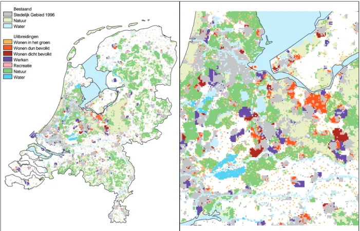
The use of (land-use) maps is important for a wide range of products issued by the Netherlands Environmental Assessment Agency (NEAA or MNP in Dutch), with special reference to the Nature Outlook and Environmental Outlook, each produced once in four years (see MNP (2002a) and MNP (2000), respectively). Other examples are found in MNP (2001) and MNP (2002c). Maps also play a role in the annual Environmental Balance and Nature Balance. Please see below for an example from Nature Outlook 2 , 2000 - 2030.
NEAA is required to report regularly on the current status and future trends in the environment and nature. Nature Outlook 2 presents a scenario analysis based on spatially detailed sketches of the Netherlands in 2030. These land-use maps were generated by a software tool called the Environment Explorer (De Nijs et al., 2002). Nature Outlook 2 examines the effects of future developments in society on nature and landscape by means of four scenarios based on the so-called IPCC- SRES scenarios. The Nature Outlook 2 scenarios describe the development of Dutch society on the basis of two different contradictory trends: ‘globalization versus regionalization’ and ‘individualization versus co-operation’.
The four scenarios in Nature Outlook 2 have been converted to future land use using the present land use and the developments of the various land uses according the scenarios. The spatial quantification results in four maps showing the land use in 2030. In essence, the maps are sketches of the Netherlands in 2030, defined by the principles and assumptions of the scenarios, showing the results of current trends and potential transitions. The maps form the basis for subsequent emission, distribution and effect analysis in the Nature Outlook 2. The maps characterize the potential effects of the four scenarios on naturally and culturally valuable landscapes and reserves in the Netherlands. An example is given in Figure 1.
Bestaand Stedelijk Gebied 1996 Natuur
Water Uitbreidingen Wonen in het groen Wonen dun bevolkt Wonen dicht bevolkt Werken Recreatie Natuur Water Bestaand Stedelijk Gebied 1996 Natuur Water Uitbreidingen Wonen in het groen Wonen dun bevolkt Wonen dicht bevolkt Werken Recreatie Natuur Water
Figure 1 Land use in 2030 in the scenario ‘Individual World’ on a national scale (left panel) and regional scale (right panel) (Source: De Nijs et al., 2002).
1.2
Why compare maps?
Maps may be compared for a number of reasons. We have chosen to describe six of these: • Comparison of model output generated under different scenarios and assumptions.
• To detect temporal changes. Many maps have a temporal dimension. For example, in Chapter 5 we will show land-use maps from Statistics Netherlands (CBS) for 1989, 1993 and 1996. It would be interesting to study these land-use maps to find out where and for which categories major changes have occurred. Another example of temporal changes will be given in section 4.2.
• To calibrate/validate land-use models. Land-use models such as the Environment Explorer (De Nijs et al., 2002) and the Land Use Scanner (Scholten et al., 2001), generate land-use maps starting at an actual observed land-use map (here the CBS map for 1989). How well do these models predict future developments and how can we optimize model output to unknown parameters in the model? For such calibration problems we need an objective measure for map (dis)similarity. In fact, map comparison may seen as giving a Goodness-of-fit measure. We will give an example of the procedure in section 5.1.
• Besides as a Goodness-of-fit measure map comparison has another role in the calibration/validation procedure. A map comparison method may give information about the nature of the differences between model map and reality map. Insight in these differences help in estimating better, adjusted, parameter values.
• To detect hot spots. With hotspot detection is meant the process of finding in a haystack of spatial data those areas that require further attention, say the problem areas. A map comparison method that is capable of distinguishing policy-relevant changes can be used for hotspot detection. For example, map comparison methods may be capable of recognizing changes that are related to land degradation.
• To perform uncertainty analyses. There are many sources of error in maps. By comparing model output to a reference map, such errors may be detected and quantified. In fact, calibration is a form of uncertainty analysis. The study of changes in category definitions in land-use maps is also an example (section 5.2).
• To compare different methodologies. Maps may be generated by different models. How well do these maps compare and if they differ, where are the differences located and how can we quantify them? An example of such maps is given in section 4.2, where historical maps for agriculture are studied. Two independent research groups generated maps for the years 1700, 1850 and 1990.
Here we will introduce a number of five map-comparison techniques. These techniques differ in mathematical approach (no math, ‘cell by cell’, ‘fuzzy’ or single-map statistics), and apply to different types of maps. Our main focus will be on maps denoted as ‘categorical’ or ‘nominal’. Comparison is most complicated for these types of maps: how can we compare ‘grassland’ with ‘residential’, or ‘glasshouses’ with ‘recreational’? Still, we are looking for exact quantification of differences between maps containing such categories.
Land-use models such as the Environment Explorer and the Land Use Scanner predict land-use changes given scenarios for future (economic) developments. Changes as given above in the four cyclorama pictures should be predicted as much as possible. Map comparison may help to locate and quantify differences in model output and actual observed changes. Quantification of changes is important for the calibration and validation of land-use models.
The pictures are taken from exactly one point near the village of Zetten:
1. April 1999 (upper panel). Shown is an orchard located in the Betuwe region. Here, a new railway line for freight transport (the so-called Betuwe line) is being built.
2. April 2000 (second panel). Trees have been cut down for a temporary roadway (the A15). 3. May 2001 (third panel). Groundwork for the detour of the A15 roadway.
4. November 2001 (lower panel). Asphalt has been laid. The Betuwe railway line will eventually
pass through this area.
1.3
From cell-by-cell to fuzzy
Growth of high-resolution spatial modelling, geographical information systems and remote sensing has increased the need for map comparison methods. Good comparison methods will be needed to perform calibration and validation of spatial results in a structured and controllable manner. The importance of map comparison methods has been recognized and has stimulated growing interest among researchers (Monserud and Leemans, 1992; Metternicht, 1999; Winter, 2000; Pontius, 2000; Pontius and Schneider, 2001; Power, Simms and White, 2001; Hagen, 2003).
For most purposes, visual, human comparison still outperforms automated procedures. When comparing maps the human observer takes many aspects into consideration without deliberately trying. Local similarities, but also global similarities, logical coherence and patterns are recognized. Map-comparison methods performed by software usually capture one of these aspects but overlook the others. Furthermore, they generally lack the flexibility to switch from one aspect to the other when the data requires so.
The best example of this rigidity is the cell-by-cell comparison of two checkerboards. The first board has a white field in the upper left corner, the second a black field. The average observer would immediately recognize the two boards as being highly similar in quality. However, a cell-by-cell comparison method would find a black cell where a white one is expected and vice versa. Hence, total disagreement would be concluded. A checkerboard example is given in Figure 2.
Despite these clear disadvantages, there are situations where automated map comparison is preferred above visual map comparison, for example, where an automated procedure can save time and human effort. A more important reason for choosing automated comparison is that automated procedures are explicitly defined and therefore objective and repeatable. Thus the method can be analysed and evaluated, and the results verified. A visual map comparison will always be subjective and often intuitive. The outcome of a visual map comparison can therefore depend on the person performing the comparison.
The main map-comparison method presented in this report was primarily developed for use in the calibration and validation process of cellular models for land-use dynamics. The method is based on the fuzzy-set calculation rules (Zadeh 1965). Several authors have addressed the potential of fuzzy-set theory for geographical applications (Cheng, Molenaar and Lin, 2001; Fisher, 2000). In the past fuzzy-set theory was used to assess the accuracy of map representations and for map comparisons (Metternicht, 1999; Power, Simms and White, 2001).
Figure 2 Two maps showing the observed presence of rabbits in the Netherlands. Grid size is 5 x 5 km.
For some reason the presence of rabbits has been shifted exactly one cell between both maps. A cell-by-cell comparison method would qualify both maps as totally different. However, an average observer would qualify both maps as highly equivalent. In this sense, map comparison based on fuzzy-set calculation rules is very similar to human judgement.
The objective of fuzzy-based map comparison is to find a method that to some extent mimics human comparison and gives a detailed assessment of similarity. The method introduced in this report is aimed at comparing nominal and ordinal raster maps. The assessment results are spatial and gradual. Additionally, an overall figure for similarity, the Fuzzy Kappa statistic, is aggregated from the detailed spatial results.
Although fuzzy-based map comparison has clear advantages over the more traditional cell-by-cell methods, as we will point out later, the latter still yields results showing insight into many cases. For this reason we will follow two tracks in this report. The strong points of both cell-by-cell comparison techniques and fuzzy-based map comparison will be combined to get ‘the best of two worlds’.
1.4
The M
APC
OMPARISONK
ITA central role in this report is played by the MAP COMPARISON KIT (MCK) software. The MCK is a software package for ‘state of the art’ map comparison developed by the Research Institute for Knowledge Systems (RIKS) (Hagen, 2002a) by order of NEAA. The MCK user’s guide was provided by RIKS (2003a).
This report can be seen as a practical guide to the application of map comparison using the MCK software. Five map comparison techniques are described, four of which are implemented in the software (sections 2.2 through 2.5). All examples in this report, except for the one found in Appendix A, are calculated by the MCK.
MCK software was developed in the first place for environmental applications within NEAA. All case studies in sections 4.2 to 4.6 are taken from NEAA’s daily practice. However, the software is employable for many GIS users outside NEAA as well. Therefore, the software will be made available to the general public at the beginning of 2004, via the RIVM website.
1.5
This report
As stated in section 1.2, this report is directed to map-comparison techniques based on different mathematical approaches as implemented in the MCK software. These techniques vary with the type of maps used, from nominal and ordinal scales to interval or ratio scales. Chapter 2 presents an overview of five techniques. Theoretical backgrounds are shortly described for all cases. More extensive descriptions can be found in the literature cited. Methods in sections 2.2 to 2.5 are implemented in the MCK. The single-map approach in section 2.6 (and continued in Appendix A) can be followed using such software packages as S-PLUS SpatialStats and INFLUENCE.
In Chapter 3 we give a short overview of the MAP COMPARISON KIT software (section 3.1), and two kinds of software implementations, additional to the MAP COMPARISON KIT (section 3.2). Section 3.3 will provide a description of software available for single-map statistics. Chapter 4 presents a number of practical examples and NEAA case studies. It starts off with a humorous illustration of the methods described in sections 2.3 and 2.4, followed by NEAA case studies on handling nominal maps in sections 4.2 and 4.3, ordinal maps in section 4.4 and ratio maps in sections 4.5 and 4.6. We proceed in Chapter 5 to describe two specialized applications: calibration of land-use models (section 5.1), and identification and correction of inconsistencies in land-use maps (section 5.2). The report ends with conclusions and ideas for further research.
In Appendix A we describe an example of the single-map-statistics approach as described in section 2.6. The rationale behind enrichment factors is given, along with an example. Appendix B gives a detailed description of software additional to the MAP COMPARISON KIT. As an extension to Chapter 2, Appendix C states a case for the Fuzzy-set map comparison approach showing great similarities to human judgement in comparing maps. This strengthens the argument for applying methods based on fuzzy principles rather than cell-by-cell statistics.
2.
Map comparison - methods
We can distinguish five methods for comparing maps: 1. visual map comparison
2. cell-by-cell map comparison
3. map comparison based on Fuzzy-set calculation rules
4. map comparison based on Hierarchical fuzzy pattern matching 5. map comparison based on single-map statistics
The first method, visual inspection of maps, is well-known, and may seem almost trivial. However, experience has taught us that careful inspection of data may reveal many interesting or ‘suspect’ characteristics of the maps. These characteristics could be overlooked if one applies advanced (statistical) techniques directly to the spatial data (see section 2.2). The second method, cell-by-cell with Kappa statistics, is also well-known. Kappa statistics are widely used in land-use modelling nowadays. We will extend the traditional Kappa statistic by two advanced statistics: the ‘Kappa location’, designed by Gill Pontius (2000), and the ‘Kappa histo’, designed by Alex Hagen (2003) (see section 2.3).
The third and fourth methods introduce a relatively new vision on map comparison techniques that are especially suited for nominal maps. Both methods are based on fuzzy-set theory.
Advertisement for a laser eye correction: left panel before operation, right panel after operation. In fuzzy map comparison we perform exactly the opposite ‘operation’ to the one above, i.e. we blur the images before making a comparison.
Here, map comparison is no longer solely based on cell-by-cell, but also on the neighborhoods of corresponding cells in two maps. In fact, the borders of categories are made vague (or fuzzy) before map statistics are calculated (see sections 2.4 and 2.5).
The fifth method, comparison on the basis of single-map statistics, is simple, yet seldom applied in practice. Any statistic that can be calculated for one single map can be used to compare this characteristic for a set of two or more maps. Interesting examples are expressions for the fragmentation of nature areas, the estimation of trends in a particular category of interest and the application of neighborhood characteristics for the calibration of cellular automata models (section 2.6). We will start with a few definitions.
2.1
Definition of measurement scales
There are a number of different types of maps, depending on the scale of measurement. In this report we use the terminology as summarized on the next page. Maps are distinguished according to the following scales: nominal, ordinal, interval and ratio.
These basic measurement scales may also appear in mixed forms, especially relevant for nominal and ordinal scales. For example, the Environment Explorer presents 16 land-use categories; of these, 14 are on a nominal scale and 2 on an ordinal scale: ‘sparse residential’ and ‘dense residential’.
To be complete here, we should mention that some maps are hierarchically classified, with classes and subclasses. A class may be ‘agriculture’, while subclasses may be ‘glass houses’, ‘arable farming’ and ‘cattle breeding’. A data set such as CORINE employs a class system with four hierarchical levels.
Measurement scales
Throughout this report we use four types of measurement scales, as defined below (adapted from: www.douglas.bc.ca/psychd/handouts/measurement_scales).
Nominal scale
This is the simplest and most elementary type of measurement. The purpose of a nominal scale is to differentiate one object from another. Some examples of nominal data include the categories of male/female or different religions. Another way to think of a nominal scale is that it is simply a classification system. For instance, we can define 16 land-use categories in a country map. With nominal data we cannot compute averages as these data lack the necessary properties to do so.
Ordinal scale
An ordinal scale means that the measurements now contain the property of order. We can not only specify the difference between one object and another, but also the direction of difference. This enables us to make statements using the phrases ‘more than’ or ‘less than’. Ranking is an example of an ordinal scale. It simply allows us to specify the direction of the difference, not the quantity of the difference.
Interval scale
Interval scales have the same characteristics as nominal and ordinal scales, i.e. the ability to classify and to indicate the direction of the difference. However, this scale has the added benefit of equality of units. These equal distances between observation points permit us to make statements about the direction of the differences and to indicate the amount of the difference. The Fahrenheit temperature scale is an example of an interval scale because of its equality of units. Interval scales typically occur in psychological or social studies.
Ratio scale
The ratio scale incorporates all the characteristics of the interval scale with one important addition - an absolute zero. Using an absolute zero point, one can make statements involving ratios of two observations such as ‘twice as long’ or ‘half as fast’. For example, the Kelvin temperature scale has a ratio scale because a temperature of 0 Kelvin indicates the absolute zero point of temperature. Typically, ratio scales apply to physical measurements. Examples for maps are chances between 0.0 and 1.0, as generated by RIVM’s ‘Natuurplanner’ (Nature Planner), or a percentage of grids with coverage of a certain category, as in the RIVM’s ‘Ruimtescanner’ (Land Use Scanner).
2.2
Visual map comparison
There is an old adagium in data analysis: always look at your data carefully, before doing advanced analyses. For map comparison, we have to visualize our set of maps and look at differences. Of course, this approach is subjective but it serves as a good start for any analysis. By zooming in we can detect interesting, as well as ‘suspect’ map differences. The following descripition is the result of a visual comparison of the two fictitious maps given in Figure 3.
‘I see two maps that are not identical; however they clearly depict the same area. Both maps have a river network that is roughly the same but show minor differences all over. Maybe the maps are of the same area but at different times and the river has changed it course a bit. There is one big difference in the river network; this is found in the upperleft part of the map. Here the second map has a river branch that in the first map is missing.
I recognize two urban clusters on both maps. They are located at the same location in both maps. The orientation of the upper cluster seems to be different in the two maps. The clusters, maybe towns or villages, have approximately the same size in both maps.
Also in both maps there is a speckled pattern of city, park and open area. I wonder if this is a bungalow park or something else. The precise location of park and city is completely different in both maps and the total area taken in by this cluster is larger in the second but denser in the first map.’
Other opinions on Figure 3 could be:
Figure 3 Two fictitious land-use maps.
‘The difference between these two maps are highly significant, I suppose they are of the same area but they must be at least ten years apart in time.’
‘These maps are similar but somehow the second one seems to be more artificial.’
‘These maps are practically identical, I can not imagine them to be depicting two different areas.’
Visual map comparison has strong and weak sides. Intuition and personel interpretation clearly play a subjective role. However, visual inspection of maps has a logic and integrality which one misses in standard automated map-comparison techniques.
Fuzzy-set map comparion as introduced in section 2.4, tries to combine the strong sides of visual map comparison, and the objectivity and repeatability of an automated procedure. Please see Appendix C for an Internet map-comparison test.
2.3
Comparing maps cell by cell - Kappa statistics
by A.Hagen
2.3.1 Equal or unequal, that’s the question
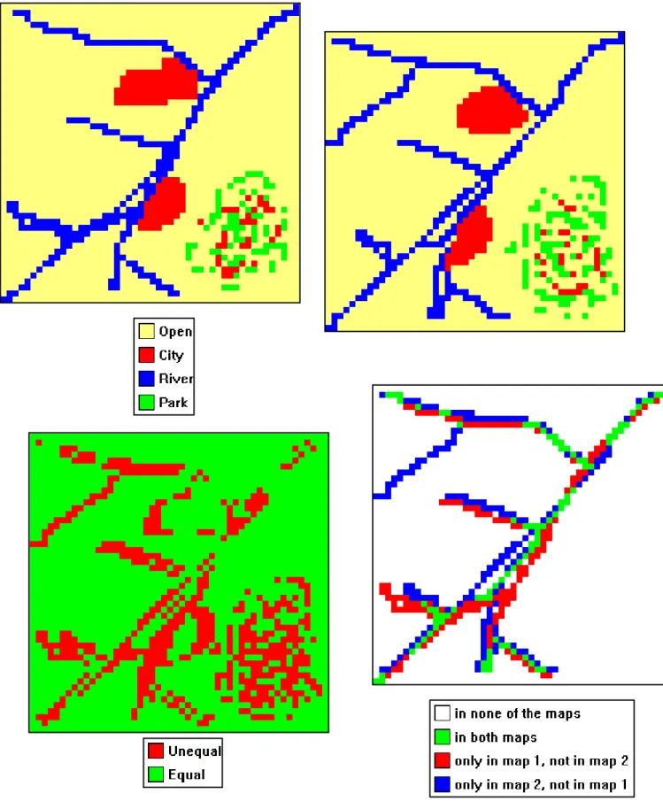
For maps on interval or rational scales, differences can be expressed numerically on a cell-by-cell basis. However, for maps on nominal or ordinal scales, we only have the outcome ‘equal’ or ‘unequal’ for identical grid points in both maps. Therefore it would be helpful to project a difference map between two maps with these binary outcomes for all grid cells available. Thus, the difference maps shows for all grid pairs in both maps the outcome ‘equal’ or ‘unequal’.
We can also construct a series of difference maps per category. Focusing on one particular category, we can identify four outcomes: ‘present in none of the maps’, ‘present in both maps’, ‘present in map 1, not in map 2’ and ‘present in map 2, not in map 1’.
A fictitious example is given in Figure 4. The left panel shows ‘map 1’, the upper-right panel ‘map 2’. The lower-left panel shows a simple equal-unequal result map. For the lower-right panel we focused on the category ‘River’. The other three categories are aggregated to a category ‘other’. The white area on the result map means that the category ‘other’ is identical in both maps, i.e. is not ‘River’ in both maps.
2.3.2 Advanced use of Kappa statistics
The Kappa statistic is often used to assess the similarities between observed and predicted results. It is not only applied to geographical problems (e.g., Pontius, 2000; Monserud and Leemans, 1992) but to many other fields such as medical and social sciences. As a result much has been published about the Kappa statistic and its functionality extensively discussed (Carletta, 1996; Fielding and Bell, 1996; Lantz and Nebenzahl, 1996; Maxwell, 1977).
This section will shortly discuss the Kappa statistic and the contingency table forming its basis, followed by the introduction of a few related statistics, and suggestions for practical use of Kappa statistics. The description is taken from Hagen (2002b).
Figure 4 Upper two panels show two fictitious land-use maps (identical to Figure 3). The lower left panel shows a cell-by-cell comparison, yielding equal (green) or unequal (red). The lower right panel shows a cell-by-cell comparison for the category ‘river’. There are four possible outcomes for each cell, as shown in the lower right legenda.
2.3.2.1 Contingency table
The calculation of Kappa is based on the so-called contingency table (sometimes also referred to as confusion matrix). Table 1 shows the generic form of a contingency table. The table details how the distribution of categories in map A relates to that of map B. The cells contain a value representing the fraction of the cells in the map: in map A by the category specified in the matrix row, and in map B by the category specified in the matrix column. For example, a value of 0.10 for p12 indicates that 10% of the total mapped area, belonging to category 1 in
map A, is found in category 2 of map B.
The last row and column give the column and row totals. Each row total represents the total fraction of cells of the related category in map A. Similarly, each column total represents the total fraction of cells of the related category in map B. All fractions taken collectively make up the whole map, with the total sum equal to 1.
Table 1 The contingency table in its generic form (Monserud and Leemans, 1992).
Map B categories 1 2 … c Total 1 p11 p12 … p1C p1T 2 p21 p22 … p2C p2T Map A cat egori es c pC1 pC2 ... pCC pCT Total pT1 pT2 ... pTC 1
A number of statistics can be derived on the basis of the contingency table. The following three statistics are applied here:
1. P(A) stands for Fraction of Agreement and is calculated according to Equation (1).
2. P(E) stands for Expected Fraction of Agreement subject to the observed distribution and is calculated according to Equation (2).
3. P(max) stands for Maximum Fraction of Agreement subject to the observed distribution and is calculated according to Equation (3).
c P(A) p ii i 1 = å = (1) c P(E) p p iT Ti i 1 = å ∗ = (2)
(
)
c p , p P(max) = min i T T i i = 1å (3) 2.3.2.2 Kappa statisticsIn many situations it is preferential to express the level of agreement in a single number. The Kappa statistic may be a suitable approach if the comparison consists of a number of pairwise comparisons (Carletta, 1996). The essence of the Kappa statistic is that the fraction of agreement P(A) is corrected for the fraction of agreement statistically expected from randomly relocating all cells in the map. Thus, this expected agreement is based on random location of subject to the observed distribution; this is referred to as P(E).
The Kappa statistic is defined according to Equation (4): P(A) P(E) K 1 P(E) − = − (4) Note that Kappa may become negative if the fraction of agreement P(A) is worse than random relocation of all cells P(E).
2.3.3 Kappa dissected into K-histo and K-location
Pontius (2000) clarified the Kappa statistic as confounding similarity of quantity with similarity of location. In this sense ‘quantity’ means the total presence as a fraction of all cells in a category taken over the whole map. ‘Location’ means the spatial allocation of quantity over the map. Pontius introduces two statistics to separately consider similarity of location and similarity of quantity. The statistic for similarity of quantity is called K-quantity, but the application of this statistic leads to many practical problems. However, the statistic for similarity of location is very informative because it gives the similarity scaled to the maximum similarity which can be reached with the given quantities.
K-location is calculated according to Equation (5): P(A) P(E) Klocation P(max) P(E) − = − (5) An alternative expression for the similarity of the quantitative model results is the maximal similarity that can be found on the basis of the total number of cells taken in by each category. This is called P(max). P(max) can be put in the context of Kappa and K-location by scaling it to P(E). The resulting statistic, newly introduced here, is called K-histo since it is a statistic that can be calculated directly from the histograms of two maps.
K-histo is defined by Equation (6): P(max) P(E) Khisto 1 P(E) − = − (6) The powerful property of the K-histo definition is that Kappa is now defined as the product of two factors:
K=Khisto Klocation∗ (7) The first factor is K-location, a measure for the similarity of spatial allocation of categories for the two maps compared. The second factor is K-histo, which is a measure of the quantitative similarity of the two maps.
Besides calculating Kappa statistics for all categories combined, Kappa statistics per category can be calculated as an option. For a categorical Kappa statistic, the two maps are transformed to a map consisting of only two categories. The first new category is the category for which the individual Kappa statistic is derived; the second is the combination of all other categories.
2.3.3.1 Relative Kappa statistics
A typical map comparison problem is the question how well a map generated by a model (the Model Map) resembles a real map (the Reality Map). The Kappa statistic can be of use here. By itself, however, it offers insufficient information: a Kappa statistic with a value 0.7 may be considered very high in one case but can indicate a poor result in another. For an indication of how well two maps look alike, a reference level for similarity is needed. This reference level can be obtained from a Reference Map, for instance, in the form of a historical map.
The procedure is as follows. In first instance the Model Map is compared to the Reality Map. This comparison yields several statistics: Kappa, K-histo and K-location. The same operation is performed for the Reality Map and a Reference Map. This comparison also yields values for Kappa, K-histo and K-location. Finally, the individual comparison results are combined, and the similarity between the Model Map and the Reality Map can be expressed relative to the similarity of the reference map (cf. Figure 9 in section 2.4.5).
2.3.4 Example
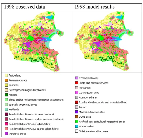
The multi-method similarity assessment is applied to a validation case of model results. The particular model is a constrained cellular automata applied to the study of the urban development of Dublin as part of the Murbandy project (White et al., 2000). The objective of the case was to compare model results with observed data. The two maps are displayed in Figure 5.
1998 observed data 1998 model results
With the Kappa-related statistics it is possible to recognize the contribution per individual category and also to distinguish between both similarities due to quantity and those due to location. The result of this analysis can be found in Table 2.
The results presented in the table suggest that although a little improvement can still be made, most of it can be expected from improving the spatial allocation. The categories with relatively weak spatial allocation are ‘Residential continuous dense urban fabric’ and ‘Construction sites’. The relatively low scores for ‘Road’ and ‘Airport’ are in accordance with the observations made on the comparison map.
Table 2 Detailed Kappa results, overall and per individual category.
Kappa K-location K-histo
Overall 0.96 0.97 0.99
Arable land 0.95 0.96 0.98
Pastures 0.94 0.96 0.98
Forests 1.00 1.00 1.00
Shrubs and/or herbaceous vegetation
associations 1.00 1.00 1.00
Sparsely vegetated areas 1.00 1.00 1.00
Wetlands 1.00 1.00 1.00
Residential continuous dense urban fabric 0.78 0.78 1.00 Residential continuous medium-dense
Urban fabric 0.95 0.95 1.00
Residential discontinuous urban fabric 1.00 1.00 1.00
Residential discontinuous sparse urban fabric 0.91 0.91 1.00
Industrial areas 0.96 0.96 1.00
Commercial areas 0.86 0.86 1.00
Public and private services 0.95 0.95 1.00
Port areas 0.85 0.85 1.00
Construction sites 0.00 0.00 0.08
Road and rail networks, and associated land 0.43 0.82 0.53
Airport 0.88 1.00 0.88
Mineral extraction sites 0.97 1.00 0.97
Dump sites 0.99 0.99 1.00
Artificial non-agricultural vegetated areas 0.93 0.93 1.00
Water bodies 1.00 1.00 1.00
2.4
Fuzzy-set map comparison
by A. Hagen In this paragraph fuzzy-set theory, as introduced by Zadeh (1965), will be applied to compare nominal maps. In order to consider fuzziness in the maps it is necessary to change the way in which cells are represented. Instead of one single category or value per cell, each cell is characterized by a membership vector. Each element in the vector states the extent of membership per category using values between 0 and 1,.
Two sources of fuzziness are considered, the first is fuzziness due to vague distinctions between categories, and the second is fuzziness due to a gliding scale of severity of spatial error. The comparison method is documented more extensively in Hagen (2002b).
2.4.1 Considering categorical similarity
Many maps show vagueness in the definition of categories. This is especially true if some or all categories on the map have, in fact, an ordinal definition, such as the categories ‘high’-, ‘medium’-and ‘low’-density residential area on a land-use map. It might often be that boundaries between such categories are less clear-cut than what seems to be the case from the legend. This fuzziness can be made explicit in the vector describing the cell, by giving elements that correspond to similar categories and higher membership values. Table 3 gives an example how the fuzziness of the categories can be expressed in the membership vector.
Table 3 An example of fuzzy representation of ordinal data.
Category Nr. Category vector
High density residential 1 ( 1 0.4 .2 0 0 ) Medium density residential 2 ( 0.4 1 .4 0 0 ) Low density residential 3 ( 0.2 0.4 1 0 0 )
Agriculture 4 ( 0 0 0 1 0 )
2.4.2 Considering proximity of similar cells
Proximity of similar cells can also be expressed in the membership vector. Cells within a certain distance (the neighborhood) of a central cell influence the fuzzy representation of that cell. To achieve this, the proximity of categories is considered to contribute to the degree of membership of those categories. The different membership contributions of the neighbouring cells are combined by calculating the union according to fuzzy-set theory. This is expressed in Equation (8) for a map with N categories and considering a neighborhood consisting of C cells. mi stands for the value of the membership function at the i-th cell in the neighborhood
and is calculated according to a distance decay function.
(
)
(
)
(
)
1 1,1 1 1,2 2 1,C C 2 2,1 1 2,2 2 2,C C fuzzy C N ,1 1 N ,2 2 N ,C C F Max m , m , , m F Max m , m , , m F Max m , m , , m V = µ ∗ µ ∗ µ ∗ = µ ∗ µ ∗ µ ∗ = = µ ∗ µ ∗ µ ∗ æ ö ç ÷ ç ÷ ç ÷ ç ÷ ç ÷ è ø L L M L (8)2.4.3 Comparison of fuzzy cells
The maps of fuzzy membership vectors obtained by considering proximity and categorical similarity are compared. The comparison algorithm is designed to evaluate similarity in accordance with human ‘intuitive’ criteria. This can be achieved by performing a two-way comparison, proceeding as follows: first, the fuzzy vector of cell A is compared to the category vector of cell B according to fuzzy-set theory. Next the category vector of cell A is compared to the fuzzy vector of cell B. Finally, the lower of the two comparison results establishes the similarity.
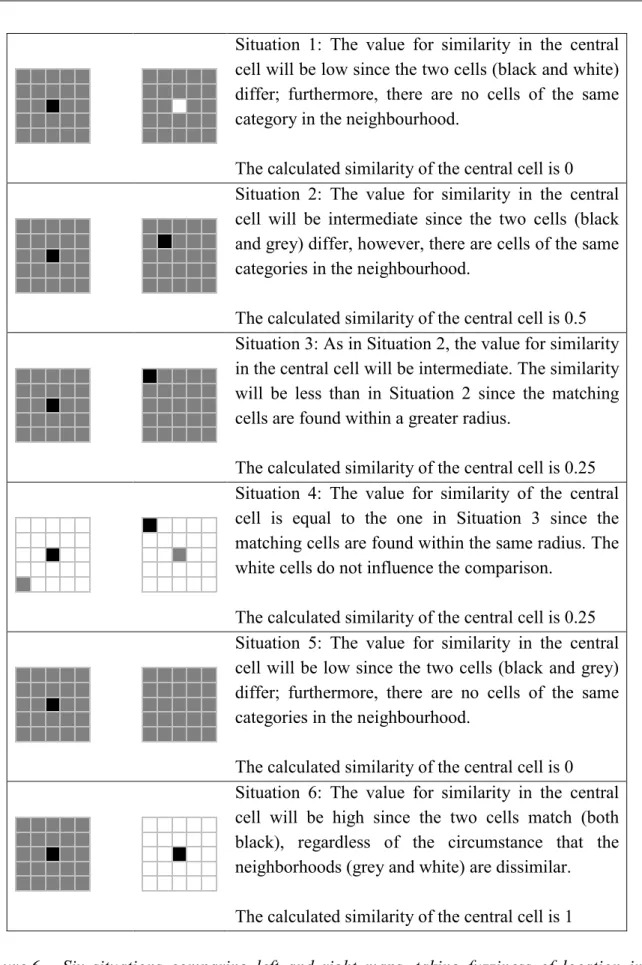
A similarity map is generated by applying the comparison cell-by-cell to the whole area. In this similarity map each cell has a value between 0 (for total disagreement) and 1 (for identical cells). Figure 6 shows six situations that clarify this point; it should be noted that the exact value for the intermediate similarities (between total disagreement and identical) will depend on the membership function applied. The similarity values in the figure are based on a membership function of exponential decay with a halving distance of √2 cells.
Situation 1: The value for similarity in the central cell will be low since the two cells (black and white) differ; furthermore, there are no cells of the same category in the neighbourhood.
The calculated similarity of the central cell is 0 Situation 2: The value for similarity in the central cell will be intermediate since the two cells (black and grey) differ, however, there are cells of the same categories in the neighbourhood.
The calculated similarity of the central cell is 0.5 Situation 3: As in Situation 2, the value for similarity in the central cell will be intermediate. The similarity will be less than in Situation 2 since the matching cells are found within a greater radius.
The calculated similarity of the central cell is 0.25 Situation 4: The value for similarity of the central cell is equal to the one in Situation 3 since the matching cells are found within the same radius. The white cells do not influence the comparison.
The calculated similarity of the central cell is 0.25 Situation 5: The value for similarity in the central cell will be low since the two cells (black and grey) differ; furthermore, there are no cells of the same categories in the neighbourhood.
The calculated similarity of the central cell is 0 Situation 6: The value for similarity in the central cell will be high since the two cells match (both black), regardless of the circumstance that the neighborhoods (grey and white) are dissimilar. The calculated similarity of the central cell is 1
Figure 6 Six situations comparing left and right maps, taking fuzziness of location into consideration.
In all six cases the similarity is given with respect to the central cell of the left map. Similarities with respect to the central cell of the right map are always equal or larger.
2.4.4 Aggregated map results and overall similarity with Fuzzy Kappa
It is possible to aggregate the similarity map that results from the Fuzzy two-way comparison to an overall value of map similarity, for instance, by integrating the similarity values over the whole map. Subsequent division by the total area yields a result between 1 (for identical maps) and -1 (for total disagreement).
The outcome of the Fuzzy-set map comparison depends partly on the number of categories present and also on the numerical distribution of cells over those categories. In order to make the results of maps with different numerical distribution more comparable, we have introduced a statistic that corrects the percentage of agreement for the expected percentage of agreement. The statistic is similar to Kappa and is therefore called Fuzzy Kappa. For details please see Hagen (2003).
2.4.5 Dublin example continued
Here, we continue the Dublin example from section 2.3, having applied Fuzzy-set map comparison to the maps shown in Figure 5. Figure 7 shows the results in the form of a comparison map indicating the level of agreement per cell. The membership function that was applied is one of exponential decay with a halving distance of two cells.
Figure 7 Spatial assessment of similarity in the fuzzy set approach. The darker the area the more intensive the disagreement.
The result map can be used as an aid in to find the cause of the disagreement. For instance, we see large areas of strong disagreement in the north of the city where the model situates ‘Commercial areas’ where an ‘Airport’ is expected. The result map also clearly points out the ‘Road and rail networks, and associated land’ , representing a motorway existing in reality but not foreseen by the model (the curved linear shape starting just south of the airport).
A reference level, sought for validation, was found in the map of observed data of 1988 (see Figure 8). This map was also used to show the initial situation in the simulation. If the 1998 model simulation is more similar to the 1998 observed data than the 1988 reference level does to the 1998 observed data, the validation is positive. Taking into account that changes in land use are only slight over a period of ten years, this is a strict validation.
Figure 8 The observed map of 1988, which functioned both as the Reference Map and a map showing the initial situation in the simulation.
Children playing in a residential discontinuous sparse urban fabric area of Dublin (category definition given in Table 4).
Photo: H. Visser.
The comparison performed conformed to the method presented in section 2.3.3.1, with results presented schematically in Figure 9. The model was concluded as delivering a positive validation of results.
Figure 9 Relative results of the comparison.
Kfuzzy =0.91 Khisto = 0.99 Klocation = 0.97 Kfuzzy =0.90 Khisto = 0.97 K-location = 0.99 Quality report Kfuzzy: + 1% Khisto: + 2% K-location: - 2% 1998 model 1998 real 1988 real
2.5
Comparing maps by Hierarchical fuzzy pattern matching
The evaluation of spatial similarities and (land-use) change between two raster maps is traditionally based on cell-by-cell comparison techniques, as previously described. Along with the method based on fuzzy-set calculation rules, given in the preceding section, there are also other fuzzy methods in existence. One of these is the Hierarchical fuzzy pattern matching. This approach is based on the comparison of overlapping polygons (= groups of concatenated cells belonging to the same category). Polygons are then compared on the basis of a number of properties, such as size and overlap. These comparisons are based on a so-called Fuzzy Inference System (FIS).
The maps are compared at both local and global levels. This combination provides a robust alternative approach. Local matching determines the degree of containment of each unique polygon in the template map in terms of so-called fuzzy area intersections. Formally, the local agreement values are based on polygon property containments; calculations originate in a fuzzy logical Max-Min compositional algorithm.
A global agreement value can be derived by the fuzzy summation of the local matchings. This global agreement, compared to the Fuzzy-Kappa statistic, is denoted as Global matching index.
The theory behind Hierarchical fuzzy pattern matching is fully described by Power et al. (2001). Examples are given by Hagen (2002a). The method is also incorporated in the MAP COMPARISON KIT. However, we have not analysed the Fuzzy pattern matching approach in this report because the method has not yet fully evolved. Moreover, it is not clear what the specific advantages and disadvantages are between the fuzzy-set mapping approach introduced by Hagen (2003) and the method of Power et al..
2.6
Comparing maps by use of single map statistics
All methods described in sections 2.2, 2.3 and 2.4 involved map comparison on the basis of grid-cell similarities. However, there are many map statistics more conceivable than those based on grid cells. In fact, any statistic that can be calculated for one specific map, can be used in map comparison as well!
For example, if we have a map index for the fragmentation of nature areas, we can compare this fragmentation index across a number of simulated land-use maps for the year 2020. Another application is for the process of calibration. We may want a land-use simulation for the year 1996 to be as similar as possible to a 1996 real land-use map with respect to fragmentation.
There are many map statistics available. We refer to Cressie (1993), Deutsch and Journel (1998), Goovaers (1997) and Kaluzny et al. (1998). However, the number of techniques decreases if we move from maps on the interval/ratio scale to ordinal maps to nominal maps. We mention four statistics below that grasp important map characteristics; these statistics are specially suited for nominal maps:
• Estimation of spatial trends for two-category maps (any multi-category map can be transformed to a two-category map). Methods available are LOESS estimators, kernel estimators or Indicator Kriging. As in time-series analysis it may be of interest to compare spatial trends between a set of maps, or their residuals, i.e. the data minus the spatial trend. In this way both low and high frequency patterns may be compared across maps. Estimation is only possible for two-category-maps. For example, if one map has a pronounced north-south gradient in the category ‘industrial’, does another map have this gradient too, or if so, does it have the same slope?
•
Estimation of fractal forms of categories within a map. The fractal forms are a measure of the fragmentation of a specific category (White and Engelen, 1993). Fragmentation is an important environmental issue for nature and forest areas. For the maintenance of many animal species fragmentation of lands is bound to certain limits.•
Estimation of spatial autocorrelation (the spatial equivalent of the autocorrelation function in time-series analysis). This can be done by standard geostatistical methods (Cressie, 1993) or spatial statistics such as Moran’s I statistics for spatial autocorrelation (Anselin,1988; Verburg et al. 2003).• Estimation of neighbourhood characteristics. These characteristics allow us to quantify the influence of a specific land-use type on other land-use types in the neighbourhood of that location. Such an analysis will allow us to identify how land-use types interact and to judge over which distances such interactions are relevant. Neighbourhood characteristics are important for the calibration of land-use models such as the Environment Explorer, because these characteristics are very similar to distance-decay functions that are an integral part of cellular automata models.
In Appendix A we describe the spatial structure of land use by characterizing the influence of the neighbourhood of a location on its land use. This description is taken from Verburg et al. (2003).
3.
Map Comparison - software
by H. Visser and A. Hagen
3.1
M
APC
OMPARISONK
IT3.1.1 The software
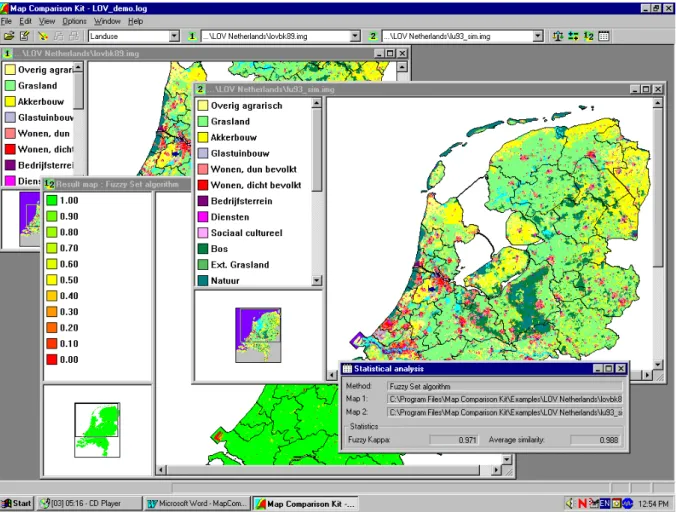
The MAP COMPARISON KIT has been designed for analysis and comparison of raster maps. Figure 10 shows a number of screens. Maps may be on nominal, ordinal or ratio scales. Mixtures of nominal and ordinal scales can be also handled by the software (compare: section 2.1). Besides a number of comparison algorithms, the MCK also offers advanced options for visualizing, organizing and exporting raster maps.
Figure 10 Impression of the MCK screen. Shown are two maps from the RIVM Environment Explorer, a fuzzy result map and corresponding statistical results.
The first version of the MAP COMPARISON KIT dates back to 1992, when it was called the Analyse Tool. The software was initially intended for the analysis of series of maps generated as output by simulation software from the Research Institute for Knowledge Systems (RIKS). From 1992 onwards, the tool was steadily further developed as part of the RIKS projects for RIVM, RIKZ, RWS, EC-JRC and others.
The latest extension of the MAP COMPARISON KIT has been developed by order and for the account of RIVM, within the framework of project S/50002/01/TO, Measuring and Modelling. New additions are (i) the extended Kappa analysis, (ii) Hierarchical fuzzy pattern matching and (iii) the Fuzzy-set map comparison. All these map comparison methods are the result of research performed by RIKS, in collaboration with RIVM.
Another novelty is that the software contributes added value by not only being suited to work in conjunction with other RIKS products, but may also be used to compare any set of raster maps in some of the most popular file formats. Specifically, these are ArcInfo ASCII format, Idrisi Raster format and the LLO format used at RIVM. A third novelty is the simple import of maps and statistical results to WORD files, as shown in Figure 10. The active screen is copied to the Windows clipboard using ‘Ctrl C’ and pasted into the Word file with ‘Ctrl V’. These extensions have stretched the use of the tool beyond the analysis of RIKS simulation results, and inspired the name change from Analyse Tool to MAP COMPARISON KIT. The
software is available on CD as a stand-alone package. The CD also contains a user manual of which Alex Hagen is the lead author (RIKS, 2003a). As part of the software a number of map datasets have been added to ease understanding of the software. The software will also become available on Internet at the beginning of 2004.
Besides the MCK stand-alone version, a Raster Comparison Module containing three comparison methods has been programmed: (i) cell-by-cell, (ii) Hierarchical fuzzy pattern matching and (iii) the Fuzzy-set algorithm. The module can be incorporated into GIS packages such as ArcGis-8. The reference manual for the Map Comparison Module is from I. Uljee (RIKS, 2003b). A simple prototype user shell in ArcGis-8 has been programmed by G.J. Verspaij and G.J.C. Stolwijk (both IMP/MNP).
3.1.2 Handling different measurement scales
Nominal maps may be compared cell by cell or by fuzzy methods. The MCK screen for choosing one of these methods is given in Table 4.
In the following sections we will exploit these methods for analysing: (i) children’s maps (section 4.1), (ii) historical changes in agricultural land use (section 4.2) and (iii) the analysis of different land-use scenarios for the year 2020 (section 4.3). Nominal maps are also analysed in Chapter 5.
Table 4 MCK screen for choosing a nominal comparison method.
methods for nominal map comparison
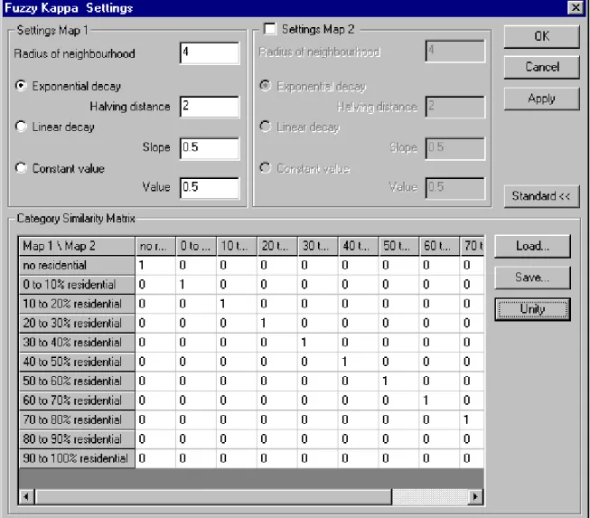
The ordinal character of a set of maps can be exploited using the so-called Category Similarity Matrix. In standard use, this matrix is unitarian, meaning that each category is defined similarly in both maps (ones on the main diagonal), and different categories have no overlap (zeros at all off-diagonal places) (see Table 5). In ordinal maps this situation typically not the case. If we have the two categories of ‘sparse residential’ and ‘dense residential’, we may want to make these similar by applying a value of, say, 0.5. A value of 1.0 would make both categories totally equal and would in fact define the new category ‘total residential’. Since the choice of a particular value is subjective, it has to be chosen on the basis of a-priori insights.
In section 4.4 we will use maps from the Land Use Scanner to illustrate the procedure.
When we are dealing with maps on interval or ratio scales, we can choose two paths of analysis. First, we can transform the continuous variable to disjunct categories and treat the maps subsequently as ordinal. This procedure is followed in section 4.4 for ascertaining ‘percentage residential’. With use of the MapTransformer software we generated 11 ordinal categories.
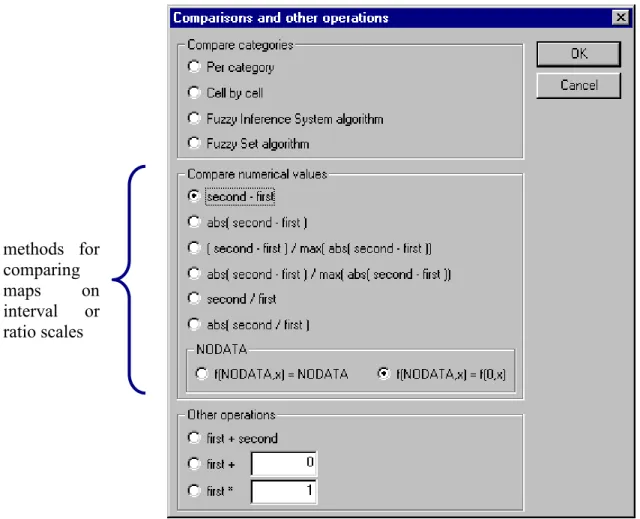
Second, we can exploit the character of specific continuous variables and subtract or divide values for identical grid cells. We then get result maps that show map differences on a continuous scale. The MCK screen for choosing the calculation of such result maps is shown in Table 6. Examples are given in sections 4.5 and 4.6.
Table 6 MCK screen for manipulations on a set of ‘continuous’ maps.
methods for comparing maps on interval or ratio scales
3.2
Tools additional to the M
AP
C
OMPARISON
K
IT
There are a number of software tools for reading, generating and transforming maps, which can be used in conjunction to the MCK software. Especially, the import and export facilities of the MCK with respect to the widely used ArcInfo ASCII files ease such combinations. We name here ArcView, Idrisi and Fragstats. RIVM environmental modelling software, such as the Environment Explorer, Nature Explorer and Land Use Scanner, is also used easily in combination with the MCK.
Furthermore, one can easily program input and output routines in well-known software environments such as Fortran, S-SPLUS or Mathematica.
We will later describe two additional tools in Appendix B, both developed at RIVM. The first tool performs transformations to a set of maps in ArcInfo ASCII files, while the second tool enables the import and export of maps in ArcInfo ASCII format to S-PLUS.
3.3
Software for the calculation of additional statistics
Many of the map statistics named in section 2.6 can be calculated through the use of the SpatialStats module from S-PLUS. We refer to the textbook by Kaluzny et al. (1998).
Software, called INFLUENCE, for calculating enrichment factors (Appendix A) has been developed by Kor de Jong of Utrecht University.We note that INFLUENCE is able to cope with maps that have missing data.The source code and executables can be downloaded from the project homepage: http://networks.geog.uu.nl.
Maps in the ArcInfo ASCII grid format (unfortunately) cannot be imported directly to INFLUENCE. To import these maps, one has to import maps in the software package PCRaster, after which the maps are exported in the PCRaster CSF-2.0 format. The PCRaster package can be downloaded from http://www.pcraster.nl and http://pcraster.geog.uu.nl.
A textbook written by Kaluzny et al. (1998) contains a great number of statistics for spatial data and a number of input – output routines for GIS applications. The SpatialStats module forms an integral part of the S-PLUS software at RIVM (Dekkers, 2001).
4.
M
AP
C
OMPARISON
K
IT
– applications
Here, we will give six examples of map comparison applications. The first example is a humouristic illustration for two children’s maps, both on a cell-by-cell and a fuzzy-set theory basis. Sections 4.2, 4.3, 4.4 and 4.6 give case studies from the daily NEAA practice. Section 4.5 on ambulance driving times is taken from the Environmental Health group (VTV) of RIVM.
The examples comprise all types of maps as described in section 2.1: nominal maps (sections 4.1, 4.2 and 4.3), ordinal maps (section 4.4), and interval/ratio maps (sections 4.5 and 4.6).
The prediction of land use 20 to 30 years in advance is an important task of NEAA. This is done on the basis of scenarios developed for future economic and demographic growth. These scenarios function as input for land-use models such as the Environment Explorer and the Land Use Scanner. Of special importance is the ‘tension’ between growing urbanization on the one hand, and environmental care for nature/forest areas on the other hand. Photo: Advertisement campaign – Gemjobs.
4.1
Spot the 15 differences!
by Hans Visser and Alex Hagen
4.1.1 Introduction
We will illustrate the practical use of Fuzzy-set map comparison versus cell-by-cell through the use of two hobbit drawings (maps) given in Figure 11. The task for the reader is to spot 15 differences in the ‘maps’. Before reading further, it is helpful to find these differences and mark them with a pencil.
4.1.2 Cell-by-cell comparison
The cell-by-cell, equal-unequal, map is given in Figure 12. The result map shows approximately 10 differences and a great number of red contour lines, originating from the fact that we have shifted the original second hobbit map a few cells to the left. Such a shift is not seen by the human observer. The shift led to the red contour lines around the hobbits and the PC. Such shifts or distortions often occur in practical situations. They can be due to re-projection of data, gridding and re-gridding, or vague transitions between categories.
The Kappa statistics are summarized in Table 7. The Kappa for the colour black seems to be lowest (0.58), an obvious result of the complete shift of the second drawing.
However, we are not interested in these shifts. We only want to find the 15 differences. Five differences are masked in Figure 12 by the contour lines. There has to be a better method.
4.1.3 Fuzzy-set map comparison
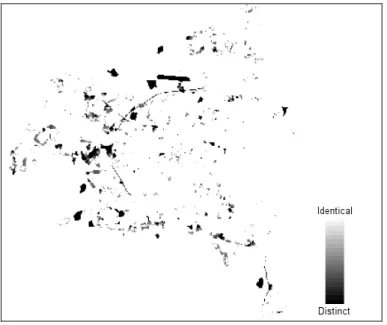
Figure 13 (left panel) shows the result map following the fuzzy-set approach (see section 2.4), using the default settings of the MCK software. Because the black contour lines shifted only a few cells, the fuzzy-result map shows these in the yellow colour. These lines are now less pronounced.
It is easy to find 14 differences in the left panel in Figure 13. However, we want to find the 15th difference too. To this end, we changed the colouring in the legend. The result is shown in the right panel of Figure 13, where all differences are easily identified.
Figure 13 Fuzzy-set result map for the hobbit maps shown in Figure 11. Left and right panels differ only in the colouring of the legend.
If we want to remove the contour lines from the presentations in Figure 13, we can choose another distance function within the fuzzy context: a constant distance with a weighting factor 1.0. For the maximum distance (‘radius of neighbourhood’) we chose two cells (the left panel in Figure 11 shifted by only two cells). The result is shown in Figure 14, where exactly the 15 differences and no contour lines are visible.