PIK Report
No. 127
No. 127
FOR
POTSDAM INSTITUTE
CLIMATE IMPACT RESEARCH (PIK)
UNDERSTANDING CHANGE
IN PATTERNS OF VULNERABILITY
Matthias K. B. Lüdeke, Carsten Walther, Till Sterzel, Marcel T. J. Kok,
Paul Lucas, Peter Janssen, Henk Hilderink
Herausgeber: Prof. Dr. F.-W. Gerstengarbe Technische Ausführung: U. Werner POTSDAM-INSTITUT FÜR KLIMAFOLGENFORSCHUNG Telegrafenberg Postfach 60 12 03, 14412 Potsdam GERMANY Tel.: +49 (331) 288-2500 Fax: +49 (331) 288-2600 E-mail-Adresse:pik@pik-potsdam.de Authors: Dr. Matthias K. B. Lüdeke* Carsten Walther Till Sterzel
Potsdam Institute for Climate Impact Research P.O. Box 60 12 03, D-14412 Potsdam, Germany Marcel T. J. Kok
Paul Lucas Dr. Peter Janssen Henk Hilderink
Netherlands Environment Assessment Agency (PBL) P.O. Box 1, 3720 BA Bilthoven, The Netherlands E-Mail: luedeke@pik-potsdam.de
* corresponding author
POTSDAM, JANUAR 2014 ISSN 1436-0179
This report is the result of a joint study between the PBL Netherlands Environmental Assessment Agency and PIK.
3
Abstract
A methodology to assess future development in patterns of vulnerability is presented which can support the assessment of global policies with regard to their impacts on specific vulnerabilities on the regional or local scale. Patterns of vulnerability, formalized by vulnerability profiles (e.g. for the livelihoods of dryland smallholder farmers) were investigated under different consistent indicator scenarios reflecting different global policies. After unfolding several principal possibilities to do such an analysis of temporal change in vulnerability patterns we could conclude that the concept of “Clusters of Change” (CoCs) is the most straight forward and promising approach. The main arguments are that each interpretation has necessarily to consider both, the starting situation and it’s change over time (”poor and heavily improving”, ”rich and stagnating” etc.). This implies that we are looking for patterns which represent typical combinations of present states AND expected future changes. An application of the CoC-concept to the drylands vulnerability patterns considering the indicator set for the present situation and the same indicator set for 2050 under a baseline scenario was performed as a test. Comparison of the present vulnerability cluster partition with the spatial distribution of the CoCs revealed that most of these clusters are separated into an improving and a deteriorating part which shows where winners and losers of the baseline scenario are – an interesting result which illustrates the appropriateness of the CoC – method.
To explore the potential of CoCs for the dryland vulnerability we applied the method to two different sets of scenarios until 2050: a baseline vs. Climate policy scenario (OECD, 2012) and a ”policy first” scenario vs. ”security first” scenario (UNEP, 2007). The first one serves as an example for a policy assessment while the second compares the vulnerability consequences of two scenarios based on different story-lines of further global development.
The main conclusion to be drawn from these calculations is that the CoCs are rather insensitive with regard to the small differences between the scenarios. Regarding the first set of scenarios the relatively short time horizon of relevant influences of climate policies on climate change impacts and several indicators which are not influenced at all generate only a very small difference. The only significant change in the resulting vulnerability profiles was in the values of change in water scarcity: it was lower for all profiles in the climate policy case. The second set of scenarios is not directly related to policy decisions but to different global story-lines which deviate stronger. This resulted in an increasing cluster number from 4 (policy first) to 5 (security first) clusters, about 20% of the pixels changing cluster membership, 3 clusters showing the same spatial extent for both scenarios but the 4th cluster (“policy first”) “losing” India which generates a separate cluster in the “security first” scenario. This allows for the interpretation that a further development according to the “security first”-storyline compared to the “policy first”-storyline would make a difference particularly for India. Closer inspection of the respective profile shows a qualitatively different situation indicating increased vulnerability compared to the “policy first” scenario where India shares one cluster with e.g., Northern Africa.
4
Contents
1. Introduction ... 5
2. Using Cluster Analysis to understand Change in PoV ... 6
2.1 Methodology for analysing patterns of vulnerability ... 6
2.2 Illustrative example: historical analysis of the dryland archetype ... 9
2.2.1 Indicators... 9
2.2.2 Analysis over time ... 10
2.3 Different ways to perform the analysis of change ... 14
3. Analysing future developments ... 15
3.1 Scenarios for the indicators ... 15
3.1.1 Models ... 15
3.1.2 Scenarios ... 17
3.2 Time slice analysis ... 18
3.3 Freezing approach ... 21
3.4 Analysis via Clusters of Change (CoCs) ... 22
3.5 Sensitivity analyses... 26
4. Comparing different scenarios ... 31
4.1 The climate policy scenario and its CoC-analysis ... 31
4.2 Comparison: CoCs of baseline and climate policy scenario ... 33
4.3 Investigating the effect of more contrasting scenarios ... 36
5. Summary & Conclusions ... 39
6. References ... 42
5
1. Introduction
In our previous report (Kok et al., 2010) and several further publications (Kok et al., 2013, Sietz et al., 2011 & 2012, Jäger et al., 2007, Sterzel et al., 2013) on the quantitative analysis of patterns of vulnerability to global environmental change we described a method for identifying such patterns, discussed it’s robustness and exemplified the usefulness and plausibility of the pattern approach to assessing livelihood vulnerability in the realms of dryland smallholder agriculture, forest overexploitation, rapid coastal urbanization and food/biofuel competition (REC special issue, in prep.). For each of these patterns we derived a set of vulnerability profiles (6-12 for each) detailing the different character and intensity of vulnerability in each realm by a limited number of typical indicator constellations. The analysis covers the whole globe in a sub-national spatial resolution while the detail of mechanistic understanding of the profiles lies between the overwhelming diversity of local case studies on the one hand and the top down perspective of global quantitative models.
As already formulated in the earlier report (Kok et al, 2010), insights gained from the patterns of vulnerability analysis are intended to provide a basis for analysing response options to reduce vulnerability on two levels: (1) bottom-up as guidance to adaptation policies in specific situations, and (2) top-down as reference for addressing the consequences of global trends or international policies for vulnerable groups in specific socio-ecological systems (SESs). This second level is further investigated in the present report. So far we applied the pattern approach to identify the character and intensity of present vulnerability of social groups or regions with regard to their wellbeing against different environmental and socio-economic global changes, including rapid onset and smooth changes as well as extreme events. Such analysis looks at vulnerability in a rather static way, but also present vulnerability already refers to the future as it makes a statement how wellbeing will change after being exposed to specific stressors. Beyond this, one may ask how vulnerability itself will change in future – a question which is closely related to vulnerability reduction policies. The guiding question in this report is:
How can the “patterns of vulnerability” approach be used to evaluate the influence of global scenarios and policy options on future trends in human wellbeing within specific socio-ecological systems?
In this report we will use the vulnerability pattern for dryland smallholder agriculture to illustrate and test the different possible approaches for analysing development of vulnerability in time. In chapter 2.1 we start with an illustrative example discussing the temporal development of this pattern during the last decades using the “time slice approach”. This time interval enables an ex-post view on the results and, thereby, allows for a content-related evaluation of the method. In the following section of chapter 2 a systematic overview of the different possible methodological approaches is given.
Chapter 3 applies these different approaches to examples of indicator set scenarios (Lüdeke, 2013) aiming at a description of future vulnerability development. After the introduction of the different
6
scenarios and their construction (section 3.1) we apply the “time slice analysis” (section 3.2) and the “clusters of change method” (CoC) (section 3.3). To account for the influence of uncertainty in the indicator set data in section 3.4 a sensitivity analysis is performed.
In chapter 4 we go one step further and focus on the promising CoC-method and investigate the conditions under which it is useful for a comparative policy evaluation. Here we use two pairs of future indicator scenarios
(1) a “baseline” versus a “climate policy” scenario (2) two strongly contrasting future scenarios
In chapter 5 we present a short summary of the results and some final conclusions and recommendations.
2. Using Cluster Analysis to understand Change in PoV
In this chapter we first exemplify the approach to time dependent vulnerability patterns by analysing the development of dryland smallholder agriculture during the last decades. After discussing this example extensively we give a systematic overview on possible methodological approaches to the vulnerability analysis based on scenarios of indicator sets and identify the most appropriate one.
2.1 Methodology for analysing patterns of vulnerability
Before starting the discussion on time dependency of vulnerability we will give a short summary of the general methodology of the patterns of vulnerability. It builds on experiences in the development of GEO-4 (Jäger and Kok, 2007, Kok and Jäger, 2009) and was further developed in a joint research project between PBL, PIK and NTNU. We propose that for analysing a vulnerability pattern it is necessary to answer the following questions:
1. What is the observed “pattern of vulnerability”: what are the main exposures, key vulnerable groups, their sensitivities and their coping and adaptive capacities that together constitute this pattern of vulnerability?
2. What are the basic vulnerability-creating mechanisms that underlie this pattern of vulnerability?
3. In what form and where does this pattern manifest itself?
4. How can changes within the human-environment system affect the human well-being situation for the vulnerable groups?
5. What are the opportunities – individual responses or policy responses – to cope with and/or adapt to possible future changes confronting the vulnerable groups?
These help to identify relevant exposures of specific population groups under similar conditions, their sensitivity and possible responses at various levels of decision making. To answer these questions, we propose a method in five steps that is depicted in Figure 2.1.1.
7
Step 1 Identification of vulnerability pattern. Question: what are the main exposures, key vulnerable
groups, their sensitivities and coping and adaptive capacities that together define the pattern of vulnerability?
There is no unique or objective way to identify a pattern of vulnerability. Different approaches that could be used are: expert-based, like with the syndrome approach (WGBU 1995), user-driven, such as in the GEO process (Kok and Jäger (eds) 2009) or through science-policy workshops (Manuel-Navarrete et al. 2007), or semi-quantitative through meta-analysis of case studies (Geist and Lambin 2001, Geist and Lambin 2004). User-driven approaches will score better in terms of legitimacy of outcomes, semi quantitative approaches may be more labour intensive, while expert driven identification may be biased but efficient. The description of a pattern of vulnerability includes an identification of exposures, sensitivity and coping and/or adaptation mechanisms, and how well-being of the vulnerable populations may be affected. It focuses on the core mechanisms that constitute the pattern of vulnerability. This step results in a concise description of a pattern of vulnerability that describes not just one situation, but focuses on the most important common properties of a multitude of cases.
Identification and description Formalisation Quantification Policy analysis Interpretation
Archetypical pattern of vulnerability
Basic vulnerability creating mechanism
Spatial pattern and vulnerability profiles
Opportunities for policy response Cluster interpretation
Figure 2.1.1 Steps in analysing patterns of vulnerability and outcomes of each step
Step 2 Formalization vulnerability pattern. Question: what basic vulnerability-creating mechanisms
underlie this pattern of vulnerability?
This step focuses on formalising the pattern of vulnerability. Complex realities captured in the description of a pattern of vulnerability in the previous step need to be reduced to a basic underlying
8
mechanisms that allow one to speak of a repeated and similar pattern of vulnerability across many places. To do this, it is suggested to first develop an “influence diagram” that encompasses all relevant mechanisms and relationships. These should then be further reduced to only include the most relevant vulnerability-creating mechanisms and their interactions. This step can be summarized in a graphic representation of the basic vulnerability-creating mechanisms.
Step 3 Identification vulnerability profiles and their spatial distribution. Question: in what form and
where does this pattern manifest itself?
To be able to quantitatively answer this question, first we need to identify indicators for the most important dimensions and mechanisms of the vulnerability-creating mechanisms. In principle, these indicators can be taken from all kinds of sources. As we want to understand where patterns of vulnerability are occurring we use spatially explicit data as much as possible. When working with global datasets on a gridded scale, typically a mask is used to select specific data points, for example, those data points that meet an already predetermined definition of “drylands”. In cases where gridded data are not available – usually for socio-economic data – we use one number for the whole country (for example for gdp/cap), in other cases we applied a downscaling method (for example for population and infant mortality rate) following a procedure described in van Vuuren et al. (2007). To further answer the question of how this pattern of vulnerability manifests itself, the selected indicators are subjected to cluster analysis. Several techniques for spatial data analysis can be applied (see Locantore et al. 2004 for an overview). When prior information on the inherent structure of data (in this case the indicator data) is absent or minimal, cluster analysis is a statistical technique to explore such datasets. It groups data into classes – groups or clusters – that share similar characteristics (for a detailed explanation of the clustering method used, see Annex 1). One important issue when carrying out cluster analysis is the decision on the number of clusters to be distinguished and used in the further analysis. To determine the “optimal” number of clusters which represents best the internal structure of the data we developed a measure of the stability of the cluster identity a new and more adequate consistency measure (see for further details Janssen et al. 2012). Cluster analysis distinguishes specific constellations, or groups, of indicator values that show the different forms in which a pattern of vulnerability manifests itself. The outcomes of this step can be used to characterise the pattern of vulnerability in two components: (1) a functional component – a specific constellations of indicators that we label “vulnerability profiles”, and (2) a spatial component – the spatial distribution of vulnerability profiles.
Step 4 Interpretation of vulnerability profiles. Question: How can changes within the
human-environment system affect the human well-being situation for the vulnerable groups?
The distinct vulnerability profiles reflect the most important characteristics that shape the specific manifestations of the pattern of vulnerability. The spatial distribution of these profiles on the world describes where these different manifestations can be found. In this interpretation step we analyse what drives the vulnerability in a specific cluster, what explains the differences with other vulnerability profiles and if the locations where a specific vulnerability profile occurs are also observed in reality. The information from local case studies is also used in this step.
Step 5 Policy analysis. Question: what are the opportunities – individual responses or policy
9
Policy responses to cope with and adapt to environmental changes can be in and beyond the environmental policy domain and on the local, sub-national, national, and supra-national scale. Vulnerability profiles provide entry points for identifying possible coping and/or adaptation policies because they point at specific characteristics of the system that needs to be taken into account. In this report we discuss policy analysis via the top down approach where global policies (which become manifest by changes in the indicator sets) are analysed via their influence on the vulnerability patterns.
2.2 Illustrative example: historical analysis of the dryland archetype
In this first example we will use a plausible approach to deal with the time development of vulnerability clusters: clustering of each time slice of the indicators separately and then comparing the respective cluster partitions for the different time slices with regard to number of clusters and most determining indicators. For the description of the dryland archetype we refer to Kok et al., 2010. As the indicator set and the way how it is constructed plays an important role for this report we give some details on this in the next section
2.2.1 Indicators
For the analysis we use the indicators identified in the analysis of drylands (Kok et al., 2010). We now benefit from the fact that at that stage we already selected indicators that are included in the PBL-modelling framework. The indicators are presented in Table 2.2.1 and elaborated below.
Core dimension Vulnerability element Indicator Proxy
Human well-being Income Average per capita income GDP per capita (UNSTAT, 2005, World Bank,
2006)
Distribution of income Infant mortality Infant mortality rate (CIESIN, 2005)
Pressure on resources
Demand for water Population density Population density (Klein Goldewijk et al., 2010)
Connectedness Soft and hard infrastructure Infrastructure density Infrastructure density (Meijer and Klein Goldewijk, 2009)
Natural resources Water supply Renewable water resource Surface runoff (Alcamo et al., 2000)
Soil quality Agropotential productivity of grassland compared to the maximum feasible(MNP, 2006)
Use of natural resources
Soil overuse Soil erosion (through water erosion)
Water erosion index (Hootsman et al., 2001)
Table 2.2.1 Cross-table for comparison of the 2000 and 2050 partitions: row percentages indicate percentage of the year 2000 cluster elements which are part of the year 2500 clusters. Bold: non-diagonal elements > 10%
Agricultural production depends on soil quality, such as nutrient content, on climatic conditions that include seasonality, growing season and monthly rainfall, and on water availability. Soil quality and climate conditions can be directly indicated by measuring agropotential, which we approximate in
10
our study using the productivity of grassland compared to the maximum feasible natural productivity in perfect circumstances (MNP, 2006). To indicate the potential deterioration of the soil resource we use modelled water erosion, which is the most important cause for soil degradation around the world. It is represented by the water erosion index, that is, the sensitivity to water erosion Hootsman et al, 2001).
Water availability for irrigation and livestock water-usage is an important agricultural production factor in arid regions that often competes with household and industrial water usage. Population density and the absolute amount of available water are important variables to determine the water resource situation. Values for the absolute water availability per water basin are taken from the WaterGap 2.1 model (Alcamo et al. 2000). Instead of taking the quotient of these two variables, we have kept them separate in the further analysis in order to be able to distinguish regions with a combination of low population and low water availability from those with a combination of relatively high population and high water availability. The quotient may show the same critical value in both cases but the first combination may be related to rangeland farming, that can be potentially critical, whereas the second alludes more to an intensive agricultural use.
Next to the natural conditions, agricultural production is dependent on the farming practices. Farming practices include capital, capital investments, knowledge, and technology involving things such as machinery, irrigation systems, fertilizer, and more advanced – possibly genetically modified crops. The possibility to invest and acquire knowledge is partly dependent on the income of the farmer, on a broader access to markets where these inputs can be purchased, on schooling and information systems such as the internet. In this study, we approximate the access to these soft and hard infrastructures by infrastructure density, which is total length of roads per square kilometre (Meijer and Klein Goldewijk, 2009).
Income allows farmers to fulfil their needs, including amongst many other things: food purchases, health and education, and acquiring production enhancers as described in the previous paragraph. This is also very closely related to human well-being. As proxies, the GDP per capita and the sub-national infant mortality rate as compiled by CIESIN (Centre for Intersub-national Earth Science Information Network) (2005) are used. The latter gives some insight into the distribution of income: in case of a sufficient national average of GDP per capita, a high infant mortality rate suggests a very unequal distribution.
2.2.2 Analysis over time
Now we explore past changes in these indicators from 1970 to 2000 in decadal time steps and document the global distributions of the seven indicators for 1970 and the global distributions of their direction of change between 1970 and 2000 in Appendix 7 (Fig. 7.1). The difference is displayed as this is the relevant input to the pattern recognition, i.e. we look more for the change in the structure of the data than for the shift in absolute values. So, e.g. taking the GDP/cap indicator, countries like Argentina, Libya and Australia declined from 1970 to 2000 with respect to their relative position, while Botswana ascended in the ranking.
Applying the algorithm for the optimum number of clusters to the 1970 indictors yield a clear relative maximum at a number of 10 (see Figure 2.2.1). Compared to the situation in 2000 (8 risk
11
profiles), this means that the 1970 situation is more complex in so far as 10 clearly separated typical risk profiles exist. For the calculation and interpretation of the 2000 clusters of this archetype we refer to the former report (Kok et al., 2010).
Figure 2.2.1 Advanced criterion to determine the optimum number of clusters (measuring the stability of the resulting maps over 300 stochastically initialized runs for each cluster number), resulting in (relative) maxima at 2, 3 and 10 clusters.
For a comprehensive analysis of this result, we broaden our analysis by considering additional intermediate time slices for 1980 and 1990. In case of a continuous (i.e. monotonous) reduction from 10 to 8 clusters, this result would be corroborated. Following the historical fate of the originally 10 clusters will also give some further insight into the current history of vulnerability of the global drylands.
Figure 2.2.2 Development of the 10 clusters in 1970 to the 8 clusters in 2000.
These additional time slices were produced mainly by interpolation of the 7 indicators. Applying our optimum cluster number – algorithm for the 1980 and 1990 time slice yielded a stepwise decrease
12
of complexity (1970: 10, 1980: 9, 1990: 8, 2000: 8). In Figure 2.2.2 the "fate" of the clusters over time is schematically displayed and in Figure 2.2.3 the explicit geographical cluster distribution for 1970 and 2000 is shown (In Fig. 7.2 each time slice is documented).
Comparing the different time slices, the allocation of the data points to the clusters shows a high robustness for most of the clusters. The green “rivers” cluster and the yellow “overuse” cluster have no remarkable interchanges with other clusters during this time period. The background is probably the relatively large distance of these two clusters to all the other cluster centres, in particular in the dimensions of the water runoff (green “rivers” cluster) and population-, road density and soil erosion in the yellow cluster. The “resource poor” purple (violet) cluster has only small losses of data points to the second “resource poor” red cluster (Region of Iran 1980/90 and 1990/2000). The latter one is a cluster with comparatively many transitions (see Figs. 2.2.3 and 7.2).
Figure 2.2.3 Cluster distributions for 1970 and 2000.
1970
13
The latter one is a cluster with comparatively many transitions. Saudi Arabia, e.g., changes from red to the dark blue “wealthy” cluster due to a temporarily increased relative GDP/cap of Saudi-Arabia in the 70th which is possibly caused by increased profit of the oil export during the oil crisis.
From 1970 to 1980 the dark green cluster disappears and is mainly split into the red cluster and the “poor water, better soils” light blue cluster. The dark green is in comparison to these two clusters characterized by wetter conditions, higher soil erosion and agropotential. To a smaller amount, parts of the dark green cluster changed into the dark blue cluster (parts of Saudi Arabia). Between the red and the light blue cluster also a small direct interchange took place: in the time step 1980 to 1990 southern parts of Argentina moved to the light blue cluster. This was maybe caused by relatively high soil erosion in comparison to the rest of the red cluster. Besides the mentioned transitions the light blue cluster interchanges only with the second “poor water, better soils” cluster (grey). Except for the much higher infant mortality in the light blue cluster both are quite similar in their indicator composition. Therefore both clusters are located – in terms of spatial distribution – next to each other and on the border between them several smaller transitions took place (see e.g. South Africa). The two so far not noted clusters are both “wealthy” clusters. Interestingly they only had transitions with the third wealthy cluster (dark blue). The ochre cluster which has the highest GDP/cap value and in comparison to the other wealthy clusters a very high water runoff merged from 1980 to 1990 into the blue cluster (not illustrated: smaller parts moved into the black cluster). The black cluster only had small losses of data points to the blue cluster (northern parts of Australia, 1980/90). The eye-catching transition of Spain from the grey to the black cluster doesn’t appear in the graph because it only had a size of 99 pixels and we took the amount of 200 pixels as a threshold for reporting the interchange.
1970 2000
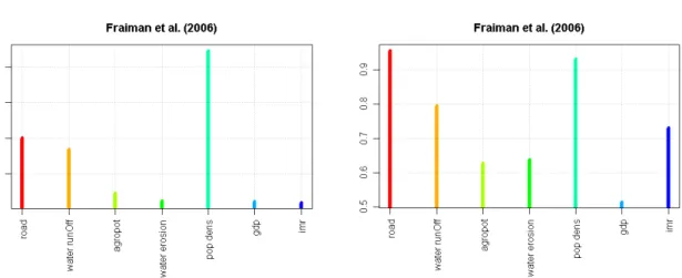
Figure 2.2.4 Fraiman-measure to identify the importance of a particular variable for the total cluster partition. The smaller the value the more important is the indicator for the clustering. For the time slices 1970 and 2000.
14
As a last comparison we look at the importance of the different indicators in generating the cluster maps and the quality of reproduction of indicator values by the clusters, for 1970 and 2000 (Figure 2.2.4). Comparison of the Fraiman measure (based on Fraiman et al. 2006) yields an interesting result: while in 2000 GDP/cap is the clearly most relevant variable in determining the cluster partition, in the more "complex" 10-cluster case of 1970 GDP/cap, infant mortality and soil erosion play an equal role in determining the clusters. This can be perhaps interpreted as a trend towards the dominance of the macroeconomic situation in characterizing the risk profiles, compared to a more equally weighted environmental/socio/economic situation in 1970. Possibly, the close interactions between environmental degradation, social discrimination and economic variables in the dryland archetype over this time period have been yielding an increased coherence in these variables, making GDP/cap a more effective leading variable to distinguish different risk profiles. So, as main results we can conclude from the analysis of the past time slice that the variety of typical risk profiles was larger in 1970 (10 compared to 8 in 2000):
• the drylands showed a more complex structure,
• there is a smooth transition from the 1970 to the 2000 – situation, hinting to the stability of the cluster results,
• in 1970 GDP/cap, soil erosion and infant mortality played an equal role in determining the cluster separation, so economic, social and resource related aspects were of equal importance while in 2000 GDP/cap became the most important variable in cluster determination,
• thus, in the current situation social and environmental problems seem to be more correlated with (low) GDP/cap than in 1970 – this development is in accordance with the vulnerability generating mechanisms which assume a positive feedback loop between poverty and environmental degradation.
2.3 Different ways to perform the analysis of change
After this short practical exploration into the historical change of the vulnerability patterns we will give a short theoretical exposition of principal alternative possibilities to do the cluster based analysis within the framework of future scenarios.
Time slice-wise clustering
The most straightforward clustering approaches to account for an analysis of change is the time slice-wise clustering as it was applied in the previous section. Here the clustering is performed for each time slice separately. One has to decide how the normalization of each indicator is done: either over all time slices or for each time slice separately. The latter choice implies that only structural changes in the clustering partitions of the different time slices are detected while the first more duly reflects also quantitative changes in the indicators but runs into difficulties when large temporal changes in single indicators occur which may lead to poor spatial differentiation within the single time slices, since the large normalization-ranges for redefining the indicator-values can severely downplay differences in the initial indicator-values. As we will show in section 3.2 the interpretation of the transition between two time slices where some structural change occurs may be very demanding.
15 Freezing approaches
Here the first possibility is to keep the present spatial extent of the clusters constant and to recalculate the vulnerability profile under the (future) projected indicators. Close to that one could keep the present state vulnerability profiles constant and recalculate the spatial extent of the respective clusters under the projected indicators. This means each pixel is assigned to that specific cluster (centre) which is closest to its indicator values. These two “freezing approaches” assume that no significant structural changes of the vulnerability clustering characteristics would occur. This can be the case but has to be tested in advance by one of the two different clustering approaches (time slice-wise clustering or clusters of change analysis).
Clusters of Change (CoCs)
Trying to include the necessities of interpretation of time slice-wise clustering into the method from the beginning we introduce the “Clusters of Change” (CoCs). Here we construct clusters which represent both, the present state of the indicators AND their projected change. This answers directly the question which is central when interpreting change in vulnerability clusters: Which (spatial)
locations are presently in a similar situation AND will undergo a similar change in future? The price
one has to pay for this kind of results is the doubling of the dimensionality of the indicator space and the respective increase in computer time which – however – occurred not to be a problem in the applications we dealt with so far.
3. Analysing future developments
In this section we will use an illustrative scenario for the development of the indicators for the dryland archetype until 2050, using PBL’s Integrated Assessment Model suite (Kram and Stehfest, 2012). We chose here the baseline scenario constructed for the OECD Environmental Outlook (OECD, 2012). This is described in more detail in section 3.1.3. In the following sections 3.2 and 3.3 different models to analyse this development path via clustering are explored. The sensitivity of the results towards different uncertainties is discussed in 3.4.
3.1 Scenarios for the indicators
In this section we describe how indicator scenarios were constructed by using different models as a basis for the exploration of the different methods of the analysis of the change in vulnerability patterns.
3.1.1 Models
Projections of indicators are made with a set of coupled integrated assessment models developed at PBL (Kram and Stehfest, 2012). The core is formed by the IMAGE integrated assessment model (MNP, 2006). The main objectives of IMAGE are to contribute to scientific understanding and support decision-making for global environmental and sustainable development problems by quantifying the relative importance of major processes and interactions in the society-biosphere-climate system (see also http://www.pbl.nl/image). The model is coupled to several other models. For the projections used here this includes the GLOBIO model (Alkemade, 2009), which describes changes in biodiversity worldwide (see also http:// http://www.globio.info/), and the GISMO model
16
(Hilderink and Lucas, 2008), which examines human development, including human health (see also http://www.pbl.nl/gismo). The modelling framework operates at a resolution of 24 to 27 world regions for most socio-economic parameters and a geographical 0.5 x 0.5 degree grid for land use and environmental parameters.
Socio-economic data is also made available on the grid level, using simple downscaling methodologies (van Vuuren et al, 2007). To acquire country level population data external input-based downscaling is applied, using the relative size of countries in the UN long-range population projections (UN, 2003). The UN scenario (low, medium, of high variant) closest to the original scenario is used as intermediate. To downscale the country-level data to the grid level (0.5 x 0.5 degrees) the methodology described in van Vuuren et al. (2007) has been revised to also address the urban-rural dimension. Using country-level urbanization rates and gridded urban and rural population maps from CIESIN (2011) aggregated to 0.5 x 0.5 degrees for the base-year, the gridded population is linearly scaled with the appropriate urban and rural growth rates. For downscaling GDP from the region to the country level partial convergence is used, with countries within a region converging to their per capita GDP generally beyond the scenario window (i.e. after 2100) using country-level World Bank and UN data for the base year. To downscale country-level GDP to the grid level it is assumed that all people within a country have similar per capita GDP (urban and rural population alike), therefore simply multiplying gridded population maps with the downscaled country-level per capita GDP data. Finally, infant mortality rates are scaled to the grid using regional trends from the GISMO model on gridded infant mortality data from CIESIN (2005).
An important aspect of the IMAGE model is the geographically explicit description of land-use and land-cover change. The model computes land-use changes based on the regional production of food, animal feed, grass and timber and changes in natural vegetation due to climate change. A crop module based on the FAO agro-ecological zones approach (FAO, 1978-81) computes the spatially explicit yields of the different crop groups and pasture and the areas used for their production, as determined by climate and soil quality. For the period 1970–2000, the model is calibrated to be fully consistent with FAO statistics. For the period 2001–2050, the simulations are driven by the input from the TIMER model (bio-energy) and LEITAP (demand for agricultural production), and by additional scenario assumptions, for example, on technology development, yield improvements and the efficiency of animal production systems (reference).
Data on emissions of greenhouse gases and air pollutants are used in IMAGE to calculate changes in concentrations of greenhouse gases, ozone precursors and substances involved in aerosol formation at a global scale. These calculations, with the exception of CO2, are based on the Fourth Assessment Report of the Intergovernmental Panel on Climate Change (IPCC, 2007). Changes in climate are calculated as global mean changes using a slightly adapted version of the MAGICC 6.0 climate model, which is also extensively used by the IPCC (Schaeffer and Stehfest, 2010). The inputs into the climate model are emissions from the energy model and from the land-use/land-cover model. As climatic changes do not manifest themselves uniformly over the globe and patterns of temperature and precipitation change differ between climate models, changes in temperature and precipitation in each 0.5 x 0.5 degree grid cell are differentiated using the IPCC approach to produce global patterns. This includes the approach proposed by Schlesinger et al. (2000) to account for the regional temperature effect of short-lived sulphate aerosols. IMAGE 2.5 uses temperature and precipitation
17
projections from the HadCM2 climate model run by the UK’s Meteorological Office (data obtained from the IPCC Data Distribution Centre).
The inputs into the climate model are emissions. These originate from the energy model and from the land-use/land-cover model. The consequences of land-use and land-cover changes for the carbon cycle are simulated by a geographically explicit terrestrial carbon cycle model. This simulates global and regional carbon pools and fluxes (pools include the living vegetation and several stocks of carbon stored in soils). The model accounts for important feedback mechanisms related to changing climate (e.g. different growth characteristics), carbon dioxide concentrations (carbon fertilization) and land use (e.g. conversion of natural vegetation into agricultural land or vice versa). In addition, it allows for an evaluation of the potential for carbon sequestration by natural vegetation and carbon plantations.
Recently, the IMAGE land and climate model has been extended by coupling with the LPJmL (Lund-Potsdam-Jena managed Land) model to better simulate the global terrestrial carbon cycle and natural vegetation distribution. For terrestrial changes, here the IMAGE model was used without the coupled LPJmL model, while for the water availability calculations LPJmL was used as a stand-alone model. LPJmL’s hydrological model has been validated against discharge observations for 300 river basins worldwide (Biemans, 2009). Water in deep aquifers is not considered.
3.1.2 Scenarios
The scenarios used in the analysis are the baseline and main climate policy scenario of the OECD Environmental Outlook (OECD, 2012). These scenarios are selected as they allow to assess the impact of a global policy on future vulnerability.
Trends of the OECD baseline scenario take place assuming business-as-usual trends, which include no strengthened or no new policies, including climate policy. The scenario assumes that world development continues to be characterized by a focus on economic development and globalization. The scenario also assumes a continuing increase in the consumption of food, the production of material goods and services and the use of energy carriers, although with a tendency towards saturation at high income levels.New technologies will continue to contribute to the rapid increase in global connectedness and interdependencies, providing new opportunities for economic prosperity.
The global population grows from around 7 billion now to more than 9 billion people in 2050 (UNDESA, 2011). Growth is concentrated almost completely in the current low-income countries, while most high-income regions show a decline in population size. The differences also show up in ageing dynamics. China and the OECD countries are projected to experience significant population ageing. In contrast, the more youthful populations in South Asia, the Middle East, North Africa and especially sub-Saharan Africa, are projected to grow significantly until 2050. Furthermore, the world’s population is becoming increasingly urbanized, growing from around 50 % of the world’s population living in urban areas now to nearly 70 % by 2050 (UNDESA, 2012).
18
The global economy is projected to grow further, with the highest growth rates in developing countries. Economic growth in OECD countries is projected to be, on average, a historically low 1.5–2 % per year. In low income regions, growth rates are assumed to be in the order of 3–5 % per year due to the large potential for growth in labour and capital productivity and a large unmet demand. For Latin America, the Middle East and Africa, projections are higher than the historical rates as these regions are assumed to profit from globalization and a favourable demographic situation. For the Asian regions, growth rates will be similar to or slightly lower than the historical rates as a result of the assumed maturing of their economies. For sub-Saharan Africa, GDP growth is projected to be relatively slowly until 2030 after which there will be the same “take-off” as earlier in Asia.
World food demand and production is projected to increase with 70% between 2010 and 2050, driven by population growth and diet changes, mostly in current low-income countries. The share of animal products in diets is expected to increase along historical trends, inducing further increases in demand for feed crops. Finally, demand for biofuels will also increase significantly, mainly as a result of current biofuel mandates. Although yield increases will provide the vast majority of the increase in agricultural production, also agricultural area is projected to increase. This increase will be particularly strong over the next 20 years, after which the slowdown in population growth will also slow down the expansion in agricultural area. Energy consumption is projected to increase with around 65 % between 2010 and 2050, again mainly in presently low-income countries. Per capita energy consumption in high-income countries does not change much, but is mostly a shift towards electricity and natural gas. In many low income countries, per capita energy use increases strongly (sometimes even doubles), with the largest increases in oil and electricity use. The energy system continues to be dominated by fossil fuels. Projected trends in food and energy production increase global greenhouse gas emissions by about 60% between 2010 and 2050. As a result of these, global temperature will increase to around 4 °C above pre-industrial levels by 2100.
The climate policy scenario aims at avoiding a global mean temperature increase above 2 °C. Therefore, the concentrations of greenhouse gases are limited to 450 ppm (CO2-equivalent) by the
end of the 21st century. The pathway assumes full flexibility in the timing of emission reductions and the use of mitigation options. It further assumes that global co-operation is achieved for tackling climate change, and thus the pathway is implemented through a fully harmonized carbon market that encompasses all regions, sectors and gases. In the scenario climate mitigation impacts on the natural resources only, i.e. land productivity, degradation and water availability. Impacts on the economy (GDP and infrastructure) and the population (total population and infant mortality) are not taken into account.
3.2 Time slice analysis
In this section we will now present a time slice analysis (see section 2.2.2) for the baseline scenario as described in section 3.1.3.
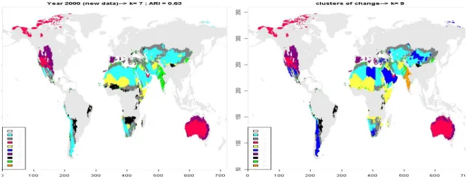
In the first step we have to determine the optimum number of clusters for both time slices, 2000 and 2050. In Figure 3.2.1 a typical result is displayed: for the 2000 time slice there is a clear relative maximum at 7 clusters. This result deviates slightly from the analysis in section 2.1 because the
19
scenario building process used a slightly different indicator set for the present time slice. This optimum cluster number persists for the chosen scenario for 2050 although the relative maximum is less pronounced. There is almost a plateau build by 7-8 clusters. This result is stable against moderate disturbances (noise) so that we will investigate the 7 cluster cases for both time slices. For details regarding the different methods to identify the optimum cluster number see Janssen et al. (2012), section 5.1. This character of temporal development differs from our first illustrative example for the historical development (section 2.1) where the number of clusters decreased by two during only 30 years. Following the same argumentation we can infer that the complexity of the vulnerability patterns stays constant for the chosen scenario.
2 4 6 8 10 12 0. 85 0. 9 0 0. 9 5 1 .00
PIK-centres; File -> AT1n_2000_mima.txt
# Cluster 30 0 -L oo ps 2 4 6 8 10 12 0. 80 0.90 1. 00
PIK-centres; File -> AT1n_2050_mima.txt
# Cluster
300 -L
oops
Figure 3.2.1 Optimum number of clusters for both time slices
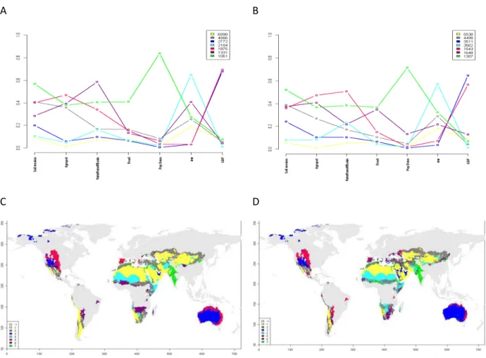
In Figure 3.2.2 the clustering results are displayed. The first row shows the change of the cluster profiles from 2000 to 2050, the second row displays the respective spatial distributions. For a quantitative comparison of the two cluster maps a cross-table indicates the relative number of cells shifted, in terms of a percentage of the value in the year 2000, was calculated (see Table 3.2.1). Analysing the latter one yields that the location of cluster 3 (dark blue) and cluster 7 (green) is almost exactly reproduced in the 2050 time slice. The same holds for the profiles of these two clusters (Fig. 3.2.2 A&B) which are qualitatively very similar but differ slightly in their absolute values. Here we can conclude that for these clusters the vulnerability stays similar under the baseline scenario until 2050. A totally different behaviour can be observed for cluster 6 (violet) – it becomes spatially disintegrated under the given scenario and distributed mainly amongst the 2050 clusters 2 (grey), 4 (light blue) and 5 (red). Consequently, the profile of this cluster changes significantly, both in qualitative and quantitative terms.
20
A B
C D
Figure 3.2.2 Results for the optimum number of clusters for both time slices. A, B: Cluster centres for 2000. C, D: respective figures for the 2050 time slice.
This example makes clear that a proper interpretation of the result of a time slice analysis can easily become very demanding as at least all larger non-diagonal elements of the cross table (the bold numbers in Tab. 3.2.1) have to be interpreted as they potentially denote significant transitions in the vulnerability properties. Additionally, the spatial characteristics of these transitions have to be also traced. The historic analysis from section 2.2 also illustrated this problem nicely: the textual interpretation of the spatial and functional vulnerability profile transitions started to become confusing and comprehensiveness uncertain.
Building on these experiences we conclude that we are mainly interested in the relevant transitions which are changes in the vulnerability profiles (and their locations) that are large compared to the differences amongst the profiles in the present time slice. This objective is more directly addressed by the clusters of change (CoC) analysis as already sketched in section 2.3. Therefore we will give the content oriented interpretation in section 3.4 which deals with the CoC method.
21 2050 2000 1 2 3 4 5 6 7 1 75 12 3 7 0 2 1 2 3 65 1 3 1 23 4 3 0 0 98 0 2 0 0 4 7 12 0 77 0 3 2 5 0 0 30 0 58 11 1 6 0 28 0 28 25 10 8 7 1 1 0 0 0 3 95
Table 3.2.1 Cross-table for comparison of the 2000 and 2050 partitions: row percentages indicate percentage of the year 2000 cluster elements which are part of the year 2500 clusters. Bold: non-diagonal elements > 10%
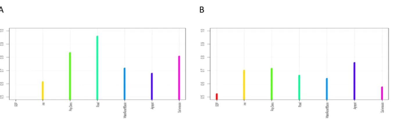
Also the Fraiman analysis of the two time slices (Fig. 3.2.3) shows significant changes. Apart from GDP/cap which is the most decisive indicator in both time slices the sequence of all other indicators changes and their differences become less pronounced in 2050. This could hint to a more complex situation in 2050 where all indicators play a rather comparable role in determining the vulnerability patterns.
A B
Figure 3.2.3 Fraiman measure for the relative importance of the single indicators in determining the cluster distribution (the lower the more important). A: 2000, B: 2050.
3.3 Freezing approach
As already discussed in section 2.3 the “freezing approach” can only applied in a meaningful manner if there a no significant structural changes in the indicator space. The preceding section showed that this was not the case in the example we chose as the large non-diagonal elements in table 3.2.1 prove. So both versions of the freezing method will not yield reasonable and interpretable results: fixing the cluster centres calculated for the present indicator distribution and then attributing the data points of the future time slice to the respectively closest centre will generate new partitions
22
which have nothing to do with the future data structure. A similar problem occurs if the spatial extent of a cluster is fixed. Here, of course, formally a new, future cluster profile can be calculated, but the data points contributing to that are by no means the most mutually similar ones. So, in the case of our example we could show under which conditions the application of the freezing approach is not useful.
3.4 Analysis via Clusters of Change (CoCs)
In this section we will apply the CoC method to the baseline scenario described in section 3.1.2. As already discussed in the section on the time slice-wise clustering (3.2) we try to include the necessities of interpretation into the method by constructing clusters which represent both, the present state of the indicators AND their projected change. The question “Which (spatial) locations
are presently in a similar situation AND will undergo a similar change in future?“ will be directly
addressed. Therefore we add to the seven indicators used so far for 2000 the seven absolute changes of these indicators over the period 2000 and 2050, thereby doubling the dimensionality of the indicator space to 14. Figure 3.4.1 shows the frequency distributions
Figure 3.4.1 Frequency distributions of the indicators for the baseline scenario after winsorising (for details see Janssen et al., 2012) and before min/max normalisation.
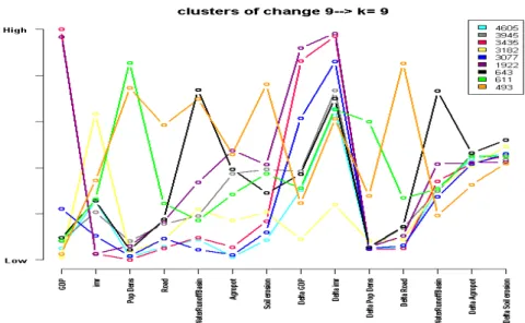
To illustrate the progress made by the CoC-method we will interpret the CoCs by comparing them with the cluster result of the present time slice. The first step in the analysis of this 14-dim data space is the determination of the optimum cluster number. Fig. 3.4.2 shows a clear relative maximum at 9 clusters indicating that there is a clear-cut and limited number of relevant state-change constellations which could clarify the somewhat confusing result from the previous section.
23
Figure 3.4.2 Optimum number of clusters, 95% confidence interval added.
The resulting CoCs are displayed in Figures 3.4.3 and 3.4.4 (right side), showing profiles of the 9 clusters now stretching over 14 indicators and their spatial distribution. Instead of directly interpreting these results we will analyse it along a comparison of the CoCs with the clustering of the present time slice result because this illustrates best the philosophy of the CoC-idea.
Figure 3.4.3 Vulnerability change profiles CoCs. For the change variables Delta Soil Erosion and Delta Agropot the “no-change” point is in the middle of the scale, for Delta Water Runoff at one third, for Delta IMR at 1 (only negative changes) and for the remaining change variables at 0 (only positive changes)
To facilitate this comparison we show the new spatial CoC distribution together with the present time slice in Figure 3.4.4.
24
Figure 3.4.4 Spatial distribution of the vulnerability clusters for the present time slice (left, 7 clusters) and for the CoCs (right, 9 clusters).
Column Percentages present 1 2 3 4 5 6 7 CoCs 1 59 3 0 10 0 1 0 2 0 75 0 0 0 18 4 3 0 0 100 0 7 0 0 4 0 13 0 90 0 39 0 5 40 5 0 0 0 1 0 6 0 1 0 0 93 0 6 7 0 1 0 0 0 39 0 8 0 1 0 0 0 1 49 9 0 1 0 0 0 2 40
Table 3.4.1 Cross table between the 7 present vulnerability clusters and the 9 clusters of change (CoCs). The entries give the percentage of present time slice clusters to be found in the different CoCs.
Table 3.4.1 quantifies the shifts from the present vulnerability clusters to the CoCs. We consider first the present clusters with “diagonal” elements close to 100% which are #3 (red), #5 (lilac) and #4 (yellow), denoting the developed/marginal, the developed/less marginal and the resource poor/severe poverty cluster (for a more comprehensive description of the present clusters see Kok et al., 2010). These are simply reproduced by the CoCs #3, #6 and #4. The two developed CoCs #3, #6 show similar change values for GDP/cap and Infant Mortality Rate (high absolute values) while the remaining changes are all low to middle (see figure 3.4.3). CoC #4 shows in most of the change variables little improvement, except for a medium improvement for water erosion and agropotential. This is the first clear result: both, the two least vulnerable and the most vulnerable cluster stay under the consideration of change homogenously as they are now – and, unfortunately no significant vulnerability reduction for cluster #4 has to be expected.
25
Now we continue with discussing vulnerability clusters which constitute 2 CoCs – or in other words, which are separated into two parts which are different regarding their expected change indicators. The first is the turquoise cluster #1 which is resource poor and shows moderate poverty. It is separated into the also turquoise CoC #1 showing a low GDP/cap growth and the dark blue CoC #5 which has a high GDP/cap growth. Here the branching is due to economic development producing a still rather poor and a better off fraction of the original cluster. The second cluster which is separated is #7 (green), the resource rich, extremely overused profile. This branches into CoC #8 with highest population growth but constant water availability and agropotential and CoC #9 with moderate population growth but strongest reduction of water availability and agropotential – both rather problematic developments regarding resource availability per cap.
The remaining present vulnerability clusters #2 (grey, poor water better soils, moderate poverty by overuse) and #6 (black, resource rich, resource independent poverty) do not branch exactly into two CoCs but approximately into CoC #2 (grey: intermediate water, good soils, not much populated, in most change variables intermediate) & #4 (yellow: resource poor, severe poverty, no GDP/cap-growth, high IMR-growth) and CoC #4 & #7 (black: resource rich, highest increase in water availability and soil erosion ) respectively. So also these present clusters are approximately separated into a rather improving and a worsening part, showing where will be the winners and the losers of the baseline scenario with regard to the drylands vulnerability pattern.
Also in the framework of the CoCs the Fraiman analysis can give some hints regarding the importance of indicators, in particular the balance of the role of state and change indicators. In this case Fig. 3.4.5 shows that the influence of state and change is well balanced – the sequence is GDP/cap, Delta IMR, Delta GDP/cap, Agropot, Soil Erosion and so forth. This is the formal reason for the rich interpretations which were given above.
Figure 3.4.5 Fraiman measure for the relative importance of the single indicators in determining the cluster distribution (the lower the more important)
26
3.5 Sensitivity analyses
In this section we will investigate the sensitivity of the cluster results towards two sources of input uncertainty: different indicator sources and stochastic uncertainty in the indicator data. As an example case we use the present time slice.
For the investigation of the influence of deviating indicator sets we use two versions for the year 2000, an earlier and a newer one. The differences are displayed as box plots in Fig. 3.5.1 and show that the largest differences are in the water availability indicator (originating from different versions of the runoff model) and the GDP/cap indicator (due to a difference base-year generating changes in exchange rates and inflation.).
Figure 3.5.1 Box plot on the differences of the two indicator sets applied.
Figure 3.5.2 Global distribution of differences between the new and old water availability indicator. In Figure 3.5.2 we show the spatial distribution of the differences for the water availability indicator (new-old). Here large areas show an increase while in scattered, small areas a pronounced decrease can be observed. In the next step we investigate how these differences influence the cluster partition. The cluster results for the two different indicator sets are summarized in Figure 3.5.3.
27
2000: old data 2000: new data
2 4 6 8 10 12 0. 85 0. 90 0 .9 5 1. 0 0
PIK-centres; File -> AT1n_2000_mimaOld.txt
# Cluster 30 0 -L oops 2 4 6 8 10 12 0. 85 0. 90 0. 95 1. 00
PIK-centres; File -> AT1n_2000_mima.txt
# Cluster
300
-Loops
Figure 3.5.3 Results of the cluster calculations for the “old” (left column) and the “new” (right column) indicator set. First row: optimum cluster number, second row: spatial distribution, third row: vulnerability profiles.
The first row of Fig. 3.5.3 shows different optimum cluster numbers determined by clear relative optima at 8 and 7 clusters respectively. On the other hand, the spatial distribution of the two cluster results as depicted in the second row of Fig. 3.5.3 shows large qualitative agreement, as well as the
28
profiles in the third row. To quantify the differences further we use a cross-table analysis (Tab. 3.5.1) which counts how many pixels changed cluster membership when changing the underlying indicator sets (from old to new) measured as a percentage of the “old” cluster.
#Cluster new #Cluster old 1 2 3 4 5 6 7 Colours in Fig. 3.5.3, rhs 1 98 1 0 0 1 0 0 yellow 2 25 8 0 58 9 0 0 grey 3 0 0 92 0 0 8 0 blue 4 1 23 0 72 1 2 0 turquoise 5 5 6 0 2 87 0 0 red 6 0 0 5 0 0 95 1 lilac 7 0 1 0 4 0 1 93 green 8 25 48 1 18 4 2 2 black
Table 3.5.1 Cross-table for the two cluster partition from Figure 3.5.3. Entries in the table indicate the percentage of pixels which change the cluster, when comparing the old and the new clustering. The first observation is that clusters #1, #3, #5, #6 and #7 stay almost stable under the indicator change. This reflects the impression one gets by qualitative comparison of the two maps in Fig. 3.5.3. In terms of content this means that the two developed clusters (blue (#3) and lilac (#6)) occur almost unchanged in the clustering of the new indicator set (92% and 95% respectively). There is only some exchange between these two clusters (8%, 5%, no other transfers). The resource-poor vulnerability profiles (yellow (#1) and red (#5)) occur also almost unchanged (98% and 87% respectively). There is some small exchange amongst the two clusters and clusters #2 and #4.
The resource rich vulnerability profiles (green,#7, and black, #8) in the old indicator set show different behaviour. While the green cluster is almost fully reproduced under the new dataset (93%) the black cluster vanishes totally – the largest part goes to the new grey cluster #2 (48%), smaller parts to the persistent yellow cluster #1 (25%) and the new turquoise cluster #4 (18%).
The poor water, better soils vulnerability profiles (grey and turquoise in the left, “old indicator” map) change considerably for the new dataset regarding location and, consequently, profile. The old turquoise cluster gives 23% to the new grey cluster while the old grey cluster gives 25% to the yellow cluster. The new grey and turquoise clusters have almost identical values for GDP/cap, population density, road density and agropotential. On the other hand, the grey cluster has larger infant mortality rate, significantly higher water availability and somewhat less soil erosion. Comparison with the persistent green profile (#7) yields that the grey cluster (#2) is resource rich but shows – in contrast to the green cluster – a low population (and road) density and somewhat less human wellbeing. Additionally, soil is less overexploited. From that we conclude that the reason for the poor wellbeing in the grey cluster must be related to reasons beyond poor resources and extreme
29
soil overuse. We lose, compared to the old data set, the “parallel band” and “Malthusian” (“resources proportional population density yielding hardly acceptable wellbeing”) interpretation (see Kok et al. 2010 for more explanation) and get a “relatively good resources, poverty for other reasons” (may be distributional aspects) new grey cluster. The new turquoise cluster (#4) is still characterized by “poor water, better soils” and the relatively poor wellbeing can be explained by the intermediate resource quality and its overuse (relatively high erosion rates corroborate this). In summary, the clusters of the new dataset are characterized in Tab. 3.5.2.
Cluster characteristics based on the new indicator set #, colour in Fig. 3.4.3, lhs
Developed clusters Marginal #3, blue
Less marginal #6, lilac Resource poor clusters Severe poverty #5, red
Moderate poverty #1, yellow Poor water, better soils Moderate poverty by overuse #4, turquoise Resource rich clusters Resource independent poverty #2, grey
Poverty by extreme overuse #7, green Table 3.5.2 Summary of the new seven cluster partition.
This example illustrates nicely to which degree modifications of the interpretations of vulnerability profiles have to be expected under a typical variation of the input indicator set as it occurs, e.g., with the further improvement of the generating modules/models. The larger part of the clusters stay surprisingly stable in terms of spatial distribution, vulnerability profile and thereby interpretations. On the other hand, a smaller fraction of the vulnerability profiles exhibited spatial change and redistribution, resulting in somewhat changed interpretations. The performed sensitivity study showed for example that the two clusters which formed parallel bands in the Sub-Saharan region collapse and the interesting “Malthusian” interpretation (see Kok et al. 2010) is no longer valid – i.e. it was based on a less stable property of the cluster partition and therefore should either be taken with care or even be dropped.
In the following we will now assess the influence of stochastic uncertainty on the cluster results and take as an indicator how the criterion for the optimum cluster number is influenced by adding artificial noise to the original indicators. Here we take the indicators for the two time slices of the baseline scenario as an example and add a 20% noise signal on the underlying indicator data.
The right column of Fig. 3.5.4 shows the cluster number criterion as calculated in the time slice analysis of section 3.2. In the right column the same analysis was done with modified indicator sets where the noise was added. We show here typical results which depend slightly on the particular realization of the stochastic noise but show qualitatively very similar results.
30
For the 2000 time slice a sharp optimum at 7 clusters was detected. After adding considerable noise, Fig. 3.5.4 shows that this relative maximum is preserved although it becomes somewhat flatter and less pronounced. But, in summary, this cluster partition is very stable against noise in the underlying data.
The situation is somewhat different for the 2050 time slice. Here even the noise-free original clustering showed a rather flat relative maximum at 7 clusters. Adding considerable noise changed the result by shifting this flat maximum towards higher cluster numbers. This shows that this time-slice is noise sensitive and poses thereby high demands on the indicator set with respect to low stochastic errors. 2 4 6 8 10 12 0. 85 0. 9 0 0. 9 5 1 .00
PIK-centres; File -> AT1n_2000_mima.txt
# Cluster 30 0 -Loo ps 2 4 6 8 10 12 0. 80 0. 85 0 .9 0 0 .9 5 1. 00
PIK-centres; File -> AT1_2000N1_mima.txt
# Cluster 200 -L o ops 2 4 6 8 10 12 0. 80 0 .90 1. 00
PIK-centres; File -> AT1n_2050_mima.txt
# Cluster 3 00 -Loo ps 2 4 6 8 10 12 0. 8 0 0. 8 5 0. 9 0 0. 9 5 1. 0 0
PIK-centres; File -> AT1_2050N1_mima.txt
# Cluster
2
00
-Loo
ps
Figure 3.5.4 Criterion for optimum cluster number. First row, lhs: as in Fig. 3.2.1 (2000), rhs: with noise signal. Second row, lhs: as in Fig. 3.2.1 (2050), rhs: with noise signal.
To conclude, for the investigated case stochastic errors in the indicators up to 20% do not alter the stable cluster partitions significantly while changing between alternative (data)sources of the indicators yields some changes in the clusters with respect to number (from 8 to 7), profiles and spatial distributions. Furthermore a lot of clusters stayed roughly the same, at least the changes did not demand for changes in their main interpretations while for one of 8 clusters a modification in its basic interpretation became necessary. For such cases we can generally conclude that interpretations related to this (or these) unstable clusters have to be taken with care.
31
Having established this feeling for the sensitivity of the method we will now continue with the future analysis based on the CoC approach.
4. Comparing different scenarios
One possible way to assess the outcome of policy measures is to compare different scenarios, for example a baseline scenario and a climate policy scenario. Potentially the cluster analysis allows then for an aggregated interpretation of the differences and thereby for an assessment of the policy measures. So the first step will be to perform the CoC-analysis for the policy scenario as introduced in section 3.1.4. Then follows the comparison of these new CoCs with the CoCs produced with a baseline scenario.
4.1 The climate policy scenario and its CoC-analysis
To characterize the scenario investigated we show in Fig. 4.1.1 the frequency distributions of all 14 indicators for the climate policy scenario. The change parameters GDP/cap, population density and road density increase, infant mortality decreases while water availability, agropotential and soil erosion show positive as well as negative changes.
Figure 4.1.1 Frequency distribution of the used state (first row) and respective change indicators (second row) for the policy scenario 3.1.3.
32 A:
B:
C:
Figure 4.1.3 Clusters of Change (CoCs) for the policy scenario. Profiles for the CoCs, A: displayed as box plot, denoting the distribution of the indicator values within each cluster and B: as spectra (lower figure). C: spatial distribution of the CoCs for the policy scenario.
33
We can identify an optimum number of clusters, as for 8 clusters a relative maximum exists (see Fig. 4.1.2). The respective cluster results are summarized in Fig. 4.1.3, showing the CoC-profiles in the form of box-plots and spectra as well as the spatial distribution of the clusters. In the next section these results will be compared with a baseline CoC-analysis aiming at an aggregated analysis of the different indicator scenarios.
4.2 Comparison: CoCs of baseline and climate policy scenario
In Tab. 4.2.1 we display one central tool for the policy analysis: a cross-table between the CoCs resulting from a baseline scenario and the policy scenario. Here we can identify baseline-CoCs which undergo a spatial change under the policy scenario.
A: Base 1 2 3 4 5 6 7 8 Sum Policy 1 4875 0 0 1 10 0 3 0 4889 2 0 3669 0 0 0 1 0 0 3670 3 0 0 3591 0 3 0 0 0 3594 4 18 0 0 3096 0 0 0 0 3114 5 0 0 2 0 2352 0 0 2 2356 6 0 1 0 0 0 1696 0 0 1697 7 0 0 0 0 1 0 1602 0 1603 8 0 0 0 0 0 0 0 990 990 Sum 4893 3670 3593 3097 2366 1697 1605 992 21913 B: Base 1 2 3 4 5 6 7 8 Policy 1 100 0 0 0 0 0 0 0 2 0 100 0 0 0 0 0 0 3 0 0 100 0 0 0 0 0 4 1 0 0 99 0 0 0 0 5 0 0 0 0 100 0 0 0 6 0 0 0 0 0 100 0 0 7 0 0 0 0 0 0 100 0 8 0 0 0 0 0 0 0 100
Table 4.2.1 Cross-tables between Clusters of Change (CoCs) for the policy scenario vs. a base line scenario. A: number of pixels changing the cluster. B: percentage of pixels changing the cluster.
Inspection of Tab. 4.2.1 A yields a very low number of pixels changing the cluster which results also in a very low percentage. This means that regions with a similar CoC-profile in the baseline case will have also a similar profile in the policy case.
The next level of comparison is the CoC-profiles which are displayed in Fig. 4.2.1. It is well possible that these profiles change even if the spatial distribution of the clusters remains constant because
34
the underlying indicators are different. This could lead to changes in the interpretation of a particular cluster in the policy case. For the given scenarios this is obviously not true for the normalized cluster centres. A comparison of Fig. 4.2.1. A and B shows that they stay virtually constant.
The next step of analysis is then to “de-normalize” the values for the cluster centres with the aim to compare their values in terms of the original indicators. Inspection of the respective normalization mapping (percentile-determined winsorising, for details see Janssen et al., 2012) yields a clear difference for the change in the water availability variable:
Baseline scenario: [-2.15.10-4, 2.57.10-4] → [0, 1] Policy scenario: [-0.83.10-4, 1.09.10-4] → [0, 1]
From this and Fig. 4.2.1 it follows directly for all clusters that there will be less change in the water availability for the policy scenario. As this scenario aims at the reduction of climate change this is a plausible although not surprising result. The main conclusion is that the scenarios do not differ enough to generate structural changes. One reason could be that the models employed in indicator scenario building do not include feedback on the socio-economic system (pop, GDP, mortality), but only on the environment (yield, water, erosion). But only such structural changes could be detected in an elegant way by the comparison of the CoCs. To further explore this possibility we will compare two more distinct indicator scenarios in the next section.