CONSTRUCTION AND ANALYSIS OF A
REAL-LIFE PROJECT DATABASE
Aantal woorden: <17.047>
Mayté Fernandez-Soliño, Thymo Moerman
Stamnummer/ Student number: 01500247, 01506417
Promotor/ Supervisor: prof. dr. ir. Mario Vanhoucke
Co-Promotor/ Commissioner: dr. Annelies Martens, Tom Servranckx
Masterproef ingediend tot het behalen van de graad van: Master’s Dissertation submitted to obtain the degree of:
Master of Science in Complementary Studies in Business Economics (Business Economics)
Vertrouwelijkheidsclausule/ confidentiality agreement
PERMISSION
De auteurs geven de toelating deze masterproef voor consultatie beschikbaar te stellen en delen van de masterproef te kopiëren voor persoonlijk gebruik. Elk ander gebruik valt onder de bepalingen van het auteursrecht, in het bijzonder met betrekking tot de verplichting de bron uitdrukkelijk te vermelden bij het aanhalen van resultaten uit deze masterproef.
The authors give permission to make this master dissertation available for consultation and to copy parts of this master dissertation for personal use. In all cases of other use, the copyright terms must be respected, in particular with regard to the obligation to state explicitly the source when quoting results from this master dissertation.
Mayté Fernandez-Soliño & Thymo Moerman, Gent 2 juni 2020
Acknowledgements
This thesis was written during Corona crisis, which had little consequences to the establishment of this dissertation. First of all, communication was completely different due to the crisis. Since march 2020 all discussions had to take place with the help of an online feature. This source of communication needs a little adaptations and since this thesis was written in duo, communication was essential. The biggest challenge was thus to be aligned. There was no need for fieldwork so the thesis could be written without any problems related to the lockdown. Last, the crisis made it hard to set specific goals and deadlines.
Despite all this, we could reach out to Annelies Martens and Tom Servranckx at any time. They guided us along the process of this thesis and gave us all information needed. We are thankful for all answers to our questions and the time they spent helping us. Also, we want to thank Mario Vanhoucke for the opportunity of working on this project and his faith in this topic. Finally this calls for a special word of gratitude to our family and friends for their never ending support and help.
Mayté Fernandez-Soliño & Thymo Moerman, Gent 2 juni 2020
Table of Content
Vertrouwelijkheidsclausule/ confidentiality agreement ... I Acknowledgements ... II List of Figures ... VI List of Tables ... VIII List of Abbreviations ... IX Introduction ... 1 Literature ... 2 1 Standard projects ... 2 1.1 The database ... 2 1.1.1 ProTrack ... 3 1.1.2 Excel ... 4 1.1.3 Project cards ... 10 2 Flexible projects ... 18 Methodology ... 19 1 Standard projects ... 19 1.1 The data ... 19 1.1.1 New projects ... 19 1.1.2 Brabo 2 ... 19 1.2 The database ... 20
1.2.1 Regular/ irregular indicator ... 21
1.2.2 Tracking... 22 2 Flexible projects ... 23 2.1 Flexibility overview ... 23 2.1.1 General indicators ... 23 2.1.2 Flexibility indicators ... 24 2.2 Database ... 25 2.3 Project card ... 27
Statistical analysis ... 28
1 Standard projects ... 28
1.1 General information ... 28
1.1.1 Number of activities ... 28
1.1.2 Project duration ... 30
1.1.3 Budget at completion - BAC ... 32
1.1.4 Resources... 33
1.2 Network topology ... 34
1.2.1 Serial/ parallel indicator - SP ... 34
1.2.2 Activity distribution - AD ... 36
1.2.3 Length of arcs – LA ... 37
1.2.4 Topological float – TF ... 38
1.2.5 Regular/ irregular indicator – RI ... 39
1.3 Project control ... 41
1.3.1 Tracking... 41
1.3.2 Impact of the network topology ... 44
1.3.3 Relation between PV, EV and AC ... 49
1.4 Concerns ... 55 2 Flexible projects ... 56 2.1 General information ... 56 2.1.1 Activities ... 56 2.1.2 Resources... 60 2.2 Network topology ... 61
2.2.1 Serial/ parallel indicator – SP ... 61
2.2.2 Activity distribution – AD ... 63
2.2.3 Length of arcs – LA ... 65
2.2.4 Topological float – TF ... 67
2.3.1 Mandatory ... 69 2.3.2 Triggering ... 70 2.3.3 Alternative ... 71 2.3.4 Causing ... 72 2.4 Concerns ... 73 Conclusion ... 74 Further research ... 75 Bibliography ... 76 Appendix ... 77
List of Figures
Figure 1: Example of a Gantt chart ... 5
Figure 2: Example of resource allocation ... 5
Figure 3: Example of risk analysis ... 6
Figure 4: Risk profiles (Batselier & Vanhoucke, 2019) ... 7
Figure 5: Example activity-on-the-node network (Alby, 2020) ... 10
Figure 6: Example of flexible project (Nyhuis, 2014)... 18
Figure 7: How to calculate the RI (Batselier, 2016) ... 21
Figure 8: Example flexible network (Kellenbrink, 2013) ... 24
Figure 9: Spreadsheet ... 26
Figure 10: Number of activities ... 28
Figure 11: Boxplot with number of activities per project ... 29
Figure 12: Project duration ... 30
Figure 13: Boxplot of project duration (in days) ... 31
Figure 14: Budget at completion ... 32
Figure 15: Resource availability ... 33
Figure 16: Serial/ parallel indicator ... 34
Figure 17: Boxplot of the serial/ parallel indicator ... 35
Figure 18: Boxplot of activity distribution ... 36
Figure 19: Boxplot of the length of arcs ... 37
Figure 20: Boxplot of the topological float ... 38
Figure 21: Regular/ irregular indicator ... 39
Figure 22: Boxplot of regular/ irregular indicator ... 40
Figure 23: Tracking information ... 41
Figure 24: Tracking info concerning time and costs ... 42
Figure 25: Distribution of the projects ... 43
Figure 26: Linear, S-curve, PV, EV, AC (new data) ... 49
Figure 28: PV new, PV ... 52
Figure 29: EV new, EV ... 53
Figure 30: AC new, AC ... 54
Figure 31: Boxplot of total activities ... 56
Figure 32: Boxplot of main activities ... 57
Figure 33: Boxplot with comparison of activities ... 59
Figure 34: Boxplot of resource data ... 60
Figure 35: Boxplot flexible serial/ parallel indicator... 61
Figure 36: Comparison flexible and standard SP ... 62
Figure 37: Boxplot of activity distribution ... 63
Figure 38: Comparison flexible and normal AD ... 64
Figure 39: Boxplot of length of arcs... 65
Figure 40: Comparison flexible and standard LA ... 66
Figure 41: Boxplot of topological float ... 67
Figure 42: Comparison flexible and standard TF ... 68
Figure 43: Boxplot of mandatory activities ... 69
Figure 44: Boxplot of triggering activities ... 70
Figure 45: Boxplot of alternative activities ... 71
List of Tables
Table 1: Example of network topology ... 11
Table 2: Example time sensitivity ... 14
Table 3: Example cost sensitivity ... 14
Table 4: Example resource sensitivity ... 14
Table 5: Example of time forecasting accuracy ... 16
Table 6: Example of cost forecasting accuracy ... 16
Table 7: The EVM of time forecasting ... 17
Table 8: The EVM of cost forecasting ... 17
Table 9: Flexibility indicators ... 27
Table 10: Activity data Brabo 2 ... 29
Table 11: Length of arcs data ... 37
Table 12: Length of arcs data based on number of activities ... 37
Table 13: Activities and PD related to time ... 44
Table 14: Indicators related to the late projects ... 44
Table 15: Indicators related to the on time projects ... 45
Table 16: Activities and PD related to budget ... 46
Table 17: Indicators related to budget overrun ... 46
Table 18: Indicators related to projects under budget ... 46
Table 19: Over budget and late ... 47
Table 20: Under budget and on time ... 47
Table 21: Relation between main and total activities ... 58
Table 22: Comparison between flexible and standard activities ... 59
List of Abbreviations
AC Actual cost
AD Activity distribution
AT Actual time
BAC Budget at completion
CPI Cost performance index
EAC Estimated cost at completion
EAC(t) Estimated duration at completion
ED Earned duration
EDM Earned duration method
ES Earned schedule
ESM Earned schedule method
EV Earned value
LA Length of arcs
MAPE Mean absolute percentage error
MPE Mean percentage error
PF Performance factor
PV Planned value
PVM Planned value method
RD Real duration
RI Regular/ irregular indicator
SCI Schedule cost index
SCI(t) Schedule cost index (time)
SP Serial/ parallel indicator
SPI Schedule performance index
SPI(t) Schedule performance indicator (time)
Introduction
Controlling and improving the performance of projects is one of the topics project management deals with. Every company hopes to optimize their projects in such a way that they can reduce costs and resources without losing the quality of their work. Project management processes are used to monitor and control the progress of a project and reduce the uncertainty.
In order to improve the practices of project management, a lot of research takes place. By collecting data of real-life projects and simulating artificial data, statistics can create an image of the indicators and parameters with a significant impact on projects. The purpose of this thesis is to research which of the stated indicators have a relevant impact on the progression of projects.
On the one hand, this thesis is based upon existing work of Batselier and Vanhoucke. They created a database with information of real-life projects as well as artificial data. On the other hand, in this thesis research was conducted in support of the study of Mr. Servranckx. He is a PhD student who is studying flexible projects. Due to this, the dissertation can be split into two components, one focussing on standard data and the other placing further emphasis on flexible projects.
The structure of this thesis is as follows, the first part of the report contains the literature study. This study is followed by the methodology reporting of how the research took place. Subsequently, some statistical analysis takes place and is documented in the next chapter. For both the standard and the flexible data some concerns are stated at the end of those chapters. Ultimately a conclusion with the most important findings is given.
Literature
Following part of this thesis gives a literature review, which forms the basis for the subsequent results.
As stated in the introduction, a distinction can be made between standard and flexible projects. The first section of this review gives information about the standard projects, the second part gives notification about a different kind of projects namely the flexible ones.
1 Standard projects
1.1 The database
In order to do research related to project management, a truthful database is essential. With this idea in mind, a database consisting project data was made by Batselier and Vanhoucke (2015). The aim of this database is to create a collection consisting of qualitative and authentic real life project data which can offer statistic information. The more varied the data, the more general results will be generated and the better conclusions can be drawn.
The database exists of baseline data, risk analysis data and project control data. All the collected information is implemented into the database in a structured way and can be found at www.or-as.be/research/database. Each project contains three files, namely a ProTrack file, an Excel file and a project card.
First a ProTrack file is generated. This file contains a baseline and all necessary information to analyze the data. Not all projects are very detailed, some projects dispose of a lot more information and known parameters than others. Only projects with useful information are relevant for the database.
Furthermore, a second file can be generated from the ProTrack file, namely an Excel file. By using the existing software tool PMConverter, it is possible to format the ProTrack file into a corresponding Excel file. The Excels contain different tabs with information and graphs derived from the ProTrack files.
Last, a project card is created. This card is based on the existing project card framework and gives a summary of the project by displaying the most important parameters.
The main goal of this database is to learn and understand how project management works by detecting the drivers that have an impact on the performance of a project. If those drivers are exposed, research can take place to improve the practices of project management.
1.1.1 ProTrack
All projects are generated in ProTrack. ProTrack is a project management product used for dynamic scheduling. This tool provides the possibility to construct a baseline of all the necessary activities of a project and their precedence relations. Next to that, resources and costs can be assigned to every activity in an easy way.
When the general information is complete, one possibility is to estimate the activity sensitivity. Theretofore two options are given: first of all the collector gets the opportunity to define a self-chosen risk distribution. If the collector has no information of this kind, ProTrack offers the possibility to take on a random simulation. The result of this risk sensitivity simulation is information about cost, resource and time sensitivity which is all collected in a sensitivity report. Later on, the different aspects of these indexes are discussed.
Last, ProTrack focusses on project control. A group of tools and techniques is handed with the purpose of controlling the project. ProTrack offers Earned Value Management analyses and reports, Earned Scheduling reports, forecasting techniques and automatic tracking. To control a project, the baseline schedule is compared to the performance of a project in progress.
1.1.2 Excel
For every ProTrack file that is given, an Excel file can be generated with the help of the PMConverter. This converter is a software tool to convert ProTrack files into Excel files and vice versa. Thereby the information of every project is rendered in different tabs, each of them containing specific data of the project. After the conversion from ProTrack to Excel, each file automatically contains following sheets:
- Baseline schedule: this shows every activity of the project, as well as their baseline start and baseline end. The relations between the activities and their predecessors and successors are also shown. For every activity, the resource demand and baseline costs are displayed.
- Resources: this tab provides information about the resources used in the project. It shows to which the resources are assigned and the total cost of the resource demand. If no resources are used, the sheet is empty.
- Risk analysis: this sheet shows the description of which distribution for risk analysis is used, next to the actual numbers for every activity. These numbers can be calculated manually or can be derived from a standard distribution. They are shown in their most pessimistic, most optimistic and most probable way.
- Agenda: presents how many hours a day and days a week are used to work on the project. Possible holidays can also be implemented.
- Tracking overview: this part of the file is very important and shows all the information regarding the project control. Logically, if there is no project control used, this part contains no data.
a. Baseline schedule
First of all, the basis of the project is created, namely the baseline schedule. With the help of this schedule, a Gantt chart is constructed. A Gantt chart shows the planning of every activity within the project, with their mandatory predecessors and successors taken into account. With this graph, an overview of the project is generated. Due to this overview it is clear at what time which activity should take place and how long every activity should take. The baseline start is subtracted from the baseline end, so that the actual duration is calculated. The data of the baseline start, and the actual duration are used to generate the Gantt chart. An example is shown in Figure 1.
Figure 1: Example of a Gantt chart
b. Resources
Not all projects contain resources, but if resources are used, it is helpful to show which share of the total resource cost is allocated to every used resource. Therefore, a pie chart is generated to visualize the percentage of the cost that goes to each resource used in the project. An example of a pie chart is represented in Figure 2.
Figure 2: Example of resource allocation
14/11/2016 04/12/2016 24/12/2016 13/01/2017 02/02/2017 22/02/2017 14/03/2017 Demolition
Shallow foundations Sills, plinths and coping Courtyard finishing Indoor floor finishing Wooden strucural elements Exterior joinery Structural elements steel Window sill coating and wallcover
Date
c. Risk analysis
As said before, the risk analysis can be predefined by the collector of the project or ProTrack can provide a standard distribution. To obtain a better view on these numbers, they are represented relative to the baseline duration. To realise this graph, all absolute numbers have to be divided by their baseline duration. That way, only relative numbers are left so that it is easier to compare the risk of each activity relative to other activities. Eventually, a graph is generated as shown in Figure 3.
As can be seen in Figure 3, every activity contains a certain duration distribution profile. This profile reflects the nature of the risk that is present in an activity. Four standard distributions can be classified, namely symmetrical, left skewed, right skewed, and no risk (Batselier & Vanhoucke, 2019). The risk profiles are shown in Figure 4. The lowest percentage of the expected duration reflects the most optimistic case and the highest percentage the most pessimistic proposition of the duration. The middle percentage gives the most probable duration of the activity. When there is no risk, those three forms are equal to 100% of the planned duration of the activity. Hence, this standard distribution is not included in Figure 4, since it would only be a vertical line.
Figure 4: Risk profiles (Batselier & Vanhoucke, 2019)
d. Project control
The last part of the Excels contains information about project control. This data is very useful when applied on the project, because the information gathered from the project control is important to measure the state of the project in the dynamic phase. By looking at the project state, it is possible to take action when things go wrong. A summary of the parameters of the executed simulations is given in the tracking overview. Below, this different parameters are discussed briefly as they appear in the Excel.
AC, EV, PV
First a comparison is made between three different types of costs: first of all the actual cost (AC), secondly the earned value (EV) and finally the planned value (PV).
- The actual cost is a dynamic cost and represents the occurred cost at a specific moment in the project progress. The value of this cost is measured and is therefore a real value.
- The planned value is a static value and predicts the value that should have been created according to plan.
- The earned value is something between a static and a dynamic value and is calculated by multiplying the percentage of completion of the project and the budget at completion (BAC). This BAC is the total budget according to plan and thus a static value. The percentage of completion forms the dynamic element.
The earned value is always the point of reference and indicates whether the project is on time or delayed. When PV equals EV, the project is right on time, if PV is bigger than EV the project is delayed. The second thing the earned value indicates is whether the budget is respected. Only if AC is equal to EV, the budget is respected. If AC exceeds EV, an overspending of the budget took place (Vanhoucke, 2012).
CPI, SPI(t)
Following two indicators stand for the cost performance index (CPI) and the schedule performance index (SPI(t)). They represent the state of the actual cost (AC) and the progress of the project (PV), compared to respectively the earned value (EV) and the earned schedule (ES) (Vanhoucke, 2012).
𝐶𝑃𝐼 = 𝐸𝑉 𝐴𝐶 𝑆𝑃𝐼(𝑡) = 𝐸𝑆
𝑃𝑉
For the CPI, an outcome lower than 1 indicates that the project is currently exceeding the budget. A result above 1 means the opposite and thus the earned value is exceeding the actual cost.
On the other hand, a SPI(t) lower than 1 indicates that a delay occurred, but a result higher than 1 means the project is ahead of schedule.
SPI, SPI(t)
The counterpart of the SPI(t) - which was discussed above - is the SPI. The SPI is calculated as follows:
𝑆𝑃𝐼 = 𝐸𝑉 𝑃𝑉
Since at the end of a project, the earned value equals the planned value no matter what, the SPI always ends with a value of 1. This can create a wrong image about the progress of the project. Because of this, the ending value of 1 would imply that the project is on time, even when there is a delay. This is called the quirky behaviour of the SPI. Because of this reason, another indicator is invented: the SPI(t). Instead of comparing the planned value with the earned value, the planned value is compared with the earned schedule (Vanhoucke, 2012).
p-factor
The p-factor measures whether the activities are executed in order or not and presents this in a number between 0 and 1. A low p-factor signifies that some activities are already executed before their predecessors are ready, which highly increases the risk of rework. Striving for a high p-factor is not a bad habitude.
CV
The cost variance is the difference between the earned value and the actual cost (Vanhoucke, 2012).
𝐶𝑉 = 𝐸𝑉 − 𝐴𝐶
A lot of projects have to deal with a budget overrun, therefore this parameter is mostly negative and increases during the project because the amount of budget overspending grows.
SV(t)
Analogue to the cost variance, there is also a schedule variance. This parameter measures the difference between the earned value and the planned value (Vanhoucke, 2012).
𝑆𝑉(𝑡) = 𝐸𝑉 − 𝑃𝑉
This can be a bit confusing because it expresses a time value in money, however it has nothing to do with money.
1.1.3 Project cards
The last part of the database consists of project cards. To create a project card for each project, both ProTrack and Excel are used.
Firstly, the baseline parameters - or in other words the network topology - will be derived. Followed by the time-, cost- and resource-sensitivity, which are derived by performing a risk analysis. If available, the data about project control is gathered.
All these parameters are discussed at length below.
a. The header
First of all more about the lay-out of the header. This header consists of basic information such as the name and project code, the date, the sector, the type of risk analysis and whether or not it contains costs, resources and project control.
Not only basics are given, there is also information about the completeness of the baseline schedule, the risk analysis and the project control. This is indicated with different colors: a green, yellow and orange color, respectively representing a full, mediocre and rather poor completeness of the data. When the baseline consists of costs and resources, it knows full completeness. For risk analysis, full completeness is defined when non-standard risk distribution was used. When tracking data was put in by the user, the project control will be colored green.
The last item provided in the header is the authenticity, which colors green when all data concerning costs, resources and baseline were obtained by the project owner.
b. Network topology
Each project contains a topological structure, differing from one another. This structure forms the project network, which can be visualized based on an activity-on-the-node network. Each activity is represented by a node, the arcs between these nodes represent the relation between the activities. An example is shown in Figure 5. An estimated duration, resource-need and a cost must be assigned to each activity (Alby, 2020).
Four topological indicators can be derived from this network, being:
- Serial/ parallel indicator (SP) - Activity distribution (AD) - Length of arcs (LA) - Topological float (TF)
An example of this indicators is shown in Table 1. They are all explained below.
Table 1: Example of network topology
Serial/ parallel indicator - SP
The first topological indicator is the serial/ parallel indicator, describing the structure of a project network. With a value between 0 and 1, it describes how close a network lies to a serial or parallel structure. Besides giving information about the format of a network, the value also correlates with the number of activities on the critical path in a network.
A value of SP equal to 1 means that the network is completely serial, while SP equal to zero means that all activities are in parallel. The values between these two, indicate how closely a network resembles to the serial or parallel side.
The formula to calculate SP is:
𝑆𝑃 = 𝑚 − 1 𝑛 − 1
In this formula, m stands for the maximum progressive level and n for the total number of activities in the network (Batselier & Vanhoucke, 2017).
70% 71% 71% 0% Network Topology Serial/Parallel (SP) Activity Distribution (AD)
Length of Arcs (LA) Topological Float (TF)
Activity distribution - AD
The second indicator is the activity distribution. This indicator measures the distribution along the project network. Just like the SP indicator, the AD has a range between 0 and 1. When AD equals 1, the network has a highly skewed distribution. On the other hand, if AD is 0, the project has a uniform distribution. This means that all levels of the network include a similar number of activities.
𝐴𝐷 = 𝛼𝑤 𝛼𝑚𝑎𝑥
In this formula, αw stands for the total absolute deviation of the activity distribution and αmax for the
maximal absolute deviation for a network with n activities (Vanhoucke, 2009).
Length of arcs - LA
The third indicator is the length of arcs, which also has a range between 0 and 1. This indicator is a measurement for the length of each precedence relation between two activities. This happens by returning each relation as a distance between the end of an activity and the start of the next activity. When the indicator is equal to zero, the project network has many precedence relations between two activities that lay far from each other. If the value is equal to one, all the precedence relations have a length of one. This means that all the activities have an immediate successor, thus little freedom to shift. So, the LA measures short precedence relations in the network. The more short precedence relations, the higher the value of LA (Vanhoucke, 2009).
Topological float - TF
The last standard indicator is the topological float (TF). The indicator measures the freedom of every activity to shift without changing the end date. When the indicator is equal to zero, the network is completely full and none activity can be shifted without having an influence on the end date. A value of one means the network has only one chain of activities without a topological float, namely the critical chain. All the remaining activities have a maximal float value (Vanhoucke, 2009).
c. Risk Analysis
The aspect of the activity sensitivity is used by project managers to concentrate their efforts on the activities which influence a project the most. If one has a better idea of which activities have more influence on the objective, it will result in a more accurate and efficient control of the project. What follows are the different aspects of sensitivity which can influence the overall performance.
Time sensitivity Criticality index - CI
The CI or criticality index is a measurement of the chance or the likelihood that an activity will be part of the critical path. The measurement itself is gained by Monte-Carlo simulations and is expressed as a percentage, expressing the likelihood of being critical.
The downside of this measurement is the fact it often fails of correctly predicting the risk. Its focus lies on the probability, while this does not mean that activities with a high CI will have an important impact on the project duration.
Significance index- SI
The significance index is regarded as a partial solution to the shortcomings of the CI. The aim of this measurement is to show the significance of single activities and thus their influence on the total project duration. In doing so, the significance index provides more founded information regarding the relative significance of activities.
Schedule sensitivity index - SSI
The schedule sensitivity index is a combination of the SI and the CI. As stated that risk is equal to probability multiplied by impact, it can be argued that the SSI is equal to the criticality index multiplied by the significance index. This results in the SSI being the most accurate of these three values, as it combines both aspects of risk.
Cruciality index - CRI
The cruciality index is another method to illustrate the influence of single activities on the total project duration. It does so by calculating the correlation between the duration of an activity and the duration of the total project. The easiest way to do so, is by using the Pearson’s product moment, also known as CRI-r. Though this comes with the disadvantage that the relation between the activity duration and the total project duration is supposedly linear, while it is often not. To circumvent this problem two non-linear measures are used: The Spearman rank correlation coefficient or CRI-rho and the Kendall’s Tau measure or CRI-thau.
Table 2: Example time sensitivity
Cost sensitivity
The cost sensitivity of the projects is calculated in the same manner as the time sensitivity. This again is expressed as three values: CRI-r, CRI-rho, CRI-thau. The difference here is that it is not the correlation between the durations that is calculated, but the correlation between the costs. An example is given in Table 3.
Table 3: Example cost sensitivity
Resource sensitivity
The resource sensitivity of the projects is calculated in the same manner as the time sensitivity. This is again expressed as three values: CRI-r, CRI-rho, CRI-thau. The difference here is that it is not the correlation between the durations that is calculated, but the correlation between the resources. Table 4 shows an example.
Table 4: Example resource sensitivity
avg (%) std dev (%) skew (-)
CI 71,6 39,4 -1,0 SI 86,2 25,2 -2,4 SSI 14,3 14,0 0,9 CRI-r 18,2 16,8 1,0 CRI-rho 20,8 17,1 0,8 CRI-thau 16,2 21,8 2,9 Time sensitivity
avg (%) std dev (%) skew (-)
CRI-r 18,30 14,93 0,9
CRI-rho 20,71 15,01 0,8
CRI-thau 15,56 21,13 3,3
Cost sensitivity
avg (%) std dev (%) skew (-)
CRI-r 46,75 30,82 1,1
CRI-rho 44,25 30,29 1,4
CRI-thau 33,25 27,90 1,6
d. Project Control
Project control is divided into 3 sections, namely the project forecasting accuracy, tracking description and the earned value management. The values for the project forecasting and the earned value management are acquired from the ProTrack files. By calculating the average and standard deviation of these values, the project cards are filled in.
Forecasting accuracy
First of all, project control contains forecasting accuracy. The accuracy of time and cost forecasting methods are already discussed in a previous chapter describing the risk profiles. Based on these risk analysis, the Mean Absolute Percentage Error (MAPE) and Mean Percentage Error (MPE) can be calculated. This factors are used to evaluate the expected accuracy of the predictions of time and cost, thus EAC(t) and EAC.
The MAPE is calculated as follows:
𝑀𝐴𝑃𝐸 = 1 𝑇∗ ∑ | 𝐸𝐴𝐶(𝑡)𝑡𝑖𝑚𝑒− 𝑅𝐷 𝑅𝐷 | ∗ 100 𝑇 𝑡𝑖𝑚𝑒=1 With
- T The number of reporting periods
- EAC(t)time The estimated duration at completion in a reporting period (time = 1,2…T)
- RD The real duration
The MPE is calculated as shown in undermentioned formula:
𝑀𝑃𝐸 = 1 𝑇∗ ∑ 𝐸𝐴𝐶(𝑡)𝑡𝑖𝑚𝑒− 𝑅𝐷 𝑅𝐷 𝑇 𝑡𝑖𝑚𝑒=1 ∗ 100 With
- T The number of reporting periods
- EAC(t)time The estimated duration at completion in a reporting period (time = 1,2…T)
- RD The real duration
The difference between MAPE and MPE is that MPE can give a negative outcome and because of the absolute value, MAPE is always either positive or zero.
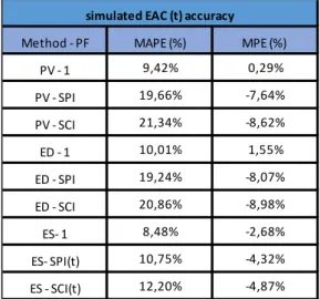
Table 5 and Table 6 are examples of how the forecasting accuracy is mentioned in the project cards. The lowest results for MAPE and MPE give the best methods for forecasting of the associated project.
Tracking description
This part of the project cards simply contains a description of the amount of tracking periods and whether or not the tracking was manually imported. The checkbox Authenticity shows if the dates, costs and durations are actually obtained from the project owner or manipulated.
Earned Value Management - EVM
The third and last section related to project control is the Earned Value Management (EVM). This methodology integrates information of costs, schedule and scope in order to perform project control. The project cards make use of nine time and eight cost forecasting methods.
First, the nine time forecasting methods can be split into three groups. Each one of these groups contains three methods with an overarching methodology, namely the planned value method (PVM), the earned duration method (EDM) and the earned schedule method (ESM). All this different methods differ in the fact that they are based on a specific performance factor (PF). Each one of this performance factors expresses an assumption about the expected performance of work.
All time and cost forecasting methods are not only represented in the project cards, they are also evaluated. The accuracy of every methodology is measured with the help of the MAPE and the MPE.
Table 7 and Table 8 are examples of how the forecasting accuracy is mentioned in the project card. The lowest results for MAPE and MPE give the best methods for forecasting of the associated project.
As can be seen at the upper side of Table 7, the planned duration and real duration is given, to calculate whether or not a project is late. If the result given in the column ‘late’ is negative, it means that the projected finished earlier than predicted, if not the project ran late.
Method - PF MAPE (%) MPE (%) Method - PF MAPE (%) MPE (%)
PV - 1 9,42% 0,29% 1 0,39% 0% PV - SPI 19,66% -7,64% CPI 2,09% -0,20% PV - SCI 21,34% -8,62% SPI 12,23% -8,30% ED - 1 10,01% 1,55% SPI (t) 3,75% -1,05% ED - SPI 19,24% -8,07% SCI 14,57% -9,31% ED - SCI 20,86% -8,98% SCI (t) 5,75% -1,66%
ES- 1 8,48% -2,68% 0.8 CPI + 0.2 SPI 2,96% -0,15%
ES- SPI(t) 10,75% -4,32% 0.8 CPI + 0.2 SPI (t) 2,32% -0,30%
ES - SCI(t) 12,20% -4,87%
simulated EAC (t) accuracy simulated EAC accuracy
The same can be said for Table 8, where the real cost as well as the budget at completion are stated. When the real cost is less than the BAC, the over budget will be negative meaning the planned budget was too big. Vice versa, the over budget is positive when the real costs exceded the BAC.
Table 7: The EVM of time forecasting
Table 8: The EVM of cost forecasting
BAC (€) € 11.562.500,00 Real cost € 10.687.800,00 Over Budget -7,56%
EAC MAPE (%) MPE (%) 2,3 1,0 3,3 -3,3 3,5 -3,3 3,6 -3,4 8,0 -8,0 8,0 -8,0 3,3 -3,3 3,4 -3,3 10287916,68 10278038,16 Real Accuracy 10288298,53 352177,67 357375,43 399517,03 385102,28 795615,91 774056,24 358186,84 361110,51 10831213,32 9821004,37 9812902,08 10289726,89 std dev (€) avg (€) 10291330,68 Method - PF 0.8 CPI + 0.2 SPI (t) 0.8 CPI + 0.2 SPI SCI (t) SCI SPI (t) SPI CPI 1
2 Flexible projects
A schedule of a project is made before any activity even started, which means that all necessary activities to complete the project should be known before the start. However, it is often difficult to specify every step of a job in advance. This problem has induced another way of thinking about project scheduling. Instead of fixed activities, flexibility is introduced. This refers to the fact that this type of scheduling contains alternative subgraphs. In standard projects every activity is fixed, which is contrary to this new scheduling manner, where alternative ways to execute one activity are available (Servranckx & Vanhoucke, 2019).
Due to this flexibility, the real structure of a project is unknown before its start. The first option into triggering flexibility is the possibility to implement or ignore specific activities, the second option is to foresee different ways of executing a specific main activity. The alternative choices for a main activity differ from each other in terms of costs, duration, quality or requested resources. This uncertainty leads to multiple different ways of constructing the project, which calls for a different way of scheduling.
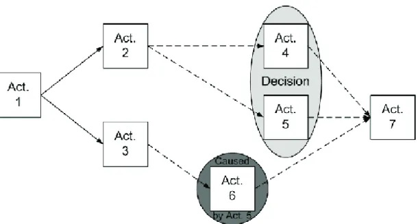
A simple example of a flexible network is given in Figure 6. With the help of this activity on the node network, the idea of a flexible project should become clear. As shown, activity numbers 4 and 5 are part of a decision round, which means only one of this two activities will take place. This is called a choice in terms of flexibility. Next to this, activity 6 is caused by activity 5. The caused by relation means that activity 6 follows after 5, but will not take place if activity 5 was not chosen in the decision round. The other activities - namely 1, 2, 3 and 7 - are mandatory activities, which signifies that no matter what choices are made, those activities will take place. The arcs show the relation between all the activities. Due to the choices, there are two possible ways of planning this project, namely {1, 2, 3, 4, 7} and {1, 2, 3, 5, 6, 7}. The chosen path will determine the costs, duration and requested resources (Nyhuis, 2014).
Methodology
1 Standard projects
First of all, this dissertation started with the extension of the existing database as quoted in the first part of the literature study. By implementing more real-life projects, an effort is made to create a truthful base from which a lot of statistic information can be derived. In total, 48 projects contained the accurate information to become part of the database.
1.1 The data
1.1.1 New projects
In order to expand the database, real-life projects are indispensable. Therefore, data was collected from groupworks and exercises of previous years. In total, 48 new projects were implemented in the database, every one of them needing an Excel file, a ProTrack file and a project card.
For most of the new projects a ProTrack file was available, those who did not consist of that information had a Microsoft Project file. This information could be uploaded into ProTrack and then forms the basis for further analysis. With the help of this ProTrack files, 48 Excels and project cards were created. The processing of this new data requires an excessive amount of labour, but it is the first crucial step in order to create a meaningful database. By implementing new projects, the database expended to an amount of 176 projects.
1.1.2 Brabo 2
To expand the scope of this research, an own real-life project of the company BAM Contractors was added in the database in addition to the obtained data. The project is called Noorderlijn, also known by the name Brabo 2 and is executed by BAM Contractors. Brabo 2 is a construction project that is localized in the centre of Antwerp and it includes the reconstruction of the Noorderleien and the Operaplein. The entire project extends over a length of six kilometres and it has a total duration of more than 4 years. The activities start on the Frankrijklei, continue in the direction of the Antwerp subway station Opera and the Operaplein. After this, the Frankrijklei becomes the Italiëlei, which is followed until the Noorderlijn. The whole project has a cost of over 250 million euros. Due to the size of the project, it is split into seven subprojects.
These subprojects are:
- Subproject 1: Leien
- Subproject 2: Operaplein overground - Subproject 3: Operaplein underground - Subproject 4: Tram line Eilandje - Subproject 5: Bridges Eilandje - Subproject 6: Tram line Ekeren - Subproject 7: Traction stations
These are the seven subprojects that were added to the database. Because of the size of the project in its entirety, all subprojects are implemented separately. Subproject 3, in its turn, has also been split up because of its size.
No resources or project control were applied on this project and the activity costs have been omitted due to trade secrets, so only a graph of the risk analysis and the Gantt chart could be made. The data of the risk analysis were all “standard – symmetric”, therefore the graph shows the same numbers for each activity. However, the project of BAM contractors contained way more activities compared to the other implemented files. The same approach was used to create the Gantt chart, but because of the multitude of activities, it becomes unclear and too extensive. For these kinds of projects, it would be better to make a chart on the level of work packages, and possibly a different chart for every package.
1.2 The database
When all projects were processed, an overview of the several projects could be made. The start of this overview already existed and was in need of some fine tuning.
When implemented in the database, every project is named as followed: first the letter C, than the year of implementation and the number of the project. This is called the project code. For example the code C2016-13 means the project was added in 2016 and it was the thirteenth project of that year. Next to this code, the project receives a name and sector, but since almost every project was created by others, there is a lack of information consisting these two items.
Next up, a summary of the general information is given. Just as presented in the header of the project cards, the completeness of the projects is stated with the help of the colors green, yellow and orange. The same applies for the authenticity data. Furthermore, the general information is the same as described in the project cards.
1.2.1 Regular/ irregular indicator
In addition to the four standard indicators, there is an additional indicator given in the database, namely the regularity indicator. This indicator was developed by Batselier and Vanhoucke in 2017 and optimizes time and cost forecasting, giving a better indication of the expected accuracy of an EVM forecasting method. The regular/ irregular indicator measures how much the actual PV-curve deviates from a linear PV-curve. This means that this indicator can only be calculated for projects with cost-information because only costs lead to a PV-curve. When RI equals 1, the project has a perfectly linear PV-curve, representing a perfect regular project. A value of 0 means the project is irregular. This is a project whose PV-curve deviates the most from a linear curve. This is in line with a project that has a constant EV-value throughout the entire duration and at the very start or end rises to a EV-value equal to BAC (Batselier & Vanhoucke, 2017).
Following formula is used to calculate the RI:
𝑅𝐼 = ∑ 𝑚𝑖− ∑ 𝑎𝑖 𝑖 1 𝑖 1 ∑ 𝑚𝑖 𝑖 1
In this formula, mi stands for the maximal possible deviation of the projects PV-curve from a perfectly
linear curve and ai for the actual deviation. Figure 7 gives the linear and the actual PV and what is
needed to calculate the RI (Batselier, 2016).
The limit for regular projects was set at 80%. Thus, when the RI exceeds 80%, the project is called regular; if not, the project is irregular.
1.2.2 Tracking
When the real cost and real duration are given, it is possible to measure whether or not the project ended on time and if the planned budget was sufficient.
The database consists of a column that will color red when the project is late and green if it ends on time or even early. To calculate whether or not a project finished on time, following formula is used. When the result exceeds 1 (100%), the project ended late and vice versa if the result is smaller than 1.
𝑜𝑛 𝑡𝑖𝑚𝑒 𝑜𝑟 𝑙𝑎𝑡𝑒 = 𝑟𝑒𝑎𝑙 𝑑𝑢𝑟𝑎𝑡𝑖𝑜𝑛 𝑝𝑙𝑎𝑛𝑛𝑒𝑑 𝑑𝑢𝑟𝑎𝑡𝑖𝑜𝑛
To check if the planned budget was sufficient, a following column consists of the possibility to calculate if a project is under or over budget. When the next formula gives an outcome smaller than 1, the real cost was smaller than expected and thus there is a case of under budget. In contrary, if the result exceeds 1, the real cost is higher than the expected one, which is called an overrun of the budget.
𝑜𝑣𝑒𝑟 𝑜𝑟 𝑢𝑛𝑑𝑒𝑟 𝑏𝑢𝑑𝑔𝑒𝑡 = 𝑟𝑒𝑎𝑙 𝑐𝑜𝑠𝑡 𝐵𝐴𝐶 This information is also represented in the project cards.
2 Flexible projects
The aim of this second part of the dissertation was to create a new database for flexible projects, with the existing database provided as basis. For this, a new overview was made, which only contains data of flexible projects. Before the creation, flexible projects had to be collected. In total 10 projects disposing of flexible information were available. The difference between the database for standard projects and that containing flexible projects is, in the database for standard projects, the information is given at project level. This while in the new database, the information is given at both activity and project level.
After collecting several projects, the second task was to group them in an overview. Theretofore it was necessary to determine the relevant flexibility indicators.
2.1 Flexibility overview
In order to provide a clear overview of a flexible project, it is important to represent the right information. The factors explained below are all grouped in the overview.
2.1.1 General indicators
For starters, just like in standard projects, every activity gets a number called the activity ID. Since not every activity will be performed, the total amount of activity ID’s will be much more than the amount of tasks that will actually take place. To fix this, there is a second manner of numbering the activities: the main activities. This indicator shows the exact number of activities that will take place, because the activities that are part of a decision round are all grouped under one main activity.
Next to this information, every activity gets its precedence relation assigned, just as used in standard projects. This precedence relation is simply the number of the activity that takes place before the current activity.
Another essential element in the project overview is the duration of an activity. The duration is split into three different columns: a minimum time, a normal time and a maximum time. These columns respectively represent the best case duration, the normal duration and the worst case duration.
The last element that is not new, so already used in the standard projects, is the information about the resources. When thinking about resources, two elements are necessary: the type of resource and the amount needed. Therefore, every project consists of two columns with the representation of that information.
2.1.2 Flexibility indicators
The following indicators are only applicable to flexible projects, with the first element being the mandatory indicator. When an activity is not part of a choice round, it will be mandatory, this means that without a doubt, this activity will take place during the project.
Secondly, an activity has the possibility of triggering a choice. When the triggering column is checked, the activity has the power of influencing the start of a choice. Therefore, the activities part of the following decision round, will be mentioned in the triggering which - column. In contrary, the triggered by - column will show which activity has led to the associated choice. Linked to this column is the alternative choice, because when a choice is triggered, it means there should also be an alternative activity you can choose. Logically, if there is a decision round for choosing one activity out of several activities, all these activities will have alternative choices.
The last item is called causing. Choosing a particular activity can cause the performance of another specific activity. It is important to notice that there is always a choice round before a causing relation can originate. The causing context is split into a causing which and a caused by column; those respectively represent the activities that are induced due to a specific choice and the activity that resulted in the current activity.
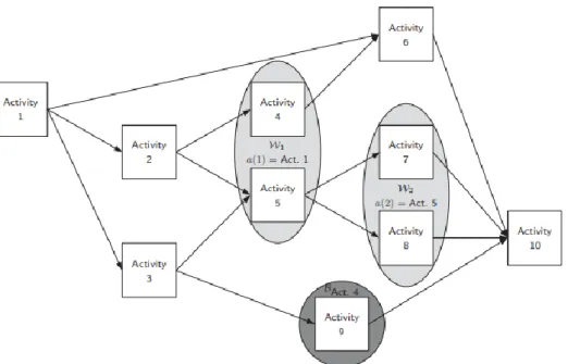
Figure 8 will explain the indicators that were just represented. First of all, the mandatory activities are easy to group, namely activity numbers 1, 2, 3, 6 and 10. Activity 2 triggers the first choice between activity 4 and 5, which means that activity 4 has activity 5 as alternative choice and vice versa. When activity 4 was chosen, this causes activity 9 to go through, but if 5 was performed, a second choice was triggered between activities 7 and 8. As shown by activity 9, the caused activity is not required to have a precedence relation with its causing activity.
2.2 Database
All the information just given, was collected into a database. Because of the difference between the information for standard projects and that containing flexible projects, a new database was created. As mentioned before, in this spreadsheet the information is given on both activity and project level. For both levels, general indicators as well as flexibility indicators are given. The difference is that on activity level, every activity consists of information related to the activity ID, duration and resources, but also related to flexibility indicators. Besides that, when the information is given on project level, the same elements are given but in a different way. The general information will contain the maximum activity ID, the sum of all main activities and that of the different kind of resources. The flexible information is put so that the average, maximum and minimum values are rendered in the spreadsheet.
The first tab of the database offers an overview of all projects. Hereby essential information is rendered, only on project level. For every project, the sector is identified and general information is given. Since this information draws a picture of the whole project, the total amount of resources is given as well as the total number of activities. As said before, the flexibility indicators are represented by the average, maximum and minimum values. The last elements are related to the network topology, including the SP, AD, LA and TF which are calculated only for the entire project. Every other tab contains the information of exactly one project, where all important data on activity level is displayed.
The database is created in such way that - for the requested project - both information at project and at activity level can be presented on one page. When the user needs specific information, the spreadsheet offers the option of choosing which information to show and thus the user has the power to decide which data is relevant in his case. Figure 9 shows how the user can select the preferred indicators. By offering this option, the goal is to foster a clear overview. Next to that, the user can choose to point out some important indicators. As shown in Figure 9, the user may pic the option Highlight all mandatory activities, which will logically highlight every row that contains a mandatory activity. Furthermore, the triggering and causing activities have the same ability. Naturally, every pointed detail can fade away by choosing to remove all highlighting. In order to create this spreadsheet, the Excel file made use of macros.
2.3 Project card
After formatting an overview of the information related to flexible projects, the second goal was to design a project card with useful information. Since the project cards for standard projects already existed, they were used as basis for the lay-out of the new project cards.
To be able to provide sufficient information, the first task was to convert the gathered information into ProTrack files. Because there was no software tool to convert the obtained information, it had to be done manually. In total, all ten projects were implemented into Protrack. However, ProTrack has no option to construct a flexible project, so all activities are supposed to be mandatory. Because of that the information generated from ProTrack is not 100% percent related to flexibility. This is an important point to take into account when making analysis.
The header of the card looks just the same as the project cards for the standard projects and thus contains no new information. Secondly, the project topology is offered. Important when processing this information is to keep in mind that the data is based upon the complete project network, ignoring the flexibility part. Due to this, the amount of activities and planned duration will exceed the actual values. The same notice should be made according to the network topology, where the indicators are calculated with the help of the entire project, ignoring any choices.
Just like the standard project cards, the next part consists of data related to risk analysis. Since none of the flexible projects contained cost information, only time and resource sensitivity were filled in, but the possibility to collect cost sensitivity is also created in case new projects would contain cost info. Again, this data is related to the entire project network, ignoring the alternative subgraphs.
The third section of the project card is called flexibility properties and - as the name suggests - contains specific indicators for flexible projects. An example is given in Table 9. First of all, the amount of main activities is shown; this item demonstrates the correct number of activities that will be performed at the end of the project. Next to this, the number of mandatory activities is foreseen. Third, the amount of activities triggering a choice is given; in this example only four activities will have a decision round as a result. Notice that this number says nothing about the amount of activities that are part of the choice. Following, the alternative activities are represented. This number says how many activities have one or more alternative options. The last indicator describes the amount of causing activities, thus how many activities were caused by choosing another specific activity.
Statistical analysis
1 Standard projects
Since the purpose of the database is to draw conclusions regarding several indicators, some statistical analysis took place. First of all, the standard projects are interpreted in order to detect which elements have a significant impact on the course of a project. To compare the existing database with the new projects, they are kept separate while taking statistics. Therefore, this dissertation used two different overviews, namely the existing overview with project data of the past years and a second collection in which the new projects are collected. First, some general information about the new data is given. Additionally, it is compared with the existing data.
1.1 General information
1.1.1 Number of activities
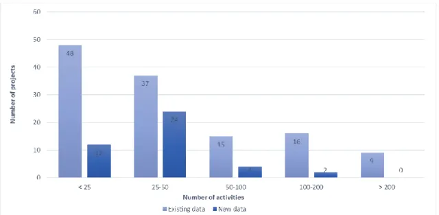
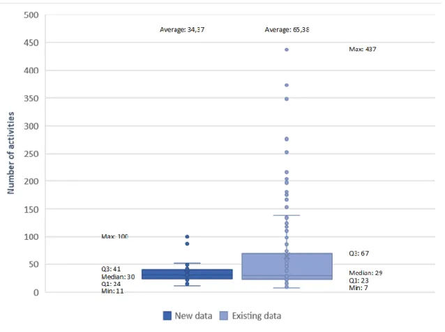
The most general information that can be given, is the amount of activities per project. Figure 10 shows how many projects contain a certain number of activities. When taking a closer look at Figure 10, it can be noted that the range of the number of activities related to the new data is lower than that of the existing data. The boxplot given in Figure 11 shows that the number of activities per project is far more scattered in the existing data than in the new obtained data. Most projects of the new data are located in the class of 25 to 50 activities. However, the largest number of projects within the existing data is situated in the set of few activities, there are also different existing projects with more than 200 activities. This results in a higher average number of activities for the existing data in comparison with the new projects. Next to that, the minimum values for the number of activities is roughly the same, as well as for the medians of the new and the existing data.
Consequently, there can be concluded that the new data mainly contains smaller projects with approximately the same number of activities. Only six projects contain more activities and still, the amount of activities is reasonably small compared to the existing data. To fulfil the information of the different numbers of activities, Figure 11 shows an overview with all activity data.
Figure 11: Boxplot with number of activities per project
As can be seen in Figure 10 and Figure 11, the number of activities part of the Brabo 2 subprojects is not included. Table 10 shows that Brabo 2 consists of a lot more activities than the other data and because of that, the figures would be unclear and establish a distorted vision of the reality. For that reason, the project is excluded from Figure 10 and Figure 11. However, Brabo 2 offers a project with a large amount of activities, which can be useful for other simulations and research.
Table 10: Activity data Brabo 2
New data Existing data Brabo 2
Minimum 11 7 132 Q1 24 23 661 Median 30 29 899 Q3 41 67 1396 Maximum 100 437 1796 Average 34,37 65,38 991,57
1.1.2 Project duration
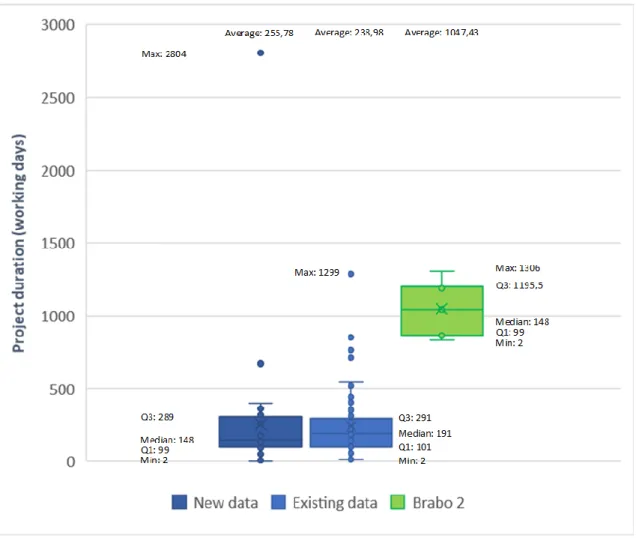
Next up, the project duration is discussed. The duration in the overview Excel is expressed in days and there should be noticed that one year contains 260 workdays.
Based on Figure 13, it can be noted that there is one case that stands out. One project of the new data has a duration of 2804 days, which amounts to a lead time of approximately 7 years, while Table 10 shows that the new data only has a maximum of 100 activities. This may suggest that the time units, used to state the duration, were various and did not always equal the real values, thus the absolute value of the durations are falsely reported. However, the duration is supposed to be filled in in such way that the relative values within one project are always correct. As long as the correct relative ratio is used, this does not affect the topological indicators.
Because it is not known whether the actual time units were used, it is difficult to draw conclusions based on project duration. If it is correct to assume that the other projects use the correct time units, based on Figure 12 and Figure 13 can be concluded that the new data is quite diverse. It contains both long and short projects. Due to this one project with a relatively long duration, the average duration is not in proportion. Brabo's projects are of course those with the longest term. This is due to the large number of activities that is present in the project. It is known that the whole Brabo 2 case had a duration of more than four years.
1.1.3 Budget at completion - BAC
Subsequently, the budget at completion is being viewed. First of all, it should be noted that not every project contains information about budget, therefore no cost statements can be created on behalf of these projects. In some projects this information was omitted due to trade secrets, such as in the Brabo 2 subprojects. Only 29 out of the total of 48 new projects consist of information regarding costs. Figure 14 shows the diversity of all the projects with information about budget at completion. It may be noted that among the projects that contain cost data, there are also projects present, the cost of which have been multiplied by a certain factor, this due to trade secrets. Hence, it is also difficult here to make conclusion about the diversity of the new data, however this is also the case for the existing data.
Because of the fact that some data has been multiplied by a certain factor, the boxplot with the accompanying table is not given. This would give a distorted picture.
1.1.4 Resources
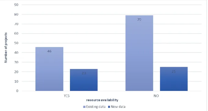
Finally, the resource availability is observed. Just as in the previous chapter related to costs, not every project contains information about resources. This causes the fact that not for all projects a resource statement can be made. As can be seen in Figure 15, only 23 projects of the new data contain resources. This means that 25 projects do not display information concerning resources. As well as with the existing data, the majority has no information about this element. Remarkable is that only two projects contain both renewable and consumable resources; one of them is part of the existing data, the other is categorized under the new data. The rest only contains renewable resources.
1.2 Network topology
After some general information concerning the new data, statistics on the subject of topological indicators are carried out. Further, in this context, one specific remark needs to be made. Because of an error in Protrack, it was not possible to determine the topological indicators of subproject 5 of Brabo 2.
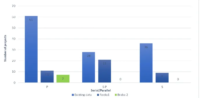
1.2.1 Serial/ parallel indicator - SP
First, the SP indicator is discussed. This parameter shows whether a project is scheduled in a serial or parallel way. If the SP indicator is less than 40%, the project is considered as parallel. Is the indicator higher than 60%, then the project is considered as serial. As shown in Figure 16, most of the new data belongs to both serial and parallel, which is in contrast with the existing data, where only a relatively small section is a combination of serial and parallel. The majority of the existing data is parallel, while the amount of parallel projects within the new data is relatively small. What is striking, is at both new and existing data, the share of parallel projects is much greater than the share of serial projects. This means that a lot of projects have the ability to execute activities at the same moment and related to this, the number of activities part of the critical path will be smaller than in the case of a serial project.
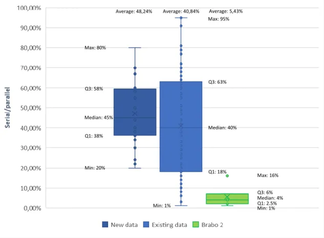
As shown in the boxplot in Figure 17, the existing data is far more spread between 100% serial and 100% parallel, while the new data is located between a seriality of 20% to 80%. Figure 16 shows that the complete case of Brabo 2 is parallel. Due to the huge amount of activities in this project, that continues over multiple years, it is logical that many activities are executed at the same time.
Figure 17: Boxplot of the serial/ parallel indicator Min: 20%
Q1: 38% Median: 45% Q3: 58% Max: 80%
Average: 48,24% Average: 40,84% Average: 5,43%
Min: 1%Q1: 2,5% Median: 4% Q3: 6% Max: 16% Min: 1% Q1: 18% Median: 40% Q3: 63% Max: 95%
1.2.2 Activity distribution - AD
Next up, the activity distribution is examined. Figure 18 shows that the existing data has a wide spread of projects with all kinds of activity distribution. The figure renders that this data is located between a minimum of 17% and a maximum of 100%. The new data only consists of projects with a minimum AD of 26% and a maximum AD equal to 85%, so it is less outspread. Besides that, it is notable that the averages of the three categories are close to one another.
Figure 18: Boxplot of activity distribution
As said before, this indicator measures the distribution of activities over the levels of the project. When AD is equal to one, the distribution is highly skewed, while when equal to zero, it is uniform. Since the averages are 55.2% for the new data, 57% for the existing data and 52.5% for Brabo 2, almost all projects are located in the middle between a skewed and a uniform distribution.
1.2.3 Length of arcs – LA
The third indicator is the length of arcs. The LA is a measurement for the length of each precedence relation between two activities. So, LA measures short precedence relations in the network. The more short precedence relations, the higher the value of the indicator. Figure 19 shows that the indicator for both new and existing data is spread between 0% and 100%. But when taken a look at the boxplot, there can be noted that most projects have a low value, meaning that most activities of the projects can be shifted further in the network.
Figure 19: Boxplot of the length of arcs
It should be noted that Brabo 2 was not implemented in Figure 19 and Table 11, since the LA is zero for all parts of the project. This may be due to the huge number of activities in this project. Hence, the impact of the number of activities was examined. An analysis of all projects shows that almost all projects that contain more than 100 activities have a LA indicator that is equal to zero. Only a few exceptions have an indicator that exceeds zero. The projects with less than or equal to 100 activities also have a low value, yet significantly higher than those with more than 100 activities. This information is displayed in Table 12.
New data Existing data > 100 activities ≤ 100 activities
Minimum -5% -2% Minimum 0% -5% Q1 1% 0% Q1 0% 0% Median 7% 4% Median 0% 7% Q3 29% 22% Q3 0% 27% Maximum 100% 100% Maximum 26% 100% Average 19,71% 13,91% Average 1,50% 17,72%
1.2.4 Topological float – TF
Subsequently, the topological float is discussed. This measures the density of the project. In a high dense project, activities have less freedom to shift. Figure 20 shows the boxplot of the topological float. The existing data is wide spread, it contains projects with a TF of 0% to 100%. This means that this data contains at least one project where every non-critical activity can be shifted without affecting the end date. Both new and existing data have a minimum TF indicator equal to 0%, meaning that they contain at least one project where the shifting of any activity will lead to a shifting of the end date of the project.
Figure 20: Boxplot of the topological float
Figure 20 shows that the average TF is 32.4% for the new data and 37.6% for the existing data. Since these percentages are relatively small, this means that most projects are sensitive to activity shifting. So when one activity changes its date, the end data of the entire project will be affected.
Notable are the values for the data of Brabo 2. The average TF is twice as high as for the other data. An average of 69% means that the biggest part of the non-critical activities can be shifted without influencing the end date.
Average: 26,20% Average: 37,64% Average: 69%
Min: 0% Q1: 9% Median: 20% Q3: 40% Max: 72% Max: 81% Q3: 78,5% Median: 74% Q1: 66,5% Min: 38% Min: 0% Q1: 19% Median: 31% Q3: 78,5% Max: 100%
1.2.5 Regular/ irregular indicator – RI
The regularity of a project can only be calculated if the project contains costs. Since the RI is based upon the information of the PV curve, no statement can be made if a PV curve is absent. As seen in subgraph 1.1.3, only 29 new projects consisted of information regarding costs, thus only those projects are included in the RI columns in Figure 21, because the other 18 do not contain any cost information. Brabo 2 is not included since no indications of costs were given. No cost means no PV curve and no RI indicator.
A regular project means that the RI indicator exceeds 80%. When the regularity indicator is located between 60% and 80%, it is called a mildly irregular project. The last category contains all projects with a regularity less than 60%, they are called strongly irregular.