A STATISTICAL STUDY OF
WEATHER-RELATED
DISASTERS
Past, present and future
PBL Netherlands Environmental Assessment AgencyMailing address PO Box 30314 2500 GH The Hague The Netherlands Visiting address Oranjebuitensingel 6 2511VE The Hague T +31 (0)70 3288700 www.pbl.nl/en
A statistical study of weather-related disasters: Past, present and future
© PBL Netherlands Environmental Assessment Agency The Hague/Bilthoven, 2012
ISBN: 978-94-91506-04-8
PBL publication number: 555076001 DGIS project E555076
Corresponding author hans.visser@pbl.nl Author(s)
Hans Visser, Arno Bouwman, Arthur Petersen and Willem Ligtvoet
Graphics
Marian Abels, Filip de Blois, Allard Warrink Production co-ordination
PBL Publishers Layout
Martin Middelburg, Studio, RIVM
This publication can be downloaded from: www.pbl.nl/en. A hard copy may be ordered from: reports@pbl.nl, citing the PBL publication number or ISBN.
Parts of this publication may be reproduced, providing the source is stated, in the form: Visser, H. et al. (2012), A statistical study of
weather-related disasters: Past, present and future, The Hague: PBL Netherlands Environmental Assessment Agency.
PBL Netherlands Environmental Assessment Agency is the national institute for strategic policy analysis in the field of the environment, nature and spatial planning. We contribute to improving the quality of political and administrative decision-making, by conducting outlook studies, analyses and evaluations in which an integrated approach is considered paramount. Policy relevance is the prime concern in all our studies. We conduct solicited and unsolicited research that is both independent and always
Contents
Abstract 8
1 Introduction 8
1.1 Weather-related disasters 8
1.2 The approach followed in this report 8 1.3 This report 9
2 Background and data 12
2.1 OECD and BRIICS 12
2.2 The CRED database EM-DAT, terminology 14 2.3 Maps for flood impact projections 14 2.4 Trend estimation methodology 16
3 Global disaster burden 18
3.1 Disaster burden and disaster types 18 3.2 Trends in disaster burden 19
3.3 Conclusions 23
4 Regional spreading of disaster burden 26
4.1 Weather-related disasters 26
4.2 Hydrological, meteorological, climatological and geophysical disasters 26 4.3 Flood and drought disasters 29
4.4 Discussion 30 4.5 Conclusion 30
5 Trends in regional disaster burden 32
5.1 Trends in losses 32
5.2 Trends in people affected 35 5.3 Trends in people killed 35
5.4 Trends in the number of disasters 35 5.5 Conclusions 35
6 How can trend patterns be explained? 38
6.1 Factors that shape disaster risks 38 6.2 Changes in wealth 38
6.3 Changes in population 40 6.4 The role of climate change 41
6.5 Vulnerability, a function of adaptation and political stability 43 6.6 Conclusions 47
7 Disasters and disaster trends in the media 48
7.1 Individual disasters and climate change 48
7.2 Contradictory trends presented in the literature 49
7.3 Presenting data on disasters over extended periods of time 50 7.4 Conclusion 51
8 Future of water- and weather-related disasters 54
8.1 Drivers of disaster burden 54 8.2 Disasters - regional case studies 56 8.3 Conclusion 57
9 Population and value at risk from floods 58
9.1 Two models for coastal flooding calculations 68 9.2 Population at risk 59
9.3 Value at risk 61
9.4 Cities most vulnerable to floods 62 9.5 Conclusions 63
10 Conclusions and outlook 66
10.1 Summary and conclusions 66 10.2 Future research 69
Glossary 72
References 74
Appendices 76
Appendix A Disaster databases and uncertainties 76 Appendix B Normalisation 79
Appendix C Construction of future flooding impact maps in detail 81 Appendix D Event report for four severe disasters 83
Abstract
Disasters such as floods, storms and droughts may have serious implications for human health, the environment, and the economic development of countries. Examples of severe disaster impacts are: the 1983 drought in Ethiopia and Sudan, which led to over 400,000 people killed by famine; the 2002 drought in India and floods in China which together affected 450 million people; and the 2005 Hurricane Katrina and subsequent flooding in the United States, which led to economic damages valued at USD 140 billion (in 2010 US dollars). This report places such severe disaster consequences in a statistical context.
The report’s main focus is on weather-related disasters, subdivided into three groups: meteorological disasters (tropical and extra-tropical storms, local storms), hydrological disasters (coastal and fluvial floods), and climatological disasters (droughts, temperature extremes (e.g. heatwaves). In addition to this categorisation, statistics were calculated for three regions: the OECD countries (the developed countries), the BRIICS countries (the emerging economies Brazil, Russia, India, Indonesia, China and South Africa) and the RoW countries (rest of the world, developing countries).
A number of conclusions were drawn. First, the global spread of disaster burdens appears to differ as a function of disaster type: (i) economic losses are mainly due to meteorological disasters (52% of global total), (ii) most people are affected by hydrological disasters (63% of global total), and (iii) the number of people killed mainly refers to climatological disasters (56% of global total).
Furthermore, disaster burdens appear to depend strongly on region, showing the following characteristic pattern: (i) the highest economic losses occur in OECD countries (63% of global total), the largest number of people affected occurs in the BRIICS countries (84% of global total), and the largest number of people are killed in the rest of the world (77% of global total). These findings are based on averages over the 1980–2010 period.
Second, state-of-the-art estimates for trends in disaster burdens show seemingly contradictory results. On the one hand, the disaster burden increased enormously over the 1980–2010 period (statistically significant in all cases). Economic losses in OECD countries, for example, increased by a factor of 4.4. On the other hand, all but one of the trend patterns show that disaster burdens increased over the first half of the sample period (1980– 1995) and stabilised thereafter. The only exceptions are losses in the OECD countries: these show continuous growth over the whole sample period.
Third, the report provides explanations for disaster trend patterns. Generally, such explanations are difficult to give since they depend on four interacting factors: (changes in) wealth, population, climate and vulnerability. It would be misleading to draw simple conclusions, such as stating that recent floods in Pakistan are due to climate change. By normalisation of disaster trends, that is, correcting for changes in wealth and/or population, trend patterns for economic losses and people affected appear stable. These results are consistent with historical drivers of
these disaster burden patterns; the frequency and intensity of storms and floods. No global or regional trends were found for these drivers (although significant trends were found on local scales). Strong trends were found for temperature-related extremes. However, these extremes represent a relatively small contribution to economic losses and people affected.
Fourth, the number of studies on future disaster burdens is limited, and mainly focuses on storms and floods. Case studies indicate that economic losses due to disasters may increase over the 2010–2040 period. This increase could largely be explained by a growing world population and increases in wealth, and to a lesser extent by climate change. In general, predictions of disaster burdens are hampered by the complex interactions between changes in wealth and population, in climate drivers of disasters and in vulnerability.
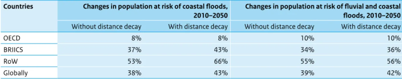
Finally, results are provided from a PBL study with respect to changes in the number of ‘people at risk’ and the amount of ‘value at risk’ due to floods. The study covers the 2010–2050 period and assumes stable climate variables. The results show that, for all regions, the number of ‘people at risk’ is expected to increase between 2010 and 2050: by 9% in OECD countries, 37% in BRIICS countries and 55% in the rest of the world (RoW). If amounts of ‘value at risk’ are compared between 2010 and 2050, lowest percentages are found for OECD countries: around 130%. Changes for the BRIICS countries and those in RoW are 650% and 430%, respectively. Calculations for cities most vulnerable to floods show that these are located in coastal zones and predominantly in Southeast Asia. Examples are Dhaka, Kolkata,
Shanghai, Jakarta, Mumbai, Bangkok, Wuhan, Jakarta, Khulna, Guangzhou, Manila, Patna and Ho Chi Minh City. All calculations have been based on the OECD baseline scenario for 2010 to 2050.
one
Introduction
1.1 Weather-related disasters
Floods, storms, heatwaves and droughts are disasters that may have serious implications in terms of health, the environment, and economic development. For example, drought in Ethiopia and Sudan, in 1983, led to a famine that killed 400,000 people. Drought in India, and floods and storms in China, in 2002, affected 450 million people. Hurricane Katrina and subsequent flooding led to economic damages valued at USD1 140 billion.
Drivers of such disasters are weather and climate extremes and their implications will be termed here as weather-related disasters or catastrophes. An important report on this topic is the IPCC special report on managing the risks of extreme events and disasters to advance climate change adaptation (IPCC-SREX, 2012). Netherlands Environmental Assessment Agency, or PBL in short, was involved in the review process of this report and parts of the present report have been initiated by analyses and comments made within the IPCC review process.
However, this was not the mean reason for writing this report. The report serves as background report to a PBL contribution to the OECD Environmental Outlook to 2050 (OECD, 2012). For Chapter 5 of this outlook report, PBL analysed both global and regional disaster burdens (OECD countries, BRIICS2 countries and the Rest of the World).
Furthermore, results were divided according to disaster burden into hydrological disasters (floods), climatological
disasters (temperature extremes and drought),
meteorological disasters (storms) and, to a lesser extent, geophysical disaster events (tsunamis, earthquakes, volcano eruptions). These four types of disasters are illustrated in Figure 1.1, for the year 2010. The figure shows 960 disasters, with a distinction between four types of disaster events and varying in severity. Another part of the PBL contribution to the OECD report (2012) relates to an overview of disaster projections for the future, based on the literature available. For one specific disaster type (fluvial and coastal floods) projections were made up to the year 2050, based on demographic and economic projections (OECD baseline scenario). In doing so, climatic conditions related to floods were assumed to be constant over time (no changes in extreme precipitation and/or coastal storms). Next to the IPCC-SREX and OECD contributions, the results described here have led to a review article on the statistical treatment of weather extremes and disasters for Climate of the Past (Visser and Petersen, 2012).
1.2 The approach followed in this
report
The character and severity of impacts depends not only on the extremes themselves but also on exposure and vulnerability (IPCC-SREX, 2012). Here, exposure means the
one one
number of people living in disaster-prone regions, as well as the number of economic, social or cultural assets in these regions. Vulnerability stands for the propensity of predisposition of a country or region to be adversely affected by disasters. Therefore, to avoid pitfalls in the attribution of disasters or disaster patterns to factors such as climate change, both historical disaster data and data on explanatory factors were gathered to put patterns of disaster burden into perspective. The role of growing wealth and growing population will be dealt with through a process called normalisation.
The reliability of disaster data, taken from the CRED database EM-DAT, was established beforehand. From this database, historical disaster data were analysed on different time scales (mainly on the 1980–2010 period, and where necessary the 1950–2010 or 1900–2010 period). Three aspects of disaster burden are considered throughout the report: the number of people killed, the number of people affected in some way (injured, homeless or evacuated) and the corresponding economic losses.
As stated above, disaster burden and trends therein are analysed both on a global scale and regionally: developed countries (OECD), emerging economies (the BRIICS countries) and the developing countries (Rest of World). In doing so, the report gives important information on disaster trends and burden, the underlying drivers and
the spatial spreading. However, the report is not directed to the management of disaster risks. At present, 130 governments are engaged in self-assessments of their progress towards the so-called Hyogo Framework for Action (HFA). This framework contributes to what is now the most complete global overview of national efforts to reduce disaster risk. For the management of disaster risks and progress therein, the reader is referred to the following two reports: UNISDR (2011) and IPCC-SREX (2012).
1.3 This report
The report is organised as follows. In Chapter 2 the background of the three regions used throughout this report is described: OECD, BRIICS and remaining countries (Section 2.1). Furthermore, an overview of the disaster databases is given, along with definitions of disaster terminology (Sections 2.2 and 2.3). In Section 2.4 the statistical treatment of trends in disaster data is shortly exemplified.
Chapter 3 gives on overview of the results for disaster burden (Section 3.1) and trends therein (Section 3.2) on a global scale. Results are split-up as for different disaster types. In Chapters 4 and 5 the same analysis is
performed, but now split-up for three regions. In Chapter 4, disaster burdens are quantified, while analyses of Figure 1.1 Geophysical events (earthquake, tsunami, volcanic activity) Meteorological events (storm) Hydrological events (flood, mass movement) Climatological events
(extreme temperature, drought, wildfire) Selection of significant
loss events Natural catastrophes
Volcanic eruption
Island, April Heat wave/Drought/Wildfires Russia, Summer Severe storms, floods
United States, 13–15 March
Earthquake Haiti, 12 Jan. Hurricane Karl, floods
Mexico, 15–19 Sept.
Earthquake, tsunami Chile, 27 Feb.
Winter Storm Xynthia, storm surge Southwestern/Western Europe, 26–28 Feb.
Flash floods France, 15 June
Floods, flash floods Pakistan, July – Sept.
Earthquake China, 13 April
Floods Eastern Europe, 2–12 June
Floods, flash floods, landslides China, June – July Landslides, flash floods China, 7 Aug.
Hailstorms, severe storms Australia, 22 March / 6 March
Earthquake New Zealand, 3 Sept. Severe storms, hailstorms
United States, 12–16 May
Severe storms, tornadoes, floods United States, 30 April – 3 May
Typhoon Megi China, Philippines, Taiwan, 18–24 Oct. Floods Australia, Dec. 2010 – Jan. 2011 Natural catastrophes, 2010
one
trends in disaster burdens are given in Chapter 5. Here,the analyses are confined to weather-related disaster events only. In Chapter 6 the trend patterns found in Chapter 5, are explained as far as possible. Here, changes in wealth, changes in population, the role of climate change and changes due to adaptation are treated in separate sections. Chapter 7 shortly deals with
communicational aspects of disasters: the attribution of individual disasters to climate change (Section 7.1) and results in the literature which are contradictory to results presented here (Section 7.2).
Chapters 3 through 7 deal with historical data on disaster burden. In the subsequent Chapters 8 and 9 the future of disaster burden will be dealt with. Chapter 8 gives a short overview of the future of disasters as presented in the literature. In Chapter 9 a PBL case study for flooding on a global scale is given, with predictions for people at risk and economic losses at risk up to the year 2050. Also a summary is given for cities most vulnerable to floods. The report ends with a summary, conclusions and a
suggestion for future research items (Chapter 10).
Notes
1 In 2010 US dollars.
2 BRIICS: Brazil, Russia, India, Indonesia, China and South Africa.
two
Background and data
2.1 OECD and BRIICS
Disaster data throughout this report are analysed on a global scale and the globe is divided into three regions: the OECD countries, the BRIICS countries and the Rest of World. See Figure 2.1 for the spatial spreading of theses regions. The background of these regions is as follows. The Organisation for Economic Co-operation and Development (OECD) is an international economic organisation of 34 countries, founded in 1961, to stimulate economic progress and world trade. It is a forum of countries committed to democracy and the market economy, providing a platform to compare policy experiences, seek answers to common problems, identify good practices, and co-ordinate domestic and
international policies of its members.
The initial 20 member countries, from 1961 onwards, in alphabetical order, consisted of: Austria, Belgium, Canada, Denmark, France, Germany, Greece, Iceland, Ireland, Italy, Luxembourg, the Netherlands, Norway, Portugal, Spain, Sweden, Switzerland, Turkey, the United Kingdom and the United States of America. Later, the following 14 countries also became a member: Australia, Chile, Czech Republic, Estonia, Finland, Hungary, Israel, Japan, Mexico, New Zealand, Poland, Slovenia, Slovakia and South Korea1. Most OECD member countries are
high-income economies with a high Human Development Index (HDI) and are regarded as developed countries.
BRIICS is an acronym for Brazil, Russia, India, Indonesia, China and South Africa. This group of countries is often denoted as the emerging economies; initially this group only consisted of Brazil, Russia, India and China (then called BRIC countries). Later, in 2010, South Africa was added, changing BRIC to BRICS. The term ‘emerging economies’ was first raised by the investment bank Goldman Sachs and was derived from their GDP projections for the year 2050. They also added Indonesia to the BRICS countries, leading to the acronym BRIICS. In the Goldman Sachs calculations, BRIICS countries are part of the ten largest economies in the world by 2050. As a characterisation of OECD countries, BRIICS countries and the Rest of World the population and GDP
developments is given in Figure 2.2. The left panel shows the GDP for these three regions, expressed as PPP (Purchasing Power Parity). PPP is a presentation of GDP where country data have been corrected for the value goods and services. Not surprisingly, the GDP of OECD countries (blue line) is dominant in the panel. It should be noted that the OECD presents projections of GDP for the 2010–2020 period (see OECD, 2012, Figure 2.6).
The middle panel shows the population growth in the three regions. Here, the BRIICS countries dominate. It should be noted that the OECD presents population growth for the 1970–2050 period (see OECD, 2012, Figure 2.1).
two two
Figure 2.1
OECD and BRIICS countries, 2012
OECD countries BRIICS countries Rest of world Source: PBL Figure 2.2 1980 1990 2000 2010 0 10 20 30 40 50 trillion USD2010 OECD countries
BRIICS (Brazil, Russia, India, Indonesia, China, South Africa) Rest of the world
GDP GDP and population 1980 1990 2000 2010 0 1000 2000 3000 4000 millions Population 1980 1990 2000 2010 0 10 20 30 40 thousands USD2010 GDP per capita Source: GISMO (PBL)
two
The right panel combines the data shown in the othertwo panels: the GDP-PPP per capita. Now, the dominance of the OECD countries is even stronger than in the presentation of GDP-PPP. Furthermore, it can be seen that the GDP per capita in BRIICS countries start to accelerate only very recently, from 2005 onwards. For more information the reader is referred to OECD (2012, Chapter 2).
2.2 The CRED database EM-DAT,
terminology
For this report the emergency database, EM-DAT, is chosen. EM-Dat is a global database maintained by the World Health Organization (WHO) and the Centre for Research on the Epidemiology of Disasters (CRED) at the KU Leuven University, Belgium. Since 1999, the Office of Foreign Disaster Assistance (OFDA) of the United States Agency for International development (USAID) has also supported CRED in improving the database.
OFDA and CRED have established and maintained the database to improve capacities to cope with disasters and to prevent them from happening. The main objective of the database is to serve the purposes of humanitarian action at national and international levels. It is an initiative aimed at rationalising decision-making for disaster preparedness as well as providing a strong base for vulnerability assessment and priority-setting. EM-DAT regularly validates and updates disaster data from various national and international organisations that specialise in disaster information analysis and dissemination (Adikari and Yoshitani, 2009). EM-DAT is the selected data source for this report because it is the only database that records all the components of disasters, and on a non-commercial basis. It is widely used by international agencies and thought to be a very reliable data source on disasters throughout the world, although other databases also exist: the
Dartmouth Flood Observatory, the NatCat database of Munich Re, and the Sigma database of SwissRe.
EM-DAT and Munich Re apply the following classification of disaster events (cf. Figure 1.1):
• Geophysical events originate from solid earth, i.e., earthquakes, volcano eruptions and mass movements. • Meteorological events are caused by short-lived/small
to mesoscale atmospheric processes (in the spectrum from minutes to days). These events include hurricanes (typhoons), extra-tropical storms and local storms.
• Hydrological events are caused by deviations in the normal water cycle and/or overflow of bodies of water caused by wind set-up. These events include coastal and fluvial floods, flash floods and mass movements. • Climatological events are caused by long-lived/
mesoscale-to macro-scale processes (in the spectrum from intra-seasonal to multi-decadal climate variability). These events include cold waves, heatwaves, other extreme temperature events, droughts and wildfires.
For each of these four disaster types a typical disaster report has been given in Appendix D, taken from the Munich Re website on disaster statistics.
Disaster burden is summarised in three indicators: economic losses, the number of people affected and the number of people killed. Definitions of these terms are provided in the Glossary at the back of this report. The reliability of the CRED database was verified by PBL using a number of tests, described in Appendix A. One such test is illustrated in Figure 2.3. Here, the disaster records in EM-DAT are validated as for historical disasters in the Netherlands, between 1900 and 2010. This validation was enabled by detailed disaster descriptions taken from the study by Buisman (2011). This study describes of disasters over the past 800 years using a wide range of documentary sources. Figure 2.3 shows that disasters in the Netherlands are absent in EM-DAT before the year 1950. The records after 1950 were found to be complete. In one case a disaster was termed as ‘storm’, while it should have been categorised as ‘fluvial flood’.
From this test case and the general advice of CRED, disaster data will generally be presented throughout this report from 1980 onwards. For more information on EM-DAT in relation to the NatCat and Sigma databases, the reader is referred to Guha-Sapir and Below (2002).
2.3 Maps for flood impact projections
Chapter 9 analyses the impact of floods on the population and assets at risk, for the year 2050, compared to the year 2010. These analyses are on a global scale. For such an assessment three different data sets are required: (i) a global map with flood-prone areas, (ii) a global map with the distribution of population (in 2010 and 2050) and (iii) idem for assets. The combination of these maps yields maps for the population and assets at risk. Ideally data on floods, population and assets would have been available for the current situation and for one or more climate and economic scenarios. However, in the approach taken here it is assumed that the intensity and frequency of floodstwo two
are constant over time. The same holds for vulnerability. No changes in vulnerability will be taken into account. Flood-prone areas
To construct a map that shows flood prone areas, the following three different data sets were used:
• The Dartmouth flood database. The Dartmouth Flood Observatory2 translated many floods, imaged by
satellite, to detailed maps of inundation extents. These maps were collected by PBL and integrated into one map. Note that this aggregated map does not contain information on water depth or the frequency of flooding. The map contains flood events from 1985 to 2010. One could say the map represents one-in-twenty-five-years events.
• The Global Lakes and Wetlands Database (GLWD) (Lehner and Döll, 2004). From the GLWD, the category of freshwater marshes and floodplains was selected, as these areas could be flooded. The Dartmouth database as well as this GLWD category contain mainly
information about fluvial floods.
• Data from the Shuttle Radar Topographic Mission (SRTM)3 was used to construct a map of coastal
flood-prone areas. The SRTM is a highly detailed digital elevation map (DEM) (3 arc seconds ~90 by 90 metres). The SRTM data set was aggregated to a spatial resolution of 30 by 30 arc seconds using the minimum (that is the lowest elevation) value within each 30 arc seconds cell. Following the aggregation, the SRTM was used to derive low-lying areas along the coast which
might be flooded by the sea when confronted with a five-metre storm surge. These areas could simply be determined by subtracting five metres from the elevation map. Subsequently, all cells with a value of less than zero were selected and inland sinks were removed. This method, using different limiting elevation values, is often used to select low-elevation coastal zones (LECZ) (Vafeidis, 2011).
The GLWD has a spatial resolution of 30 by 30 arc seconds (~600 by 600 metres). Therefore, the more detailed Dartmouth map and the more detailed SRTM were scaled up to that resolution. Combining these three maps a resulting map was gained with potential flooded areas, on a resolution of 30 by 30 arc seconds. This map has a binary character: the value true (prone to floods) or false (see Figure 2.4). Note that this map does not contain any information on the return period and the water depth of a flood.
Population and GDP in 2010 and 2050
Population and GDP-PPP data were provided by the GISMO model4. Regional population projections from
GISMO were scaled down first to the national and then to the grid level (0.5 by 0.5 degrees). Here, use was made of (i) the UN World Population prospects which provide data at country level and (ii) CIESIN’s Gridded Population of the World. A linear downscaling algorithm was used to scale down to the grid level needed5. Next, the
urban-rural distinction was made using grid-based estimates of Figure 2.3 1900 1920 1940 1960 1980 2000 2020 0 500 1000 1500 2000 2500
Number of people killed
Disasters missing from CRED database (Buisman, 2011) – 1906: coastal flood – 1916: coastal flood – 1921: drought – 1926: river flood – 1928: storm – 1929: extreme cold – 1947: extreme cold / heat
Disaster records for the Netherlands in the CRED database EM-DAT
Source: PBL
Example of a reliability check of the CRED database EM-DAT. Disaster records were checked for the Netherlands over the 1900–2010 period. Disasters before the year 1950 appear to be absent in the database. Disaster data were validated using data from Buisman (2011).
two
the urban and rural population from GRUMP (CIESIN), in combination with the different national growth figures for rural and urban populations using the UN world urbanisation prospects6 (UN, 2003). For different
IPCC-SRES scenarios, different variants (low, medium, high) of the UN population prospects were chosen. For the ‘impact in 2050 in flood prone areas’ study the medium population variant was scaled down to the 0.5 degrees grid level.
Unfortunately, there are no global geographical data sets on assets or ‘wealth’. Therefore, GDP - PPP per capita was taken as an approximation for ‘assets’. The GDP-PPP is based on GDP per capita data per country from the World Bank’s world development indicators (WDI). Here, the base year and economic growth rates from the IPCC-SRES scenarios were chosen7. Convergence in the income gap
in relative terms was taken into account in a dynamic way. That is, for different regions a different convergence year (which is the starting point of convergence) in the time period to 2100 was chosen. Regional economic growth rates combined with the GDP per country in the base year resulted in GDP for the scenarios per country. The result was GDP-PPP per capita on a country level. To calculate ‘population at risk’ and ‘value at risk’, data on population and GDP per capita were further scaled down to 30 arc seconds, the resolution of the flood-prone areas (Appendix B).
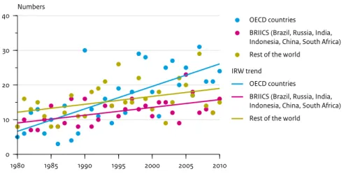
2.4 Trend estimation methodology
Choosing a specific trend model is not a trivial matter. A scan of the climate literature on trend methods provides a large number of models. To name but a few: low pass filters, ARIMA models, linear trend with OLS, kernel smoothers, splines, trends in rare events by logistic regression, Bayesian trend models, simple moving averages, neural networks, structural time-series models (STMs), smooth transition models, Multiple Regression models with higher order polynomials, Mann-Kendall tests for monotonic trends (with or without correction for serial correlations), robust regression trend lines (MM or LTS regression), LOESS and LOWESS smoothing, Students t-test on sub-periods in time, extreme value theory with a time-varying location parameter, and last not but least, some form of expert judgment (drawing a trend ‘by hand’). See Visser and Petersen (2012) for more details. The trend model almost exclusively applied in the field of disaster management is the OLS straight line. This model has the advantage of being simple and generating uncertainty information for any trend difference [μt - μs](indices ‘t’ and ‘s’ are arbitrary time points within the sample period). Disadvantage is the linearity assumption which is not desirable in all cases.
Throughout this report a sub-model from the class of STMs was applied, the so-called Integrated Random Walk (IRW) model. This model is attractive since it relaxes the assumption of a trend being a straight line: the trend pattern may show a flexible behaviour. Its flexibility may Figure 2.4 Wuhan Dhaka Manila Mumbai Khulna Jakarta Tianjin Bangkok Shanghai Guangzhou Patna Patna Kolkata Kolkata
Ho Chi Minh City
Flood-prone areas in Southeast Asia
two two
be chosen to follow a straight line or in its most flexible mode, to go through all data points. An optimal flexibility can be chosen by maximum likelihood (ML) optimisation. In that case, the sum of squared one-step-ahead prediction errors is minimised. All trend results presented in this report were obtained by ML optimisation.
Two forms of the IRW model were applied: 1. The additive model yt = μt + εt. Here, the series yt
presents the data over a time interval, μt is the trend in
the data, and εt is a white noise process (for all
examples in this report the noise was normally (Gaussian) distributed). The IRW algorithm, along with the Kalman filter to estimate unknown parameters, gives uncertainties for the trend estimate μt, the trend
differences [μt - μt-1] and the trend differences [μ2010 - μt].
For details see Visser (2004).
2. The multiplicative model xt = μt’ * εt’ , or yt = log(xt) =
μt + εt. Explanation as above. Here, the IRW trend
model is estimated for the yt process and estimates are
back transformed by taking exponentials. Due to the multiplicative nature uncertainties are found for trend ratio [μt / μt-1] and the trend ratio [μ2010/μt].
For more information the reader is referred to Visser (2004), and Visser and Petersen (2009, 2012).
Notes
1 For information on the OECD, see www.oecd.org or http:// en.wikipedia.org/wiki/Oecd.
For BRICS countries, see http://en.wikipedia.org/wiki/BRICS and http://www2.goldmansachs.com/our-thinking/brics/ brics-reports-pdfs/brics-remain-in-the-fast-lane.pdf. 2 Http://floodobservatory.colorado.edu/. 3 Http://www2.jpl.nasa.gov/srtm/. 4 Http://themasites.pbl.nl/en/themasites/gismo/index.html. 5 Http://www.mendeley.com/research/ downscaling-drivers-global-environmental-change-enabling-global-sres-scenarios-national-grid-levels/. 6 Http://www.mendeley.com/research/ downscaling-drivers-global-environmental-change-enabling-global-sres-scenarios-national-grid-levels/. 7 Http://www.mendeley.com/research/ downscaling-drivers-global-environmental-change-enabling-global-sres-scenarios-national-grid-levels/.
three
Global disaster burden
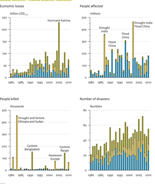
This chapter shows the varying impacts of global disasters, per type of disaster. The disaster categorisation is described in Section 2.2 (hydrological, climatological, meteorological and geophysical disasters). Geophysical disasters were included to show how the disaster burden from weather-related disasters compares to non-weather-related disasters (earthquakes, volcano eruptions, tsunamis). Disaster burden is given for three impacts: (i) economic losses, (ii) people affected and (iii) people killed.
All data in this chapter are based on the CRED database EM-DAT. Based on uncertainty considerations (Section 2.2 and Appendix A) the analyses are confined to the sample period from 1980 to 2010. Furthermore, major disasters were chosen only (for definition and argumentation, see Section 2.2)
3.1 Disaster burden and disaster types
In calculating the disaster burden all disaster information was integrated over the 1980–2010 period, thus giving a robust estimate for this burden. It is noted that the hydrological type of disasters is dominated completely by floods (landslides and avalanches have only marginal contributions to the total burdens). Such a situation is not the case for the climatological type of disasters. Here, the burden is spread more or less evenly over extreme temperatures on the one hand and droughts on the other hand.Table 3.1 gives the results for the three disaster types. In addition to disaster impacts, a column was added for the number of major disasters per group. As such this indicator is not a measure for disaster burden. However, it does provide information on how the disasters are spread over the three disaster types. The final column shows the absolute burden, represented by an average annual value.
Table 3.1 shows that the disaster burden is unequally distributed over the disaster types (maximum percentages are highlighted in yellow):
• The highest economic losses are due to meteorological disasters (storms): 52%;
• The highest number of people affected is due to hydrological disasters (floods): 63%;
• The highest number of people killed is due to
meteorological disasters (combination of temperature extremes and droughts): 56%.
It is noted here that some disasters have a dual nature. Hurricanes such as Katrina (2005) are categorised in EM-DAT as meteorological disasters. However, the resulting floodings highly contributed to the economic damages. Since the economic losses from Katrina were of a record height (around USD 130 billion), this may partly explain the high percentage in economic losses due to storms (for information on Katrina, see http://en. wikipedia.org/wiki/Effects_of_Hurricane_Katrina_in_ New_Orleans).
three three
The last column of Table 3.1 shows that the number of major disasters is equal for the types meteorological and hydrological, 43% and 42% of the global total,
respectively. The number of climatological disaster is much lower: 15%.
To visualise the integrated disaster burden, the time evolution of burden over time is plotted in Figure 3.1. The results from Table 3.1 can easily recognised: the upper panel for economic losses is dominated by the colour green (storms), the second panel for the number of people affected, is dominated by the colour blue (floods), and the third panel for the number of people killed is dominated by the colour yellow (temperature extremes and drought). Some major disasters are highlighted by catchwords.
It is illustrative to compare the weather-related disasters shown in Table 3.1, with disasters with a geophysical nature: earthquakes, volcano eruptions and tsunamis. A comparison of disaster burden is given for all four disaster types in Table 3.2.
The table shows that the main impact of geophysical disasters relates to numbers of people killed: 40% of all people killed in natural disasters, is due to these types of disasters. The number of people affected is very low (3%), followed by economic damages from meteorological disasters (27%). The large number of people killed is explained by the fact that earthquakes, tsunamis and volcano eruptions are difficult to predict. Thus, early warning systems, such as those in place for floods, are not available for geophysical hazards.
3.2 Trends in disaster burden
The results, thus far, concerned integrations over the 1980–2010 period. It is also important to see how disaster burden changes over time. To analyse trends in these data, a sample period of 31 years is rather short,especially since the driving forces behind disaster burden are weather or climate extremes. Some of these
occurrences can be rare and, for example, have an average return period of once in a century. Possible drawbacks of this relatively short sample period will be dealt with Chapter 6.
Table 3.1
Disaster burden statistics for all weather-related disasters, averaged over the 1980–2010 period
Economic losses People affected People killed Number of major disasters Meteorological disasters 52% 12% 32% 43% Hydrological disasters 34% 63% 12% 42% Climatological disasters 14% 25% 56% 15% All weather-related disasters 100% or USD 57 billion /year
100% or 140 million/year 100% or 41 thousand/year 100% or 44 disasters/year
NB Green fields show the highest percentages per type of disaster burden.
Table 3.2
Disaster-burden statistics for all types of disasters, averaged over the 1980–2010 period
Economic losses People affected People killed Number of great disasters
Meteorological disasters 38% 11% 19% 39%
Hydrological disasters 25% 62% 7% 37%
Climatological disasters 10% 24% 33% 14%
Geophysical disasters 27% 3% 40% 10%
All global disasters 100% or USD 78 billion/year 100% or 144 million/year 100% or 69 thousand/year 100% or 49 disasters/year
three
The global evolution of economic losses is given in Figure 3.2A. The upper panel shows the data (black curve) along with the estimated IRW trend (green line) and 95% confidence limits for the trend line (green dashed lines). The methodology of estimating trends and maximum uncertainty information has been given in Section 2.4. The main reference for this method is Visser (2004). Note that the high value in 2005 is for a large part due to hurricane Katrina (http://en.wikipedia.org/wiki/ Hurricane_Katrina).
It is noticeable that trend estimation has been performed after a logarithmic transformation of the data. Therefore, the upper uncertainty bands are wider than the lower bands, due to the transformation back to the original scale (in USD billions). This transformation also explains why the lower left panel shows the trend ratios [μ2010 / μt ], instead
of the trend difference [μ2010 - μt ] which would have the
result without the transformation. The same holds for the ratio in the lower right panel. Clearly, a ratio value of 1.0:1 would mean for both lower panels: no change in trend. Figure 3.1 1980 1985 1990 1995 2000 2005 2010 0 50 100 150 200 250 billion USD2010 Economic losses
Global weather-related disaster statistics
Hurricane Katrina 1980 1985 1990 1995 2000 2005 2010 0 100 200 300 400 500 millions People affected Drought India Flood China Flood China Drought India Flood China 1980 1985 1990 1995 2000 2005 2010 0 100 200 300 400 500 thousands
Meteorological (Tropical and extratropical storms, local storms) Climatological (Temperature extremes, droughts and wildfires) Hydrological (Coastal and fluvial floods, flash floods and landslides)
People killed
Drought and famine Ethiopia and Sudan
Cyclone Bangladesh Heatwave Europe Cyclone Nargis 1980 1985 1990 1995 2000 2005 2010 0 20 40 60 80 Numbers Number of disasters Source: PBL
Extreme events are denoted by catchwords. Only disasters in the severity classes 4 and higher were selected (major, great and devastating disasters, Munich Re categorisation).
three three
The middle panel shows that the trend ratio [μ2010/μt] is
statistically different from 1.0 only for the time period between 1980 and 1990. In other words, the trend value for global economic losses in 2010, statistically, was not significantly higher than loss values over the preceding period (1991–2009) = 0.05). However, compared to the 1980–1990 period, the trend value in 2010 rose
significantly. The trend ratio [μ2010/μ1980] is estimated to be
3.8:1 (2.0:1 – 7.5:1). Thus, the increase over 31 years was almost fourfold, and statistically significant (α = 0.05). The lower right panel shows that the highest trend acceleration occurred at the beginning of the series,
around the ratio 1.08 (or an increment in losses of 8% per year). At the significantly larger than values in the 1980– 1986 period (α = 0.05). The lower panel shows that the increment ratio is 1.1:1 in 1980 (annual increment in trend value of 10% per year) and ends in 2010 with in increment ratio of 1.0:1 (0% increase). At the end of the series, the annual increment ratio has fallen to 1.0:1 (increment in losses of 0%).
A discussion on the trend pattern in economic losses will be given in Section 7.2.
The trend patterns for people affected are given in Figure 3.2B and show similar patterns to those in Figure 3.2A; a Figure 3.2A 1980 1985 1990 1995 2000 2005 2010 0 50 100 150 200 250 billion USD2010 Measurements
Global economic losses due to weather-related disasters
1980 1985 1990 1995 2000 2005 2010 0 2 4 6 8 µ2010 / µt Trend relative to 2010 1980 1985 1990 1995 2000 2005 2010 0.0 0.5 1.0 1.5 IRW trend
Trend: 95% confidence limits No change
Trend relative to trend in preceding year
µt / µt-1
Source: PBL
IRW trend estimation for global economic losses due to weather-related disasters. The upper panel shows the data along with the IRW trend and 95% confidence limits. The trend ratio [μ2010/μt] is given in the lower left panel and the trend ratio [μt/μt-1] in the lower right panel. Trend estimation was performed on logarithms of the original loss data.
three
rising trend over the 1980–1995 period and stabilisation thereafter.
The lower left panel shows that the trend value in 2010, μ2010, was statistically significant for the 1980–1986
period. The trend ratio [μ2010/μ1980] was estimated to be
4.1:1 (1.5:1 – 11.4:1). Thus, the increase over 31 years was fourfold and statistically significant (α = 0.05). The lower right panel shows a trend increment ratio in 1980 accounts for 1.1:1 in 1980 (increment of 10% per year) which diminished to 1.0:1 in the year 2010 (increment of 0% per year). Figure 3.2B 1980 1985 1990 1995 2000 2005 2010 0 100 200 300 400 500 millions Measurements IRW trend
Trend: 95% confidence limits
Number of people affected by weather-related disasters, globally
No change 1980 1985 1990 1995 2000 2005 2010 0 4 8 12 µ2010 / µt Trend relative to 2010 1980 1985 1990 1995 2000 2005 2010 0.0 0.5 1.0 1.5
Trend relative to trend in preceding year
µt / µt-1
Source: PBL
IRW trend estimation for the global number of people affected due to weather-related disasters. The upper panel shows the data along with the IRW trend and 95% confidence limits. The trend ratio [μ2010/μt ] is given in the lower left panel and the trend ratio [μt/μt-1 ] in the lower right panel. Trend estimation was performed on logarithms of the original numbers.
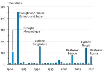
The trend estimation process for people killed appeared to lead to unsatisfactory estimates. The reason for that is best explained by showing the data, see Figure 3.2C. The annual data are generally lower than 50,000 people killed. However, there are six extreme values, which can be attributed to single disaster events. These events are highlighted by catchwords in the graph. The highest value is for the year 1983, the famine in Ethiopia and Sudan (a disaster which became known by the Live Aid concerts: http://en.wikipedia.org/wiki/Live_Aid).
For this type of data it can be said that a sample period of 31 years is too short to give trend estimates.
three three
Finally, Figure 3.2D shows the trend pattern for the annual number of major disasters. For this series a logarithmic transformation is not needed and the fitted trend appears to be a straight line. The trend difference [μ2010–μ1980] is estimated to be 33 (21–44) (lower left panel).
Thus, the increase over 31 years is 33 major disasters. The difference is statistically significant (α = 0.05).
3.3 Conclusions
As for the spreading of disaster burden (Section 3.1), it was found that disaster burden indicators differed in disaster origin: economic losses were mainly due to meteorological disasters (52%), the number of people affected mainly referred to hydrological disasters (63%) and the number of people killed mainly referred to climatological disasters (56%). If geophysical disasters are included, these percentages change for the number of people killed: for all people killed due to all types of natural disasters 40% comes from geophysical disasters, followed by 33% due to climatological disasters, 7% due to hydrological disasters and 19% due to meteorological disasters.
Trend patterns showed that global economic losses increased over the 1980–1995 period and stabilised thereafter. This stabilisation was not influenced by the ‘outlier’ in 2005: an annual loss of over USD 200 billion, from which USD 130 billion was attributed to hurricane Katrina. Seen over the whole sample period, from 1980 to
2010, economic losses showed a statistically significant fourfold increase. Section 7.2 discusses this trend pattern in relation to trends published by other institutions. The data on people affected appear to show the same pattern as that for losses; an increase over the 1980–1995 period with a stabilisation thereafter. The data do not show one extreme value but three high values (more than 300 million people affected in one year). These extremes fit in the trend model since logarithms are taken. The influence of this transformation can be illustrated by taking a logarithmic scale on the y-axis instead of a linear scale in Figure 3.3: the upper panel of Figure 3.2B is identical to Figure 3.3, apart from the y-axis scaling. Over the whole 1980–2010 sample period, the number of people affected showed a statistically significant fourfold increase.
The data on the number of people killed, globally, were found to be dominated by six extreme values (annual numbers of more than 50,000 people killed); these extremes did not allow an accurate trend estimation. Section 6.3 shows a disaster series which starts in 1900, our analysis and a discussion on the consequences. Finally, a linear increase was found for the global number of major disasters over the 1980-2010 period. The increment over this period consists of 33 major disasters, and is statistically significant.
Figure 3.2C 1980 1985 1990 1995 2000 2005 2010 0 100 200 300 400 500 thousands
Number of people killed in weather-related disasters, globally
Drought Mozambique Drought and famine Ethiopia and Sudan
Cyclone Bangladesh Heatwave Europe Cyclone Nargis Heatwave Russia Source: PBL
three
Chapter 6 discusses the question of why trends rise or stabilise. Section 7.2 shows that other interpretations of trends in global disaster data exist in the literature, as well. Figure 3.2D 1980 1985 1990 1995 2000 2005 2010 0 20 40 60 80 Numbers Measurements IRW trend
Trend: 95% confidence limits
Global weather-related disasters
No change 1980 1985 1990 1995 2000 2005 2010 0 10 20 30 40 50 µ2010 – µt
Change in trend relative to 2010
1980 1985 1990 1995 2000 2005 2010 0.0 0.5 1.0 1.5 2.0 µt – µt-1
Annual changes in trend relative to each preceding year
Source: PBL
IRW trend estimation for the global number of weather-related disasters. The upper panel shows the data along with the IRW trend and 95% confidence limits. The trend difference [μ2010–μt] is given in the lower left panel and the trend difference [μt–μt-1] in the lower right panel.
three three
Figure 3.3 1980 1985 1990 1995 2000 2005 2010 10 100 1000 millions Measurements IRW trendTrend: 95% confidence limits
Number of people affected by weather-related disasters, globally
Source: PBL
four
Regional spreading of
disaster burden
The analyses thus far have been for global data. However, disaster burdens and trends over time may deviate for different parts of the world, for countries with varying levels of wealth and varying number of people. This chapter analyses how the disaster burden, as described in Section 3.1 for global data, changes if the world would be divided into three regions: rich countries (here: OECD countries), emerging economies (here: BRIICS countries), and all other countries (rest of the world (RoW)). Similar to Section 3.1, calculations have been based on the CRED database EM-DAT, using data over the 1980– 2010 period. Section 4.1 presents disaster burdens due to weather-related disasters (the sum of meteorological, climatological and hydrological disasters). Subsequently, Section 4.2 shows a categorisation of disaster burdens according to the three disaster types: hydrological, climatological and meteorological. Finally, Section 4.3 shows disaster burdens due to flood disasters and drought disasters. The chapter ends with conclusions.
4.1 Weather-related disasters
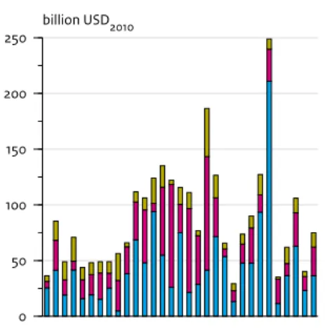
In Table 4.1 integrated disaster burden are summed for the three regions and the three burden indicators: economic losses, people affected and people killed. The table shows a remarkable spreading of disaster burden over the three regions: the highest economic losses are found for the OECD countries (63% of global total losses),the highest number of people affected is found for the BRIICS countries (84% of global total) and the highest number of people killed is found for the Rest of World (77% of global total).
The result from Table 4.1 is visualised in Figure 4.1. The upper panel shows a stacked graph for economic losses. The colour green, the OECD countries clearly dominate the graph. The middle panel shows the number of people affected. The colour orange appears to be the dominating colour: the BRIICS countries. And the lower panel shows that the number of people killed. Here, the colour blue is dominating: the Rest of World.
4.2 Hydrological, meteorological,
climatological and geophysical
disasters
It is interesting to see how disaster burden is spreading over different disaster types: hydrological, climatological and meteorological disasters. Will the disaster-burden pattern shown in Table 4.1, also show up for other categorisations of disasters?
Results are shown in Table 4.2A. The upper panel shows that the pattern is different for hydrological disasters (floods to a large extent): all three disaster burdens are highest for the BRIICS group of countries (yellow cells in the table). Economic losses, averaged over the 1980–2010
fou
R
fou
R
period, originate for 45% from the BRIICS countries and idem 86% of the people affected and 55% of the people killed. Remarkable is that the number of major
hydrological disasters for the BRIICS equals that for the Rest of World (38% of the global total).
The middle and lower panel of Table 4.2A show the pattern as found in Table 4.1: highest percentages for
economic losses in the OECD countries, highest number of people affected in the BRIICS countries and highest percentages for people killed in the Rest of World. It is also interesting to compare the absolute differences in disaster burden compared over the three disaster types. Global economic losses due to hydrological disasters is USD 20 billion/year; for climatological Table 4.1
Disaster burden statistics for weather-related disasters
Weather-related disasters Economic losses People affected People killed Number of major disasters OECD countries 63% 2% 8% 37% BRIICS countries 24% 84% 15% 28% Rest of World 13% 14% 77% 35% Globally 100% or USD 57 billion/year 100% or 140 million people /year 100% or 41 thousand people /year 100% or 44 disasters/year
NB The table presents the total of hydrological, climatological and meteorological disasters. All data have been averaged over the 1980–2010 period. Green fields show the highest percentages within the three regions.
Table 4.2A
Disaster-burden statistics for three disaster types
Hydrological disasters Economic losses People affected People killed Number of major disasters OECD countries 38% 1% 4% 23% BRIICS countries 45% 86% 55% 38% Rest of World 17% 13% 41% 39% Globally 100% or USD 20 billion/year 100% or 89 million/year 100% or 5 thousand/year 100% or 18 disasters/year Climatological disasters Economic losses People affected People killed Number of major
disasters OECD countries 58% 1% 11% 45% BRIICS countries 32% 90% 10% 29% Rest of World 10% 9% 79% 26% Globally 100% or USD 8 billion/year 100% or 34 million/year 100% or 23 thousand/year 100% or 7 disasters/year Meteorological disasters Economic losses People affected People killed Number of major disasters OECD countries 80% 5% 2% 48% BRIICS countries 8% 60% 8% 18% Rest of World 12% 35% 90% 34% Globally 100% or USD 29 billion/year 100% or 17 million/year 100% or 13 thousand/year 100% or 19 disasters/year
NB Green fields show the highest percentages within the three regions. The upper panel contains hydrological disasters (coastal and fluvial floods, flash floods, landslides), the middle panel contains climatological disasters (heatwaves, droughts, forest fires), and the lower panel contains meteorological disasters (hurricanes, extra-tropical storms, local storms, tornados, hail storms). All data have been averaged over the 1980-2000 period.
four
Figure 4.1 1980 1985 1990 1995 2000 2005 2010 0 50 100 150 200250 billion USD2010 Rest of the world
BRIICS (Brazil, Russia, India, Indonesia, China, South Africa) OECD countries
Economic losses
Global weather-related disaster statistics, per region
Hurricane Katrina 1980 1985 1990 1995 2000 2005 2010 0 100 200 300 400 500 millions People affected Drought India Flood China Flood China Drought India Flood China 1980 1985 1990 1995 2000 2005 2010 0 100 200 300 400 500 thousands People killed
Drought and famine Ethiopia and Sudan
Cyclone Bangladesh Heatwave Europe Cyclone Nargis Source: PBL
Weather-related disaster burdens, stacked for the OECD, BRIICS and RoW countries (the upper line of each panel equals the global burden for each impact). The upper panel shows disaster losses (in billion USD1), the middle panel shows the number of people affected (in millions), and the lower panel shows the number op people killed (in thousands). Main disaster events are indicated by catchwords.
fou
R
fou
R
disasters USD 8 billion/year is found, and for meteorological disasters USD 29 billion/year. Thus, highest global losses are found for meteorological disasters (damage due to storms). As for people affected the highest numbers are found for people affected: on average 89 million/year. This is for climatological and meteorological disasters 34 and 17 million/year, respectively. Finally, the highest number of people killed appears to be due to climatological disasters: on average 13,000 people per year. This is for hydrological and meteorological disasters 18,000 and 19,000 people per year, respectively.
How do these disaster-burden numbers compare to other natural disasters: earthquakes, volcano eruptions and tsunamis? The disaster burden for this category is summarised in Table 4.2B. Remarkable is that distribution of disaster burden is identical to that shown for weather-related disasters, summarised in Table 4.1: highest damages fro the OECD countries (63% of global total), highest number of people affected for the BRIICS
countries (72% of global total) and highest number people killed for the Rest of World (55% of global total). If the absolute disaster burden from Table 4.2B is compared with that in Table 4.2A, it can be seen that the number of people killed by geophysical disasters is highest: 28,000 people per year on average
(climatological disasters account for 23,000 people per year).
4.3 Flood and drought disasters
For some studies it is of interest to know the disaster burden due to water-related disasters, rather than due to weather-related disasters. To this end a selection in EM-DAT was made for flood disasters and drought disasters. The disaster burdens have been summarised in Table 4.3.Table 4.2B
Disaster-burden statistics for geophysical disasters (earthquakes, volcano eruptions, tsunamis)
Geophysicaldisasters Economic losses People affected People killed Number of major disasters
OECD countries 63% 10% 5% 31%
BRIICS countries 22% 72% 40% 31%
Rest of World 15% 18% 55% 38%
Globally 100%
or USD 21 billion /year
100% or 4 million/year 100% or 28 thousand/year 100% or 5 disasters/year
NB All data are averages over the 1980–2010 period. Green fields show the highest percentages within the three regions.
Table 4.3
Disaster-burden statistics for floods (upper panel) and droughts (lower panel)
Flood disasters Economic losses People affected People killed Number of great disasters
OECD countries 38% 1% 4% 24%
BRIICS countries 45% 86% 56% 38%
Rest of World 17% 13% 40% 38%
Globally 100% or USD 19 billion/ year
100% or 89 million/year 100% or 5 thousand/ year
100% or 18 disasters/ year Drought disasters Economic losses People affected People killed Number of great disasters OECD countries 52% 1% 0% 35% BRIICS countries 33% 90% 1% 27% Rest of World 15% 9% 99% 38% Globally 100% or USD 4 billion/year 100% or 32 million/year 100% or 18 thousand/year 100% or 2 disasters/year
four
It appears to statistics for floods are almost equal to that for hydrological disasters (upper panel of Table 4.2A). This is not the case for droughts, compared to climatological disasters (middle panel of Table 4.2A) since the disaster burden due to extreme high or low temperatures is substantial. Therefore, the pattern of yellow cells for floods equals that for hydrological disasters. The pattern of yellow cells for drought disasters has the well-known pattern: highest losses for the OECD countries (52% of global total), highest number of people affected for the BRIICS countries (90% of global total) and highest number of people killed in the rest of World (99% of global total).
4.4 Discussion
The main result found in this chapter is the typical spreading over disaster burden over the three regions: highest losses in the OECD countries, highest number of people affected in the BRIICS countries and the highest number of people killed in the Rest of World. The only exception to this rule is for the group of hydrological disasters. Here, all highest disaster-burden percentages are found for the BRIICS countries.
The result for economic losses is not surprising. The GDP data in the left panel of Figure 2.2 show that the total wealth in OECD countries was four times that in the RoW countries and double that of the BRIICS countries (between 2005 and 2010). For GDP per capita the differences are even more pregnant: the GDP per capita is six fold that of both BRIICS and RoW countries. Given a more or less even distribution of number of major disasters over the regions (last column Table 4.1), it is logical that the largest losses will occur in the OECD countries. Furthermore, it is logical that OECD countries do not show the highest numbers for people affected or people killed: they have more financial abilities to adapt to disasters (e.g., evacuation schemes, early warning systems, irrigation systems).
The finding that largest numbers of people affected fall are found in the BRIICS region is also logical. Table 3.1 shows that the largest number of people affected are found for hydrological disasters (63% of disasters on a global scale). And the upper panel of Table 4.2A shows that 86% of these numbers occur in the BRIICS countries. Within this group the largest numbers are found for China The reason why the BRIICS countries do not show the highest number of people killed, may be explained by Figure 4.2
Political risk map, 2012
High risk Very high risk Medium risk
Medium to high risk Low risk
Low to medium risk
Non rated
Source: AON, 2012
Political risk is defined by combining risks, such as those of (civil) war, strikes, riots and civil unrest, non-payments, supply-chain disruptions, and legal and regulatory risks.
fou
R
fou
R
adaptation measures. As for China, Dr. Y. Hu (UNESCO-IHE, private communication) has stated that this may have three explanations: (i) flood warning and forecasting systems were improved in recent decades (34,000 new hydrological or precipitation stations were built, as well as over 8.600 flood reporting stations, all over the country), (ii) each year, before the rainy season, flood control agencies at all levels draw up plans for flood prevention and regulation, for the major rivers and lakes, and (iii) during the rainy season, the flood control and drought relief headquarters follow a strict 24-hour-duty system as well as a system of daily consultations. In case of flooding and drought, emergency response is initiated according to the emergency plan, to avoid casualties and minimise economic losses (cf. Nie et al., 2011).
Finally, the explanation for finding the highest number of people killed in the RoW countries is logical too. First, poverty in many of these countries is high and governments do not have the means for adapting to potential disasters. Moreover, the political risks in many of the RoW countries are high. Political risk includes (civil) wars, riots, corruption, and non-payments. Clearly, countries with high political risks will be more vulnerable to impacts of extreme weather events. See Figure 4.2 for a world map of political risks, published by Oxford Analytica and Aon (a global provider of risk management services).
The map shows low risks for the OECD countries (not rated in 2012, but low risk in 2011), medium-low and medium risks for BRIICS countries, and low risks up to very high risks in the RoW countries. Most countries in Africa fall in the categories medium-high up to very high risk2. In Section 6.3 more details will be given as for
political risks and vulnerability.
4.5 Conclusion
The main result found in this chapter is a characteristic spreading of disaster burden over the three regions: highest losses in the OECD countries, highest number of people affected in the BRIICS countries and the highest number of people killed in the Rest of World. The only exception to this rule found here, is for the group of hydrological disasters. Here, all highest disaster-burden percentages are found for the BRIICS countries. Explanations for differences in wealth and vulnerability between the three regions were given. As part of that the case of floods in China was discussed.
Notes
1 In 2010 US dollars.
2 Similar maps are known as country risk maps. See http://en.wikipedia.org/wiki/Country_risk, for examples. Maps with similar background and spatial patterns were published by BEH (2011) as world maps for vulnerability, coping capacity, susceptibility and a combination of these maps, the WorldRiskIndex.
five
Trends in regional
disaster burden
This chapter describes trends in regional disaster burdens (global trends are discussed in Section 3.2). Section 5.1 provides trends in economic losses, trends in people affected are described in Section 5.2, trends in people killed in Section 5.3, and Section 5.4 discusses trends in major disasters. All analyses have been based on the CRED database EM-DAT, for the 1980–2010 period. In all cases, only major disasters were selected (see
argumentation in Section 2.2).
The analyses in this chapter have all been based on disaster data, extracted directly from EM-DAT. Chapter 6 presents analyses based on data and trend patterns relative to changes in wealth and population in the respective regions.
5.1 Trends in losses
The trend in global economic losses appeared to increase over the 1980–1995 period and showed a stabilisation over the 1995–2010 period. The global data show one outlier in losses: the year 2005 (with huge losses due to hurricane Katrina). In Figure 5.1 the trends for the OECD region are shown (upper panel), idem the BRIICS countries (middle panel) and idem RoW countries (lower panel). Note that the trend ratio information ([μ2010 / μt]
and [μ2010 / μt]) is not shown here.
The upper panel (OECD) shows a slightly increasing exponential trend with the 2005 outlier being more
pregnant than that shown in Figure 3.2A for global losses. The trend shows a fourfold increase over the 1980–2010 period: from around USD 13 billion in 1980 to around USD 52 billion in 2010. For the trend ratio [μ2010/μ1980] the
following estimates were found: 4.4:1 (1.8:1 – 10.9:1). The 95% confidence limits appear to be very wide, due to the large inter-annual variability.
The middle panel (BRIICS) shows a slightly increasing pattern up to the year 1995 and a stabilisation thereafter. This is the pattern found in Figure 3.1 for global losses. Note the difference in scale of the y-axis: the upper panel ranges up to USD 200 billion, while the middle panel ranges up to USD 50 billion. The trend shows a sevenfold increase over the 1980–2010 period: from around USD 2.4 billion in 1980 to USD 17.1 billion in 2010. For the trend ratio [μ2010/μ1980] the following estimate is found: 7.1:1 (2.7:1
– 19:1). The 95% confidence limits appear to be very wide, again due to the large inter-annual variability.
Furthermore the trend ratio [μ2010/μt] is non significant
over the 1987–2009 period (α = 0.05).
Finally, the lower panel (RoW) shows a very small rising trend. Note the difference in scale of the y-axis: the upper panel ranges up to USD 200 billion, the middle panel ranges up to USD 50 billion and the lower panel ranges up to USD 30. The trend in the loss data appears to be a straight line and is not significant for the whole 1980– 2010 period (α = 0.05). The mean losses account for USD 6.2 billion.
five five
Figure 5.1 1980 1985 1990 1995 2000 2005 2010 0 50 100 150 200250 billion USD2010 Measurements
IRW trend
Trend: 95% confidence limits
OECD countries
Economic losses due to weather-related disasters, per region
1980 1985 1990 1995 2000 2005 2010 0 50 100 150 200 250 billion USD2010
BRIICS (Brazil, Russia, India, Indonesia, China, South Africa)
1980 1985 1990 1995 2000 2005 2010 0 50 100 150 200 250 billion USD2010
Rest of the world
five
Figure 5.2 1980 1985 1990 1995 2000 2005 2010 0 100 200 300 400 500 millions OECD countriesPeople affected by weather-related disasters, per region
1980 1985 1990 1995 2000 2005 2010 0 100 200 300 400 500 millions Measurements IRW trend
Trend: 95% confidence limits
BRIICS (Brazil, Russia, India, Indonesia, China, South Africa)
1980 1985 1990 1995 2000 2005 2010 0 100 200 300 400 500 millions
Rest of the world
For OECD countries, the combination of data did not allow a trend estimation